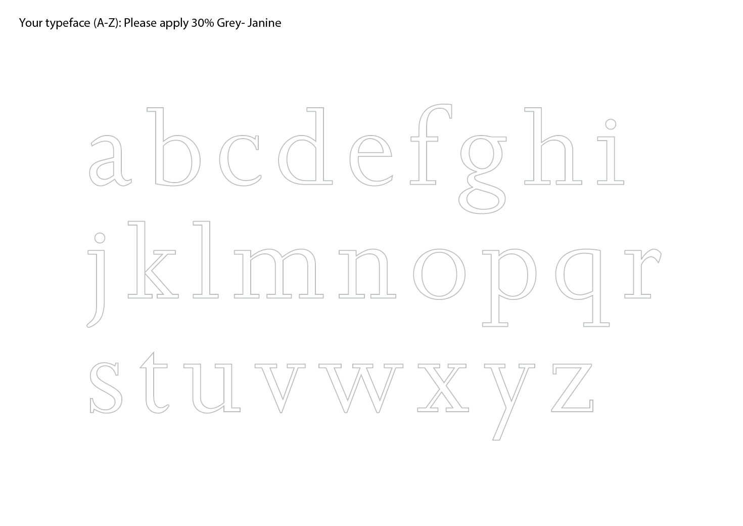
Size Variation and understanding my typeface further:
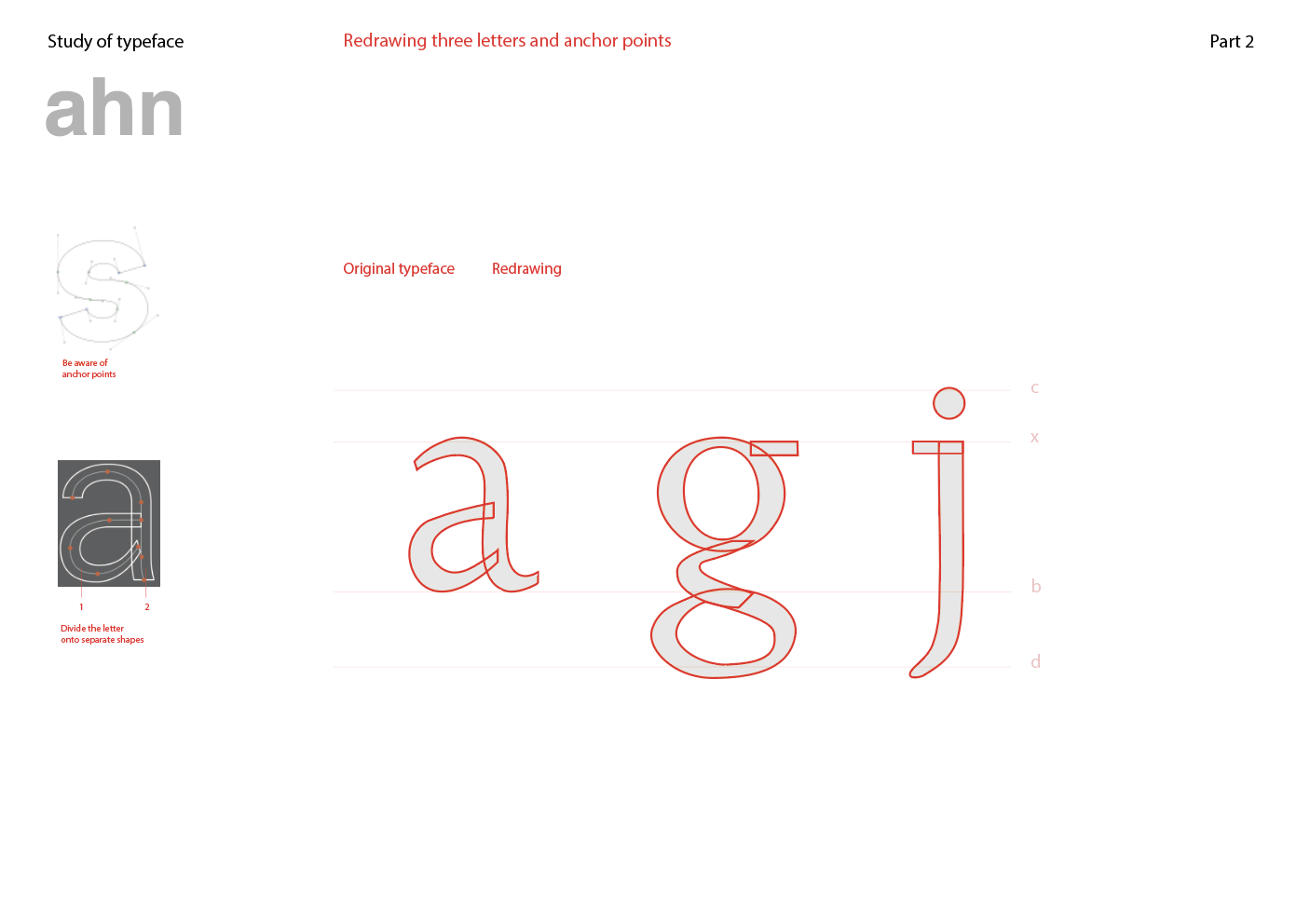
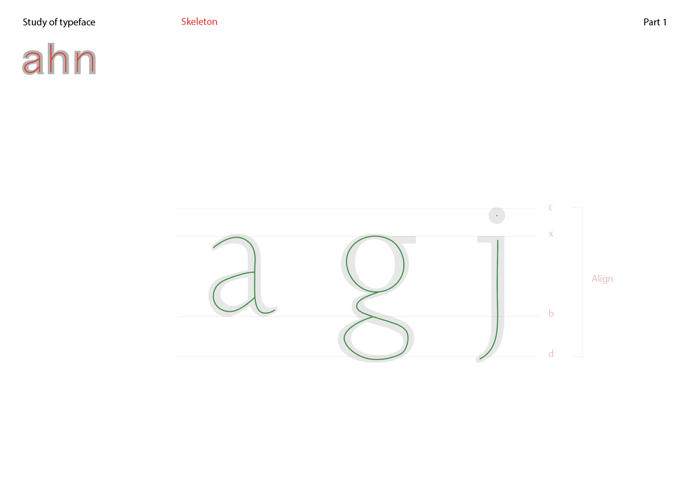
Through our tutorial class with Tatiana, we were able to understand our chosen typeface more by drawing its skeleton and measuring the parts of the typefaces like it’s strokes, curvatures and counters. For my chosen typeface (Joanna), we digitally drew its skeleton and its anchor points. Moreover, through the tutorial and studying of the typeface, I was able to understand where the letters a, g and j’s anchor points are. I also learnt that serifs are its own part and is considered a dressing to a typeface, which I found to be quite interesting.


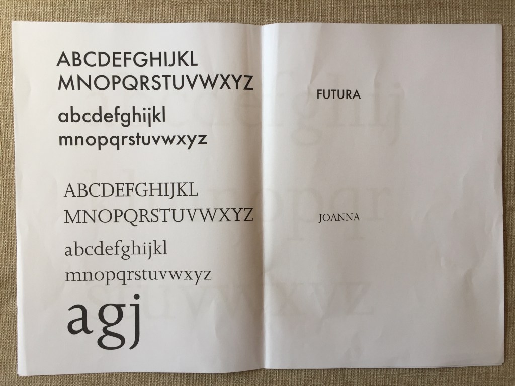
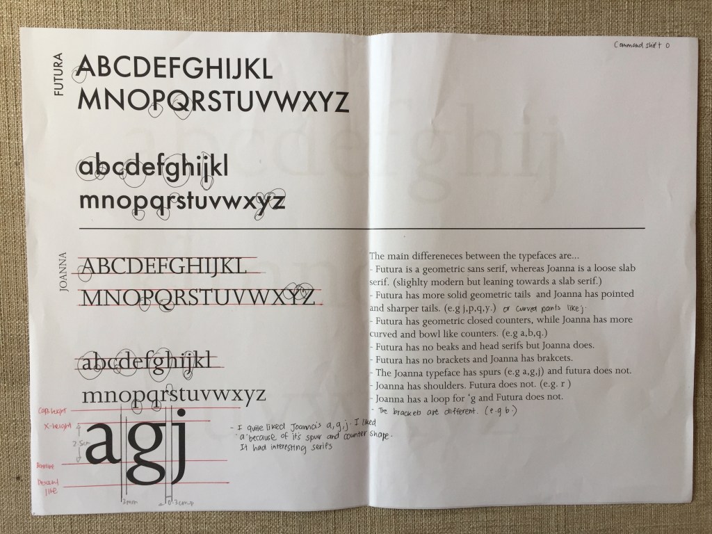
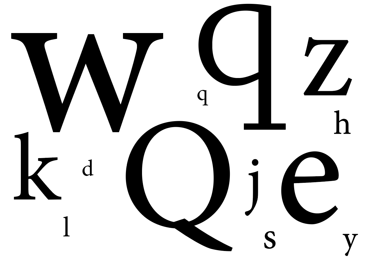
Here is an enlargement of my 3 favourite letters from the Joanna typeface. I was drawn to these 3 because of its spurs, loops, counters and interesting figures/ shapes.
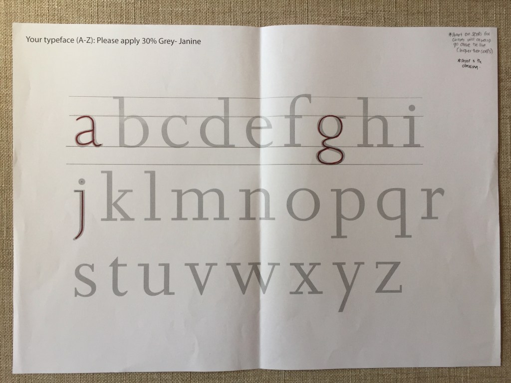
(Measuring it’s kearning, counters and x-height.)
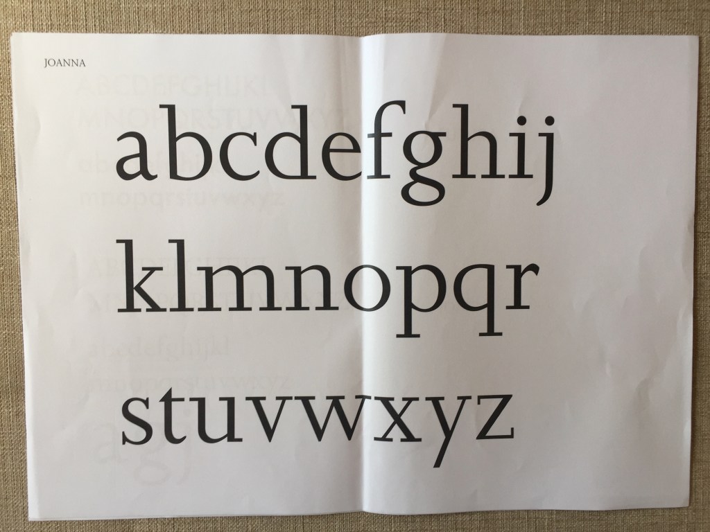
Week 3: Size Variation
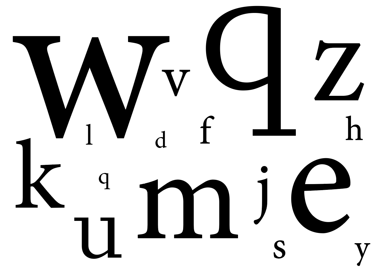
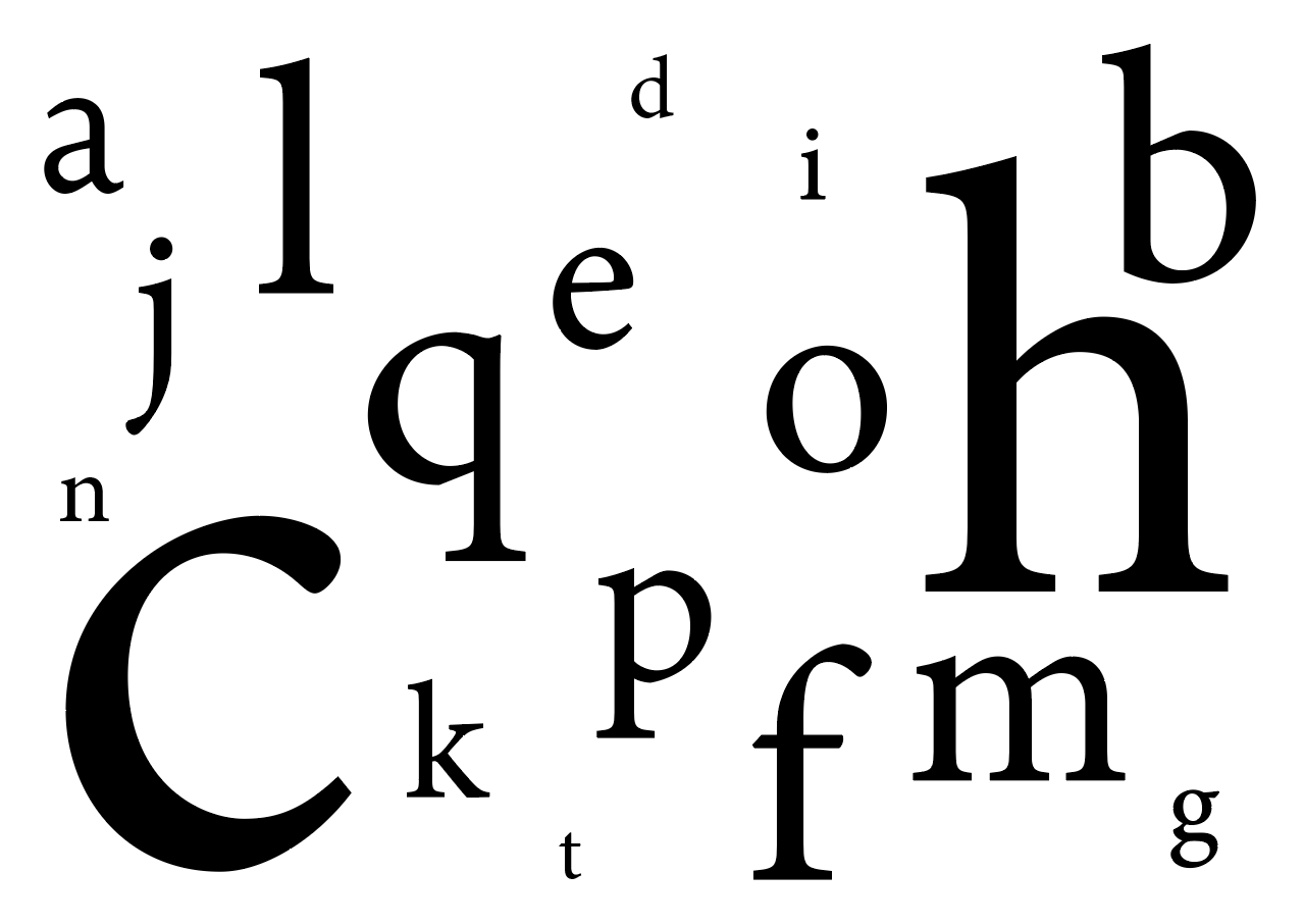
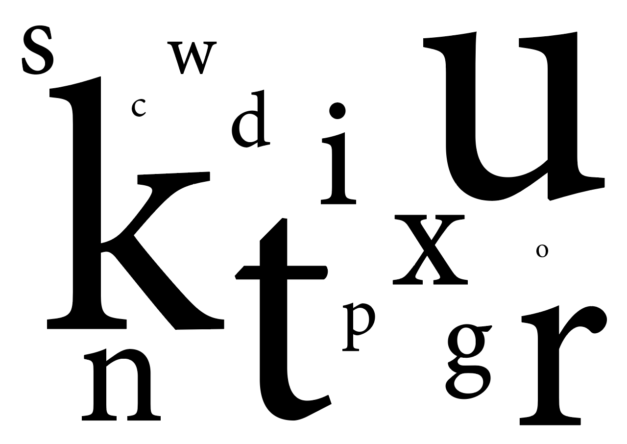
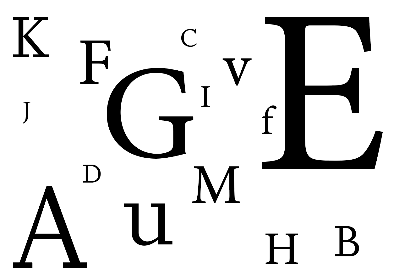
On continuation with the understanding of typeface, we were tasked to print them in variation of different sizes.
