MOODBOARD:
(Note: to add notes on the photographs. Update: Notes down below.)
Some Photographs from Mood board:
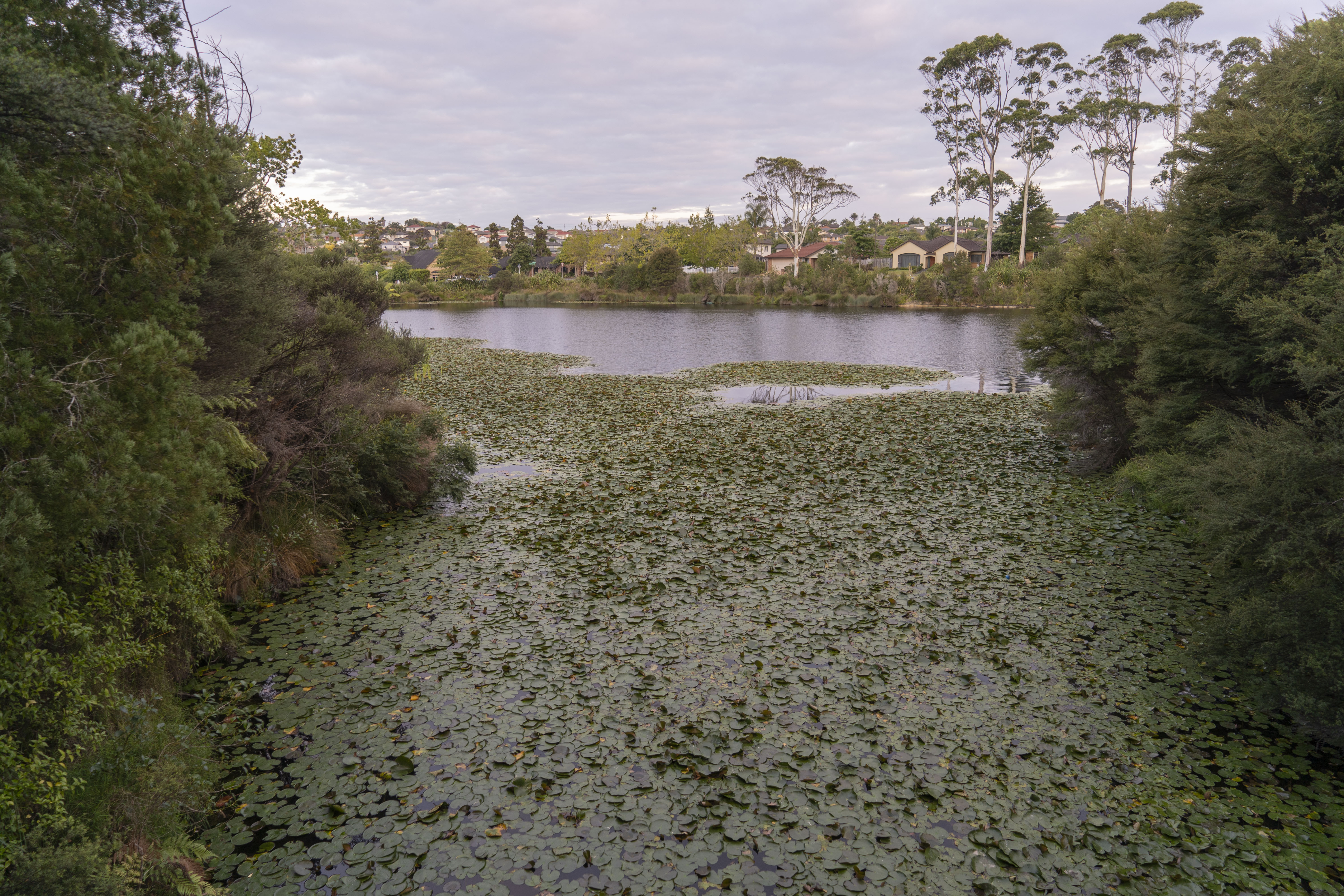
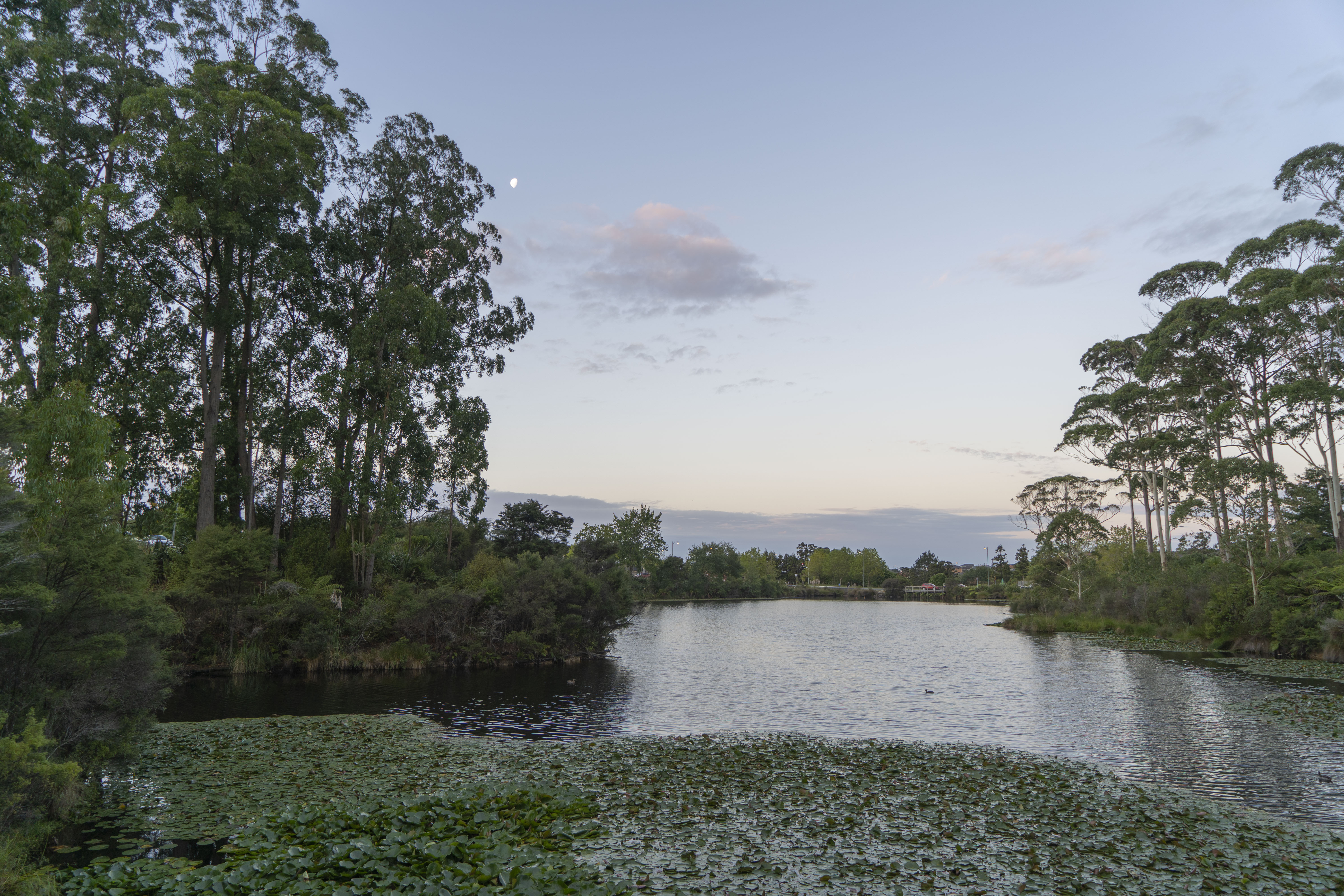
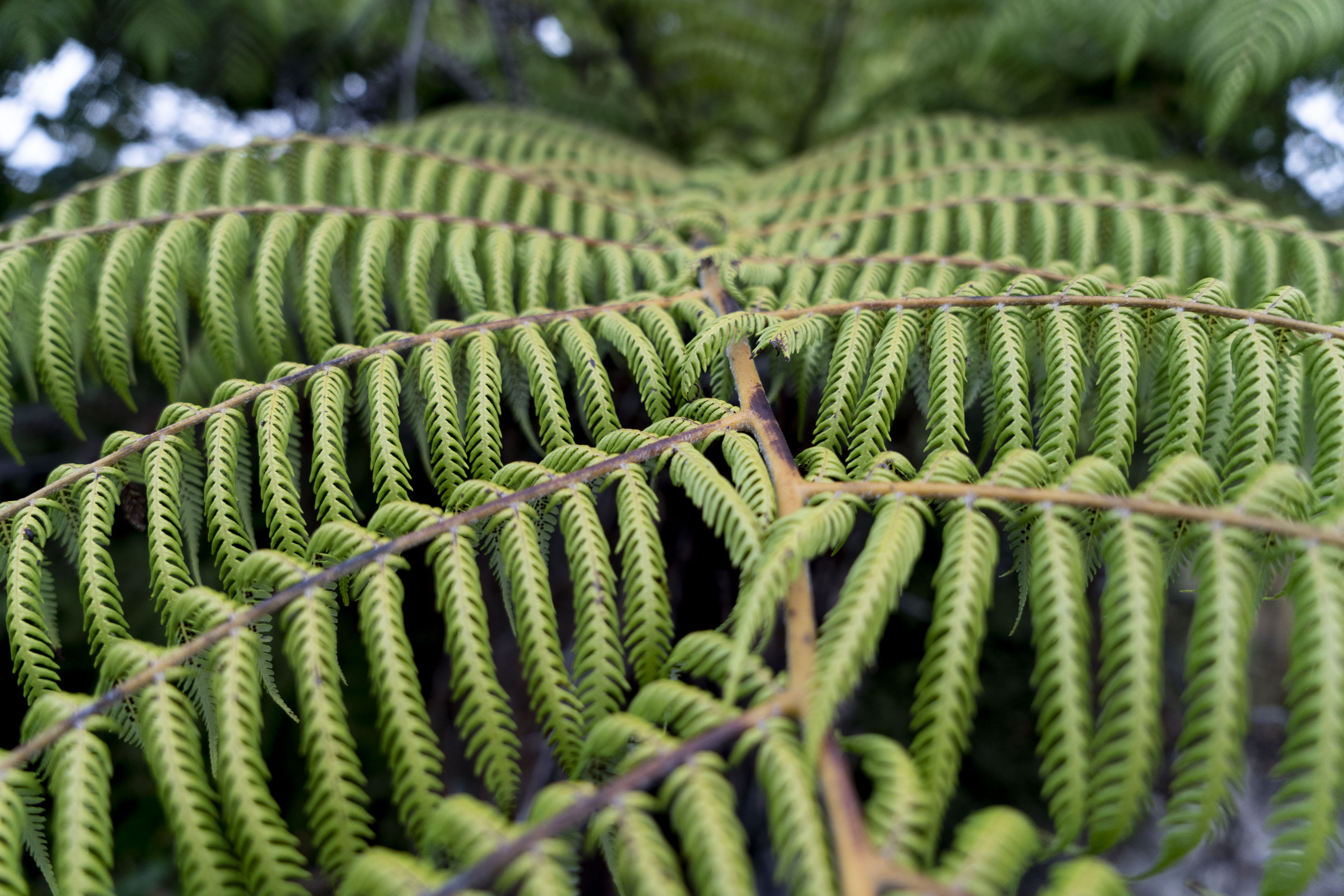
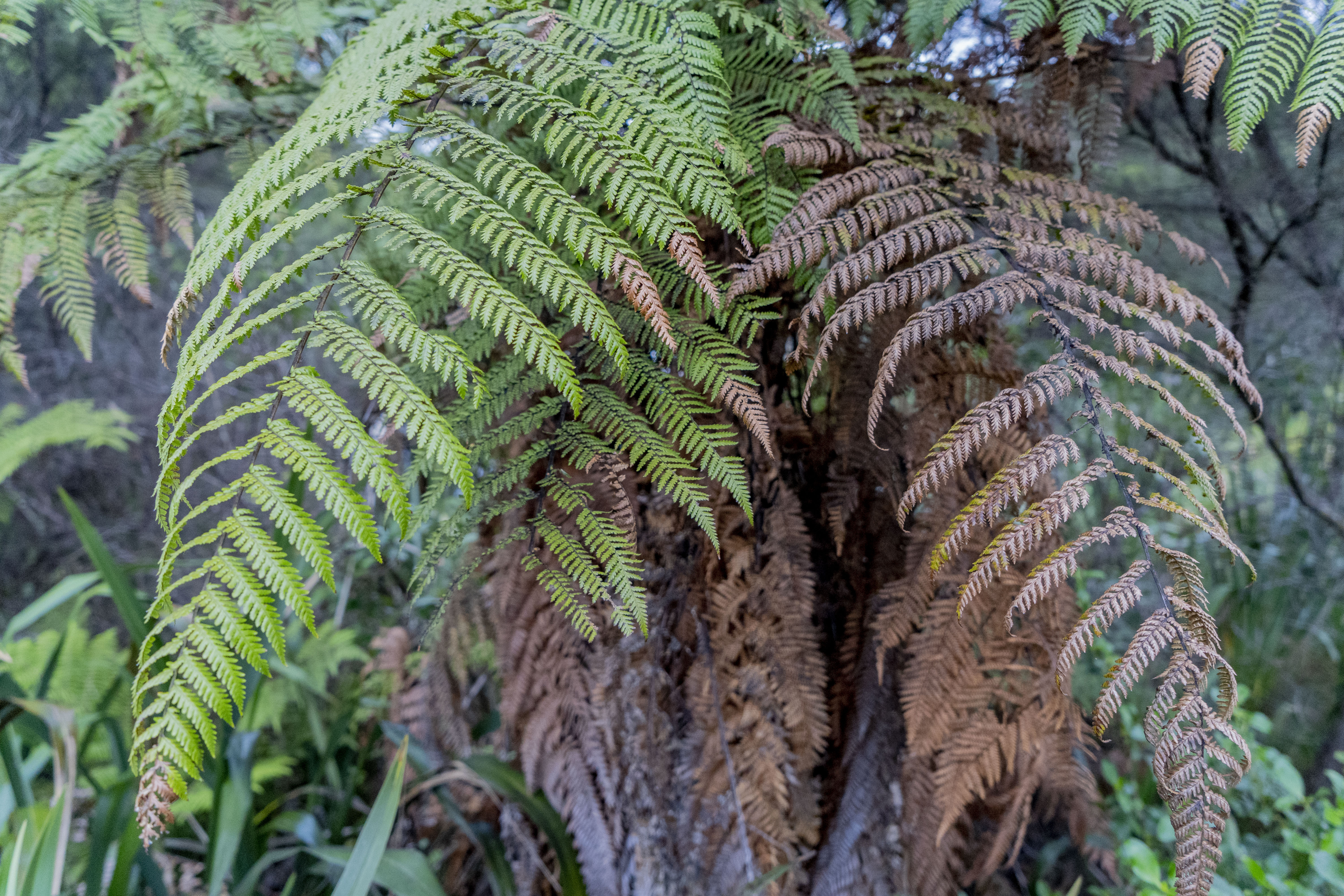
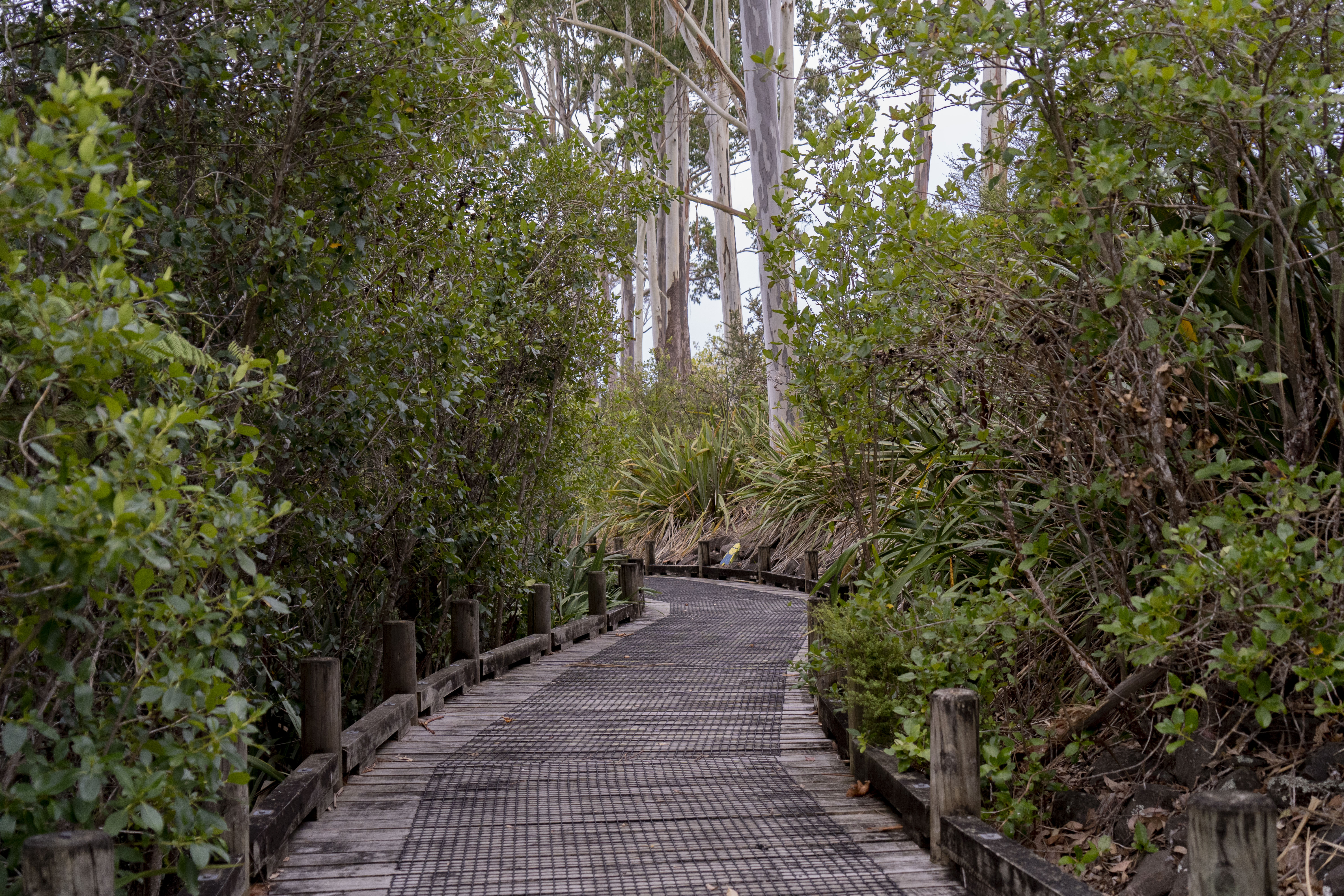
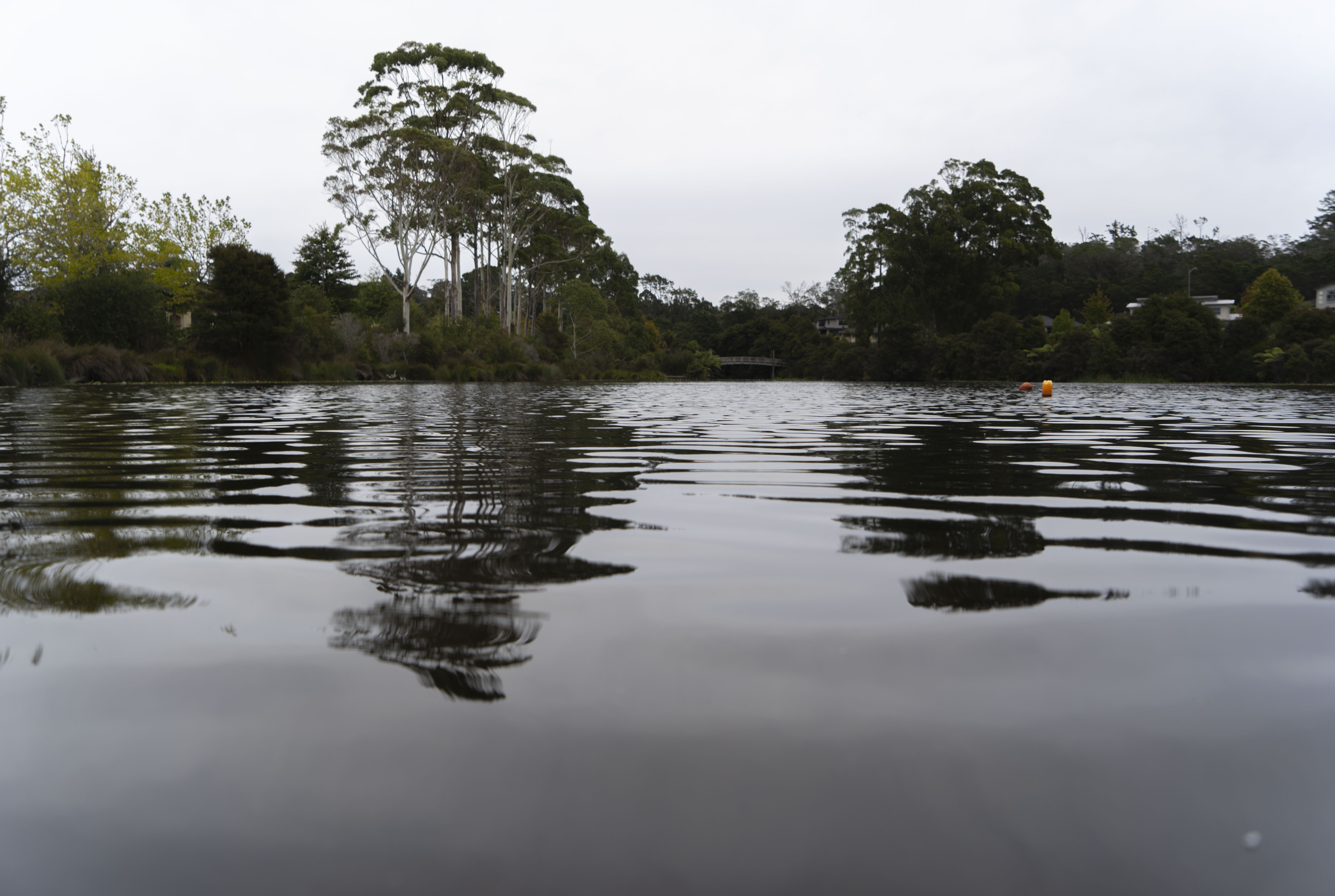
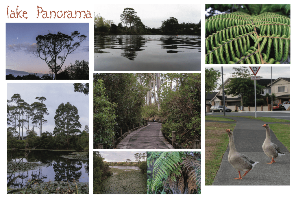
Here are a few photographs that I took while at my place. I have chosen these photographs for they show the emotion and feel I am trying to show which is peace and serenity. As you can see the place is very natural and is covered with natural elements like trees, plants and water. Whenever I come to this place everything feels so slow-paced; I can really feel my at peace, and I can hear myself think and reflect too.
Moreover, I had noticed that the Lake had a mixture of different kinds of leaves like ferns and other plants that I don’t really know (which is something I could look further into.) In saying this, the foliage reminded me of time and the idea of ageing. These ideas came to mind because of the contrast between the leaves (specifically the ferns.) As you can see in one of the photographs, some leaves are brown while the rest is green. This could bet the contrast between young people and old people. The brown represents the older and more experience people while the green represents the youth who are more full of energy and bright. Over time, you age and encounter more worries, stress and problems but as a child/(when you were younger), you are more innocent, careless and have less to worry about.
(Side note: these are just a few pictures I have taken, not all- will be shown on another post alongside more reflections and ideas.)
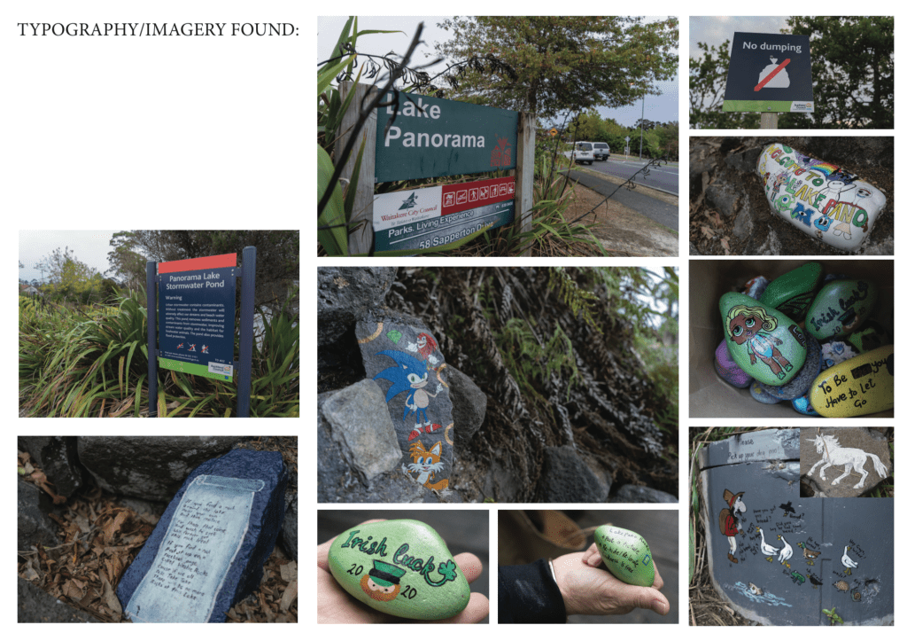
TYPOGRAPHY FOUND:
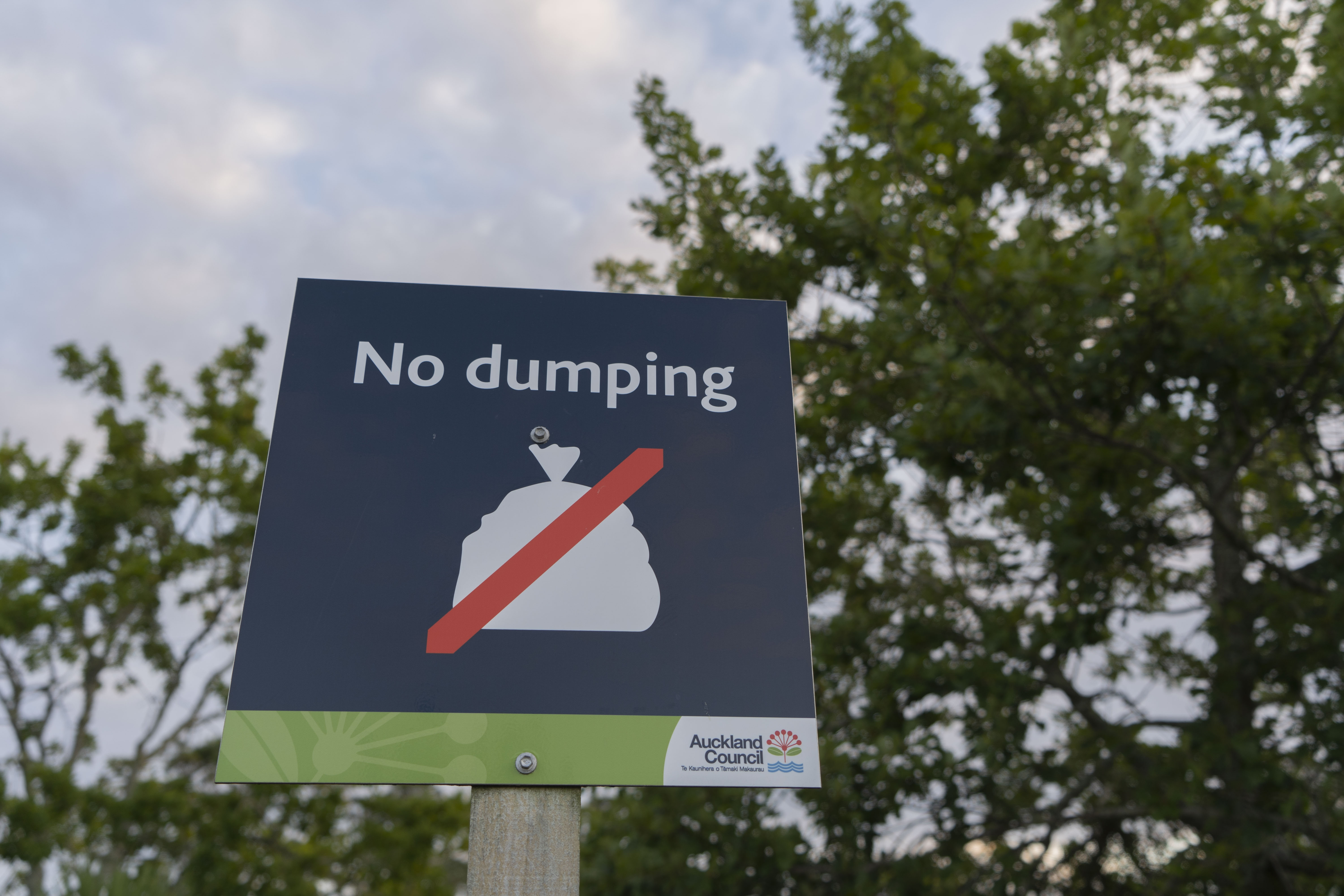
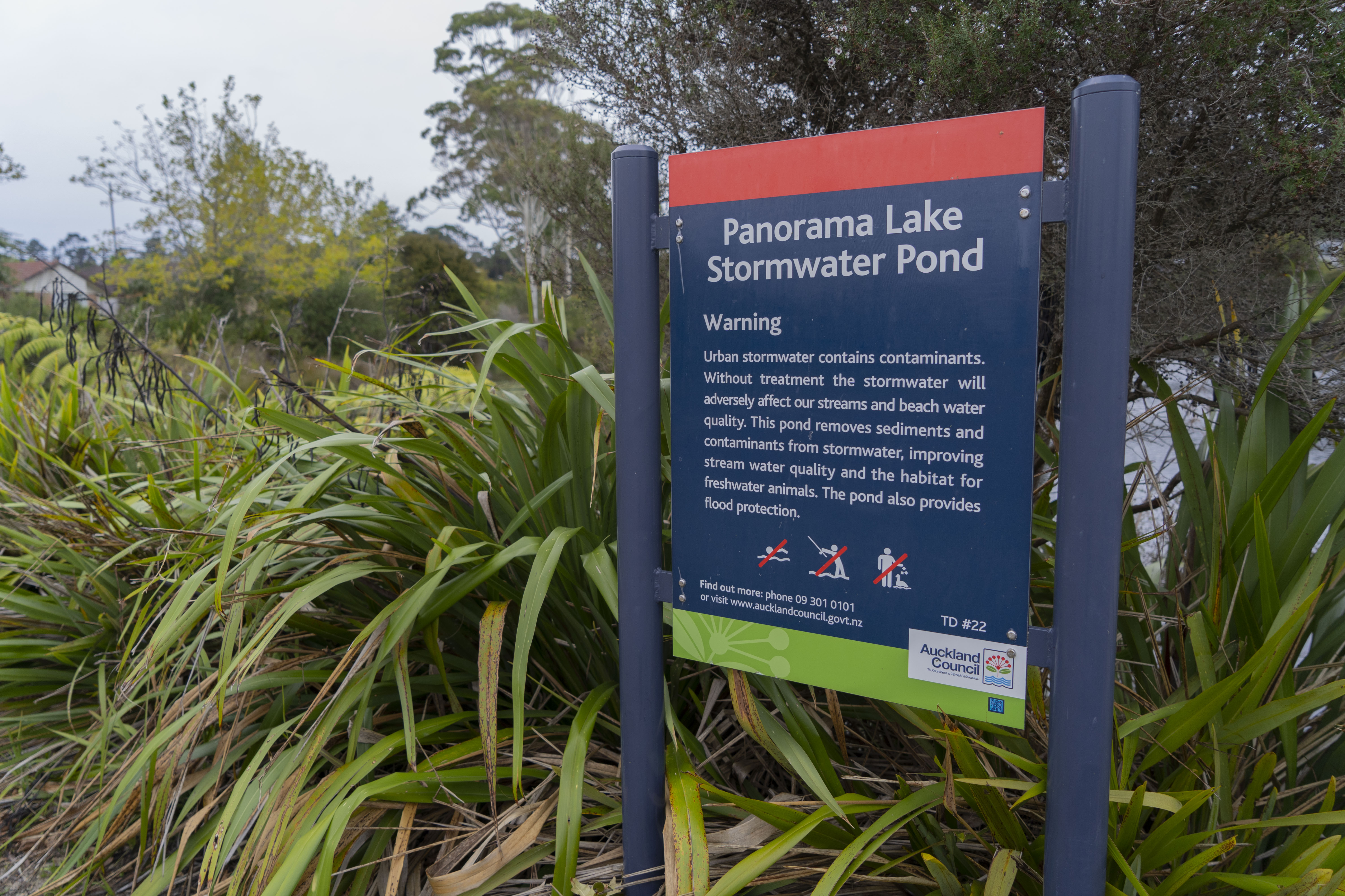
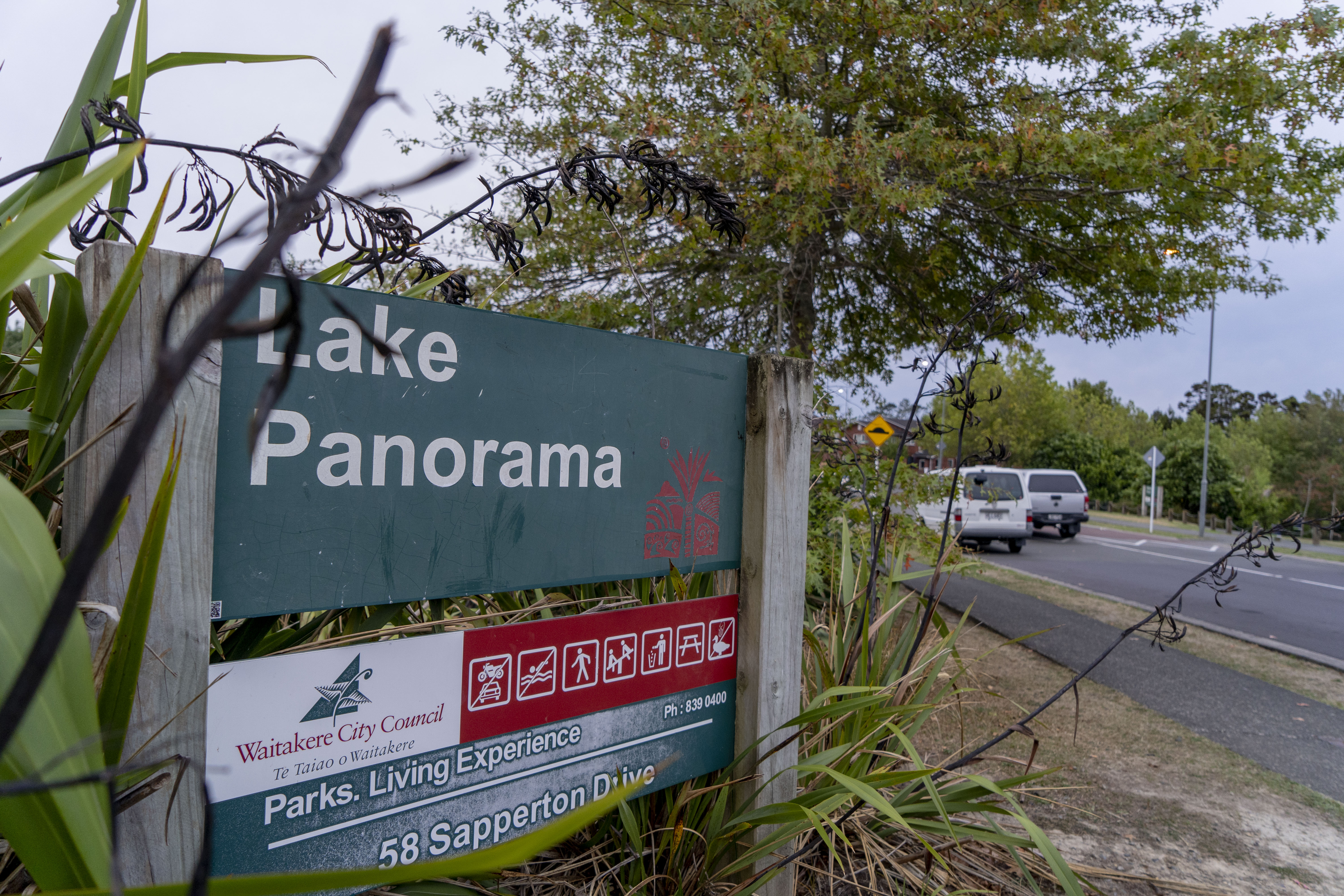
At Lake Panorama, I could not find much typography but most of the texts and typography I did find were of the signs. Looking at its signs, they have used a san serif font. Simple and easy to read. The signs also had common colours like green, navy blue and red. All typography are on signposts.
Type, Illustrations, Drawings and stories found:
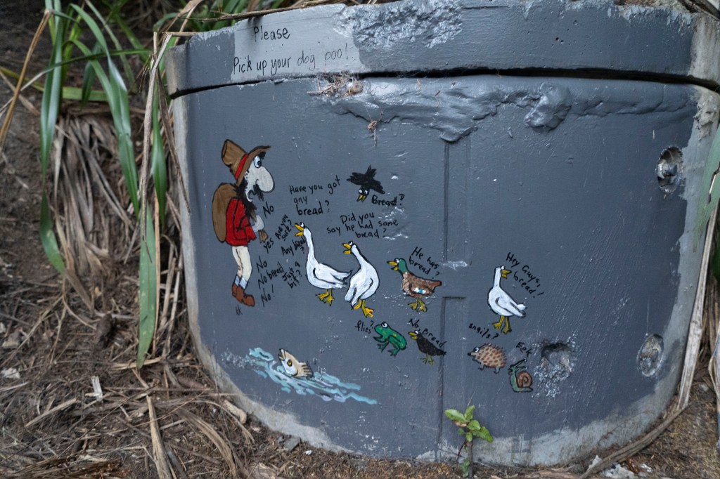
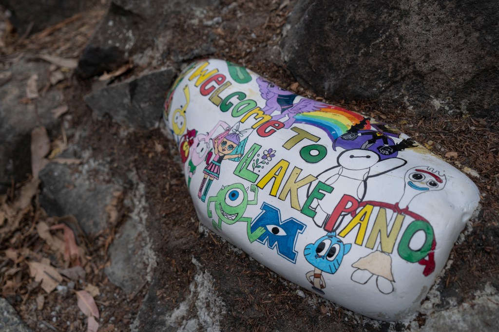
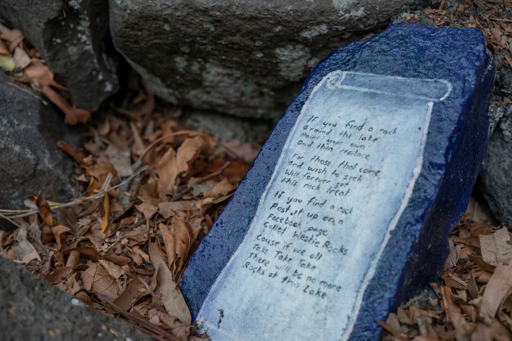
(It’s like there is a small community within the Lake.)
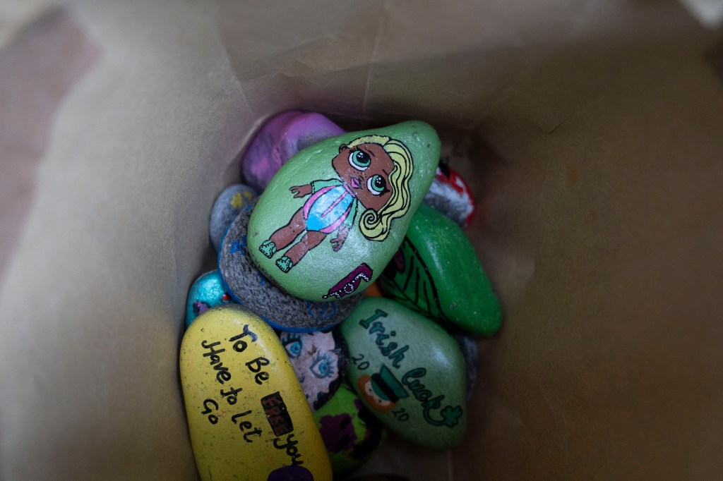
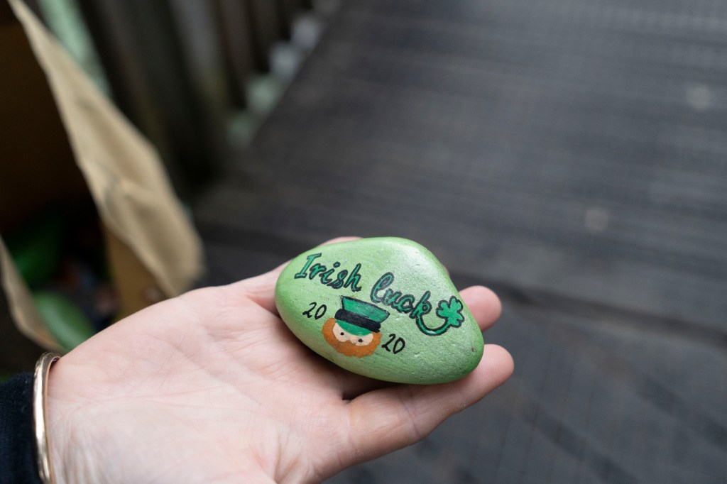
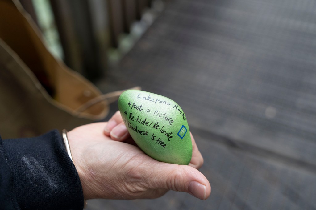
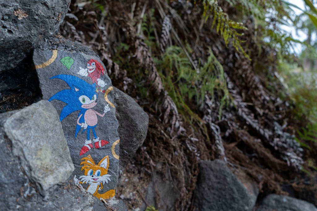
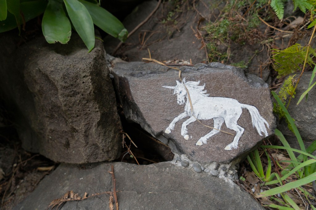
Another form of typography and Imagery I found around the lake were these hand painted rocks. I recently came to find out that there was an activity that they always do at the Lake which is painting rocks. During the time of shooting, I got to talk to one of the caretakers and she explained to me that people paint rocks and then hide theirs. Next they may try to find other peoples rocks and choose to keep them or re-hide them (which I think is a fun way of interacting with the community. (Further explanation and research on post link below.)
(Link to post more about the rocks at the ‘Lake Panorocks’ community and how it relates to my idea:) https://janinecarlos.photo.blog/2020/03/20/a-community-within-week-4-5/
STUDIES OF ANATOMY/SKELETON PART 2:
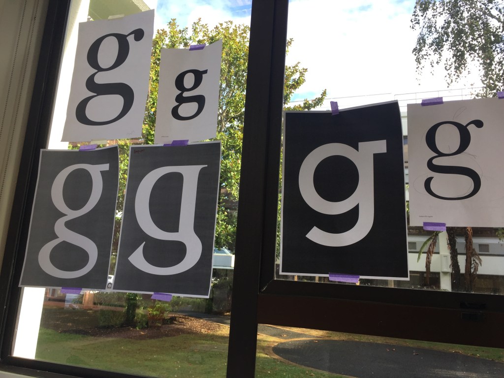
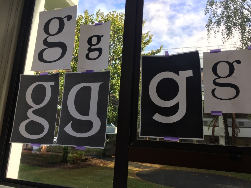
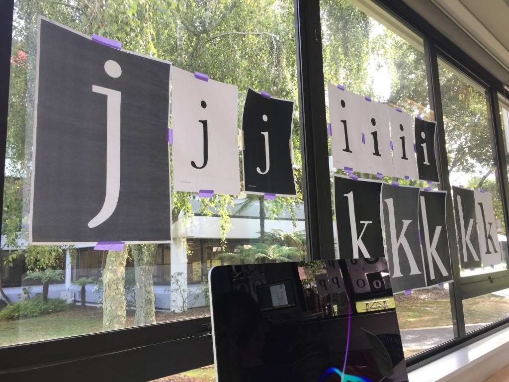
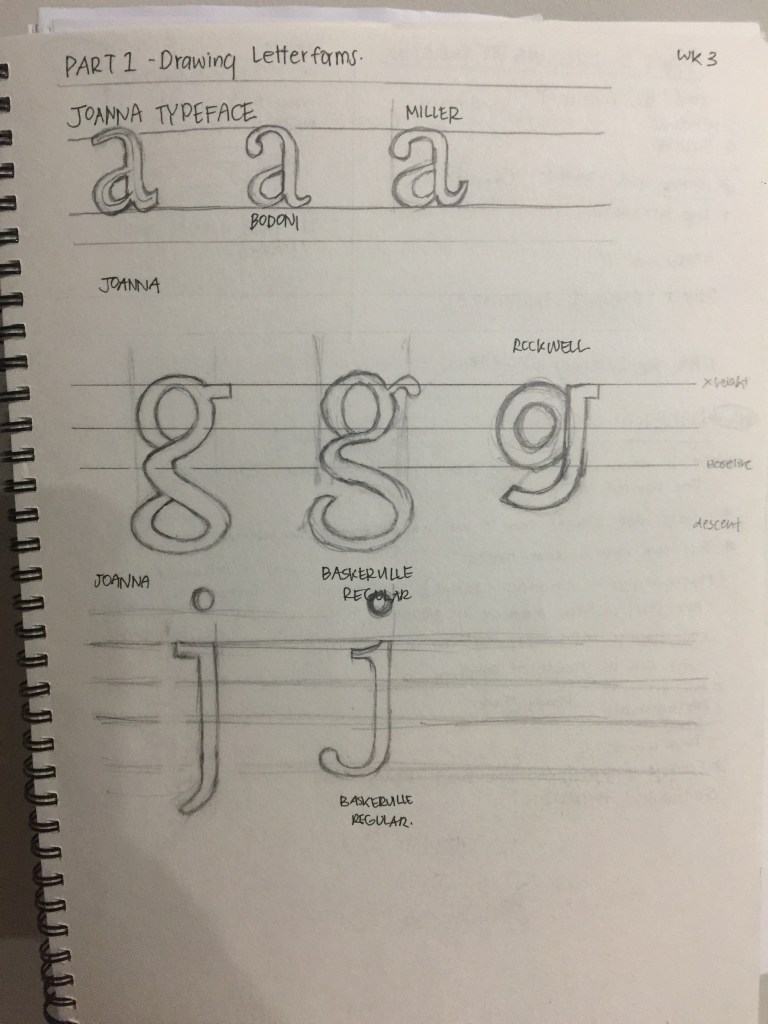
To further understand our typefaces and its similarities and differences, we did a class exercise where we physically had to draw the letters by hand. I found this exercise quite interesting for we got to see everybody’s typefaces really big and we had to try and figure out the anatomy of each typeface.
MINI PRESENTAION:
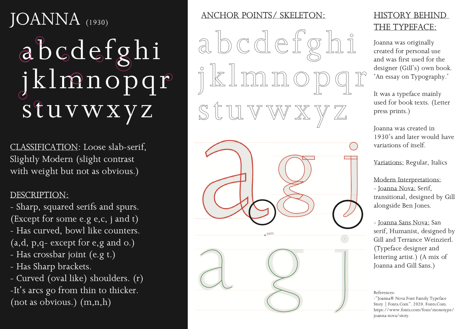
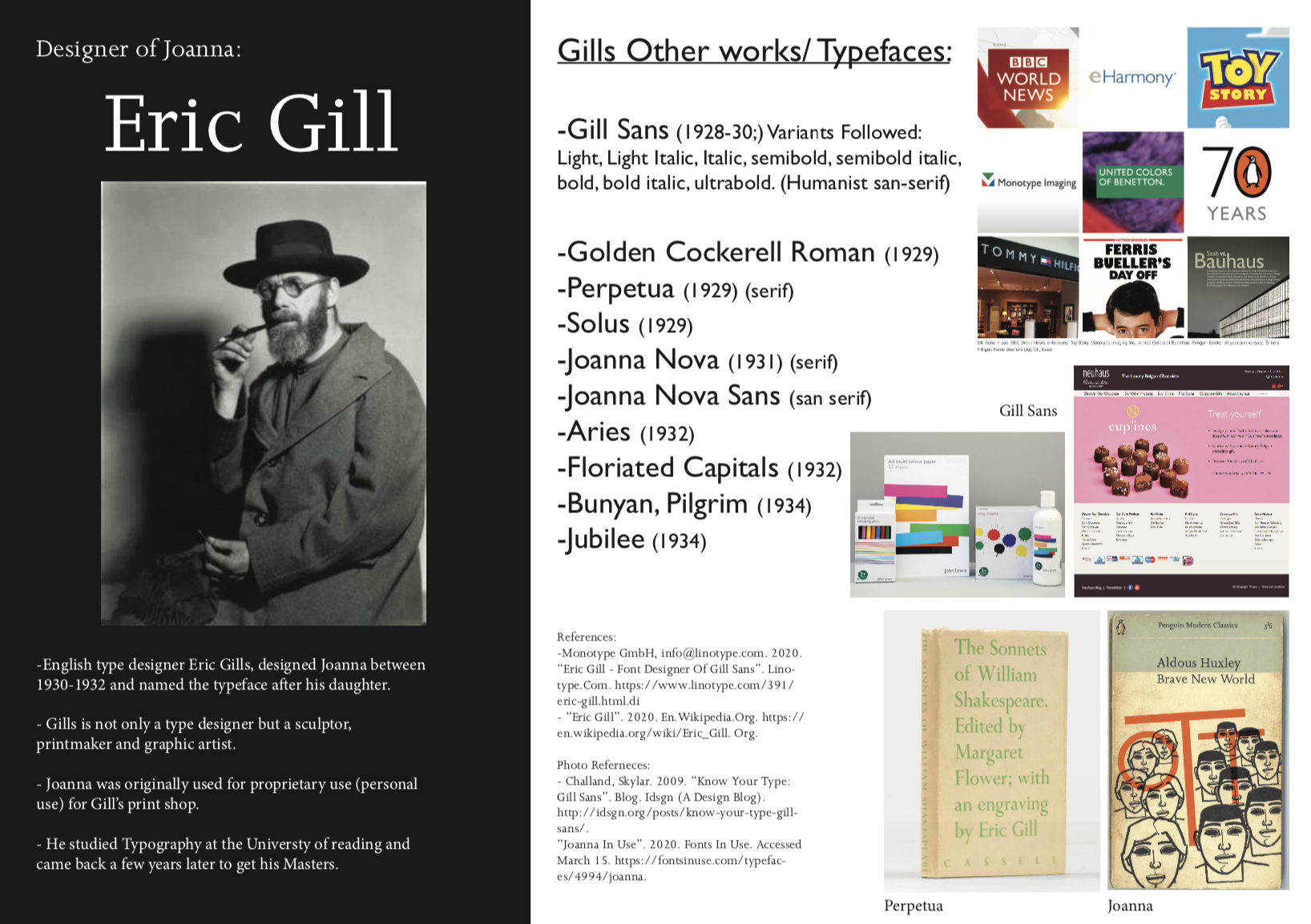
For week 4, we had to create a mini presentation about our Typeface. In saying this, we had to do further research about the typefaces history regarding the designer, the time it was created and why. Also, we had to indicate its classifications, variants and descriptions using the anatomy of typeface so that we are able to understand and talk about our typeface better.
Presentation:
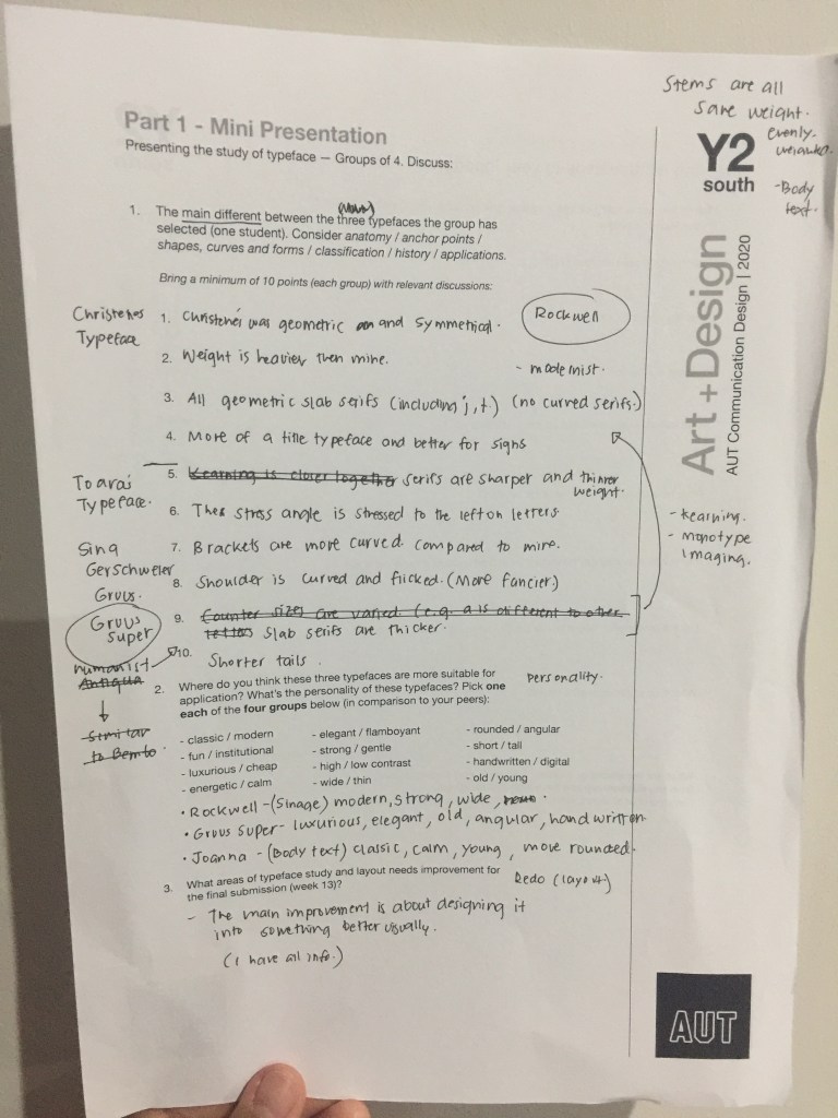
Reflection after Presentation: After our presentation talk with our group, I got to understand other peoples typefaces like Rockwell and its similarities and differences to my typeface (Joanna.) It was also a good presentation because I was able to speak about my typeface using the anatomy of typeface as well as understand other peoples typefaces.
How I can improve this informative ‘poster’ on Joanna: In terms of design, I want to make the layout much better, rather than just being informative, I want it to look creative and visually pleasing too.
(New Layout will be on a seperate post-Updated.)
