Type Explorations:
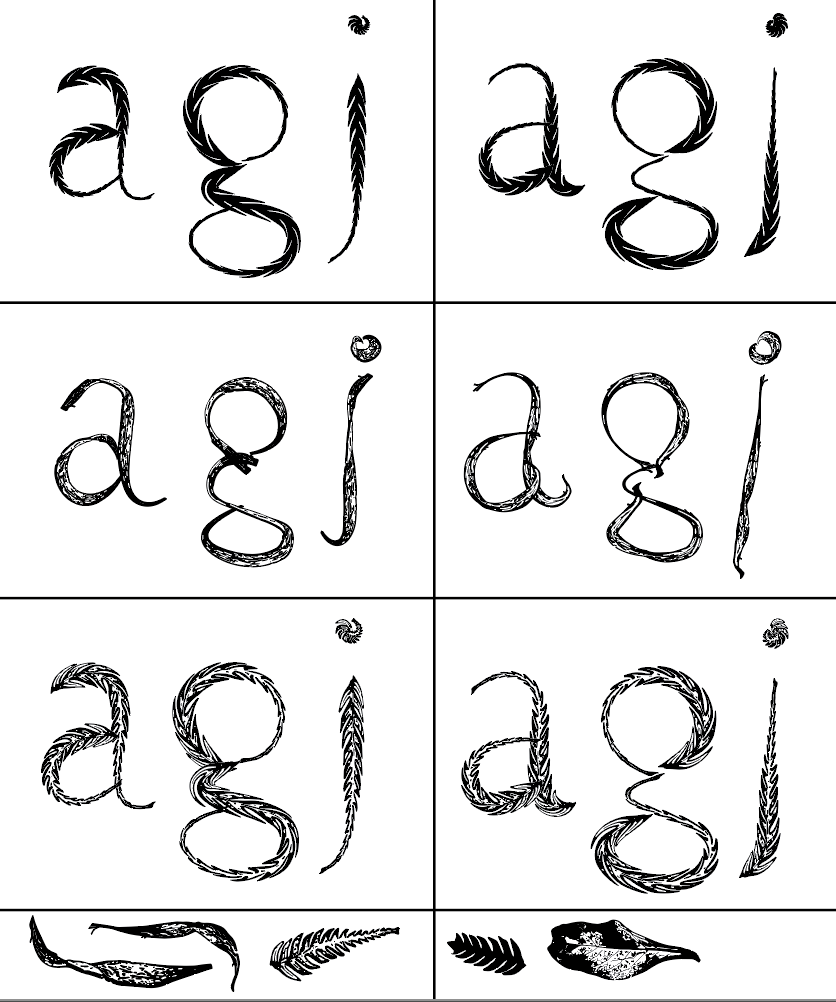
For my next set of explorations, I decided to experiment with the textures of leaves from my place to see what they would look like as fonts. I had used the textures and shapes from ferns as well as normal leaves I had found at my place. I found that this session of exploration to be more interesting then my first set of explorations for these ones came out more interesting and had more texture to them. I like how they show the textures from the leaves yet they can still be read. (or at least the letters can be seen.)
Further Type Exploration Explanations:
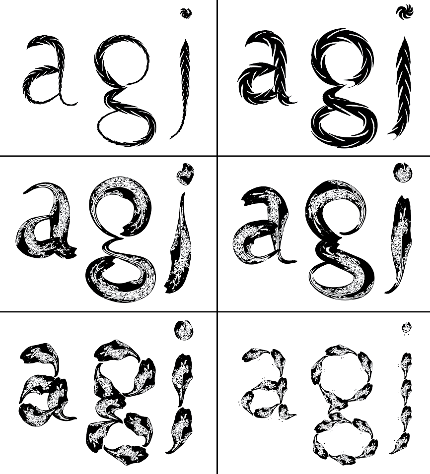
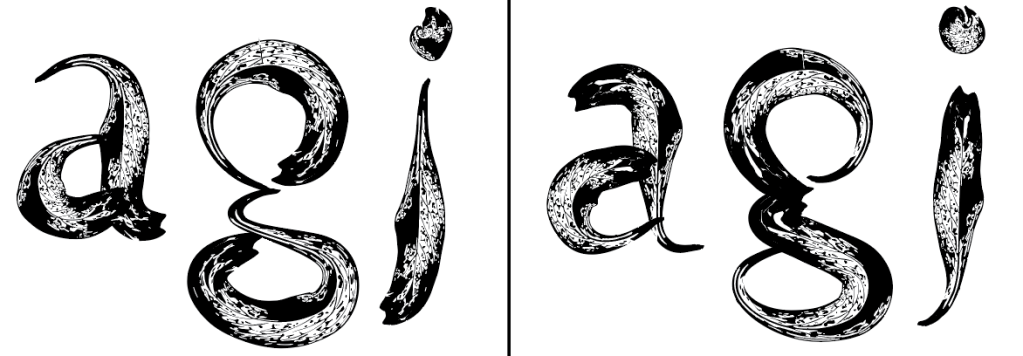
For this font, I had used a normal leaf for this test. I found this one to be quite interesting. It is a lot thicker than the other fonts made and is very detailed when it comes to the texture.
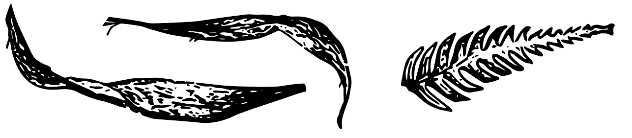
This one is made up of of the lines from the leaf. I found this one to be quite interesting for it also looks like thin branches and flowers.
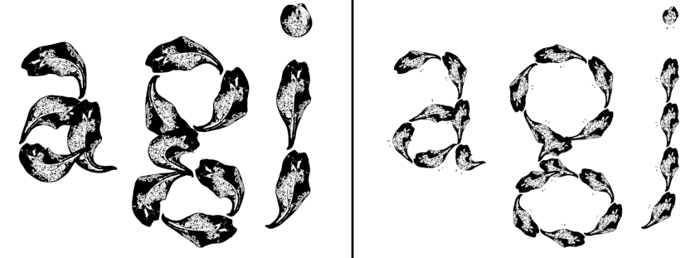
This one was a pattern made up of leaf outlines. I tried overlaying it so it looked more connected. I found this interesting yet I probably won’t explore this font further. I could possibly include this somehow in the publication design?
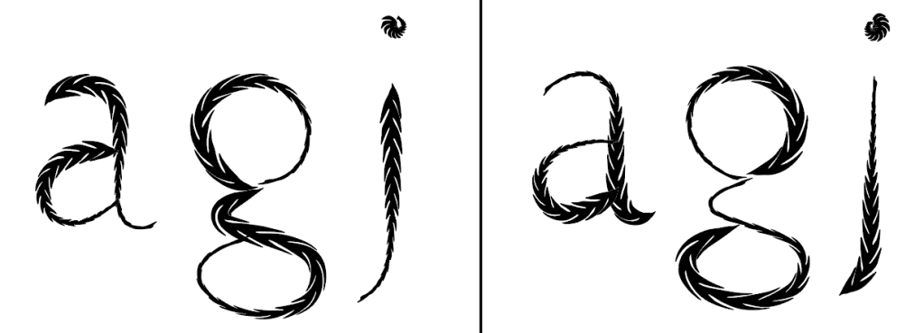
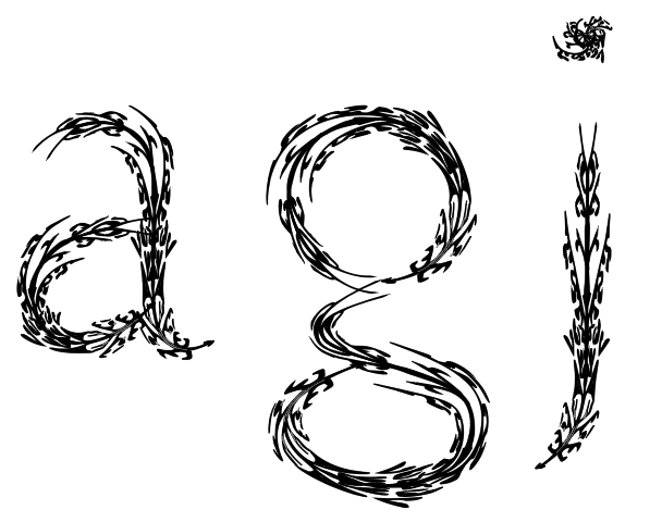
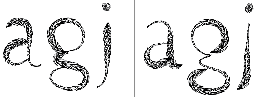
This one was a font made up of a fern leaf. I like how it’s readable yet it is still recognisable that it is a fern due to its leaf parts.
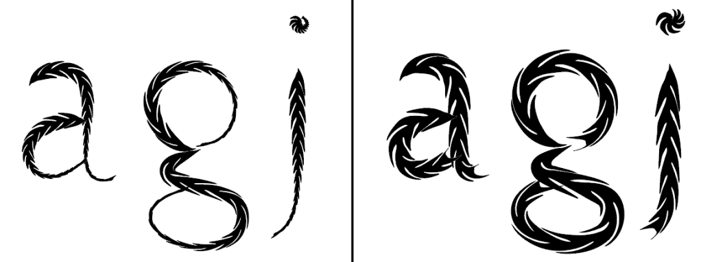
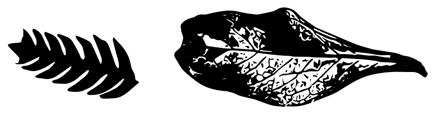
(This one is the same font as above just bigger and thicker.)
I found this one to be quite interesting and is probably one of my favourites. I like how
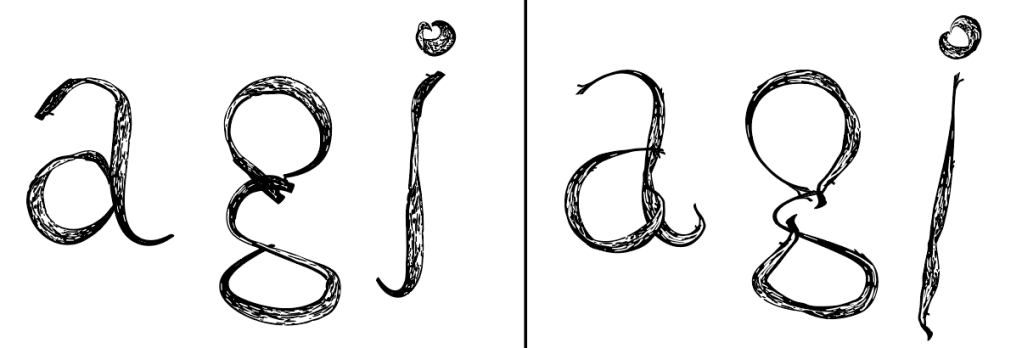
(This is also a font made up of fern but this one is not filled as we can see its small leaf details in the middle.
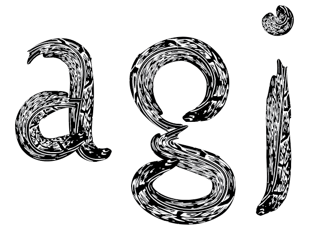
This one is made up of a leaf. I think this one looks a bit similar to the first exploration but I think I like this one more for it looks less stretched and more interesting for its shadows and leaf particle details. (e.g its Lines.)
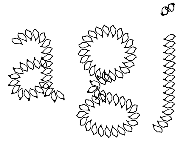
These explorations were made up of the same leaf as the one above but in a pattern form. I found this one to also be quite interesting. I played around with its size and pattern form to see if it would look better if the leaves looked smaller or bigger. For more readability I think the one with the smaller leaf pattern is more readable but the bigger one looks more interesting.
Elements/ Leaves used from My Place:
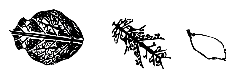
(These were the leaves I picked up from Lake Panorama.) I picked up leaves that would have interesting textures and were different from each other so that I would have options to explore with when creating and testing the making of my font. For some of the explorations, I picked the leaves apart so that I could test the particles and lines of the leaves as possible fonts.
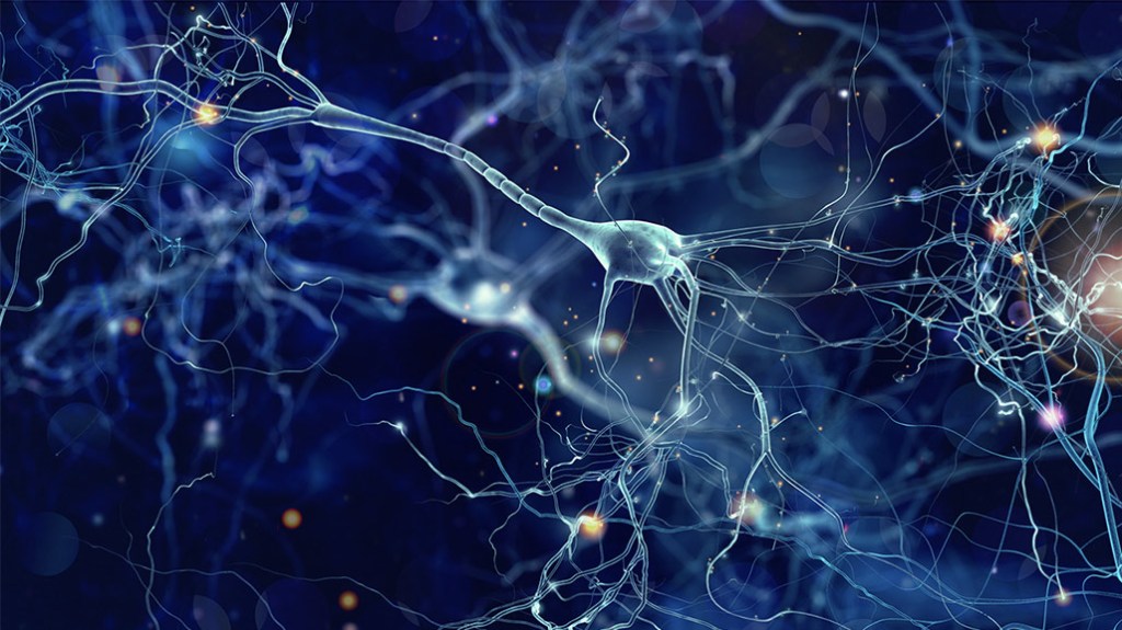
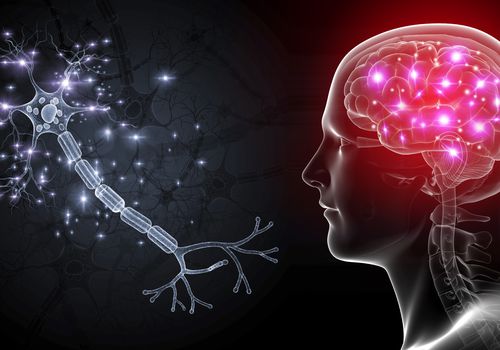
Relating to the idea of mental health, I had noticed that the lines and textures on the leaves reminded me of brain cells (which links to the mind-mental health.) It reminded me of this, for the way the lines are set out on the leaves. We can see that there are some thicker lines than others. Some are more curved while others are not, similar to the way brain cells look like. (In a way there is some sort of relation between nature and mental health by the similar textures and lines leaves and brain cells have.)