Typography Seen at my place:
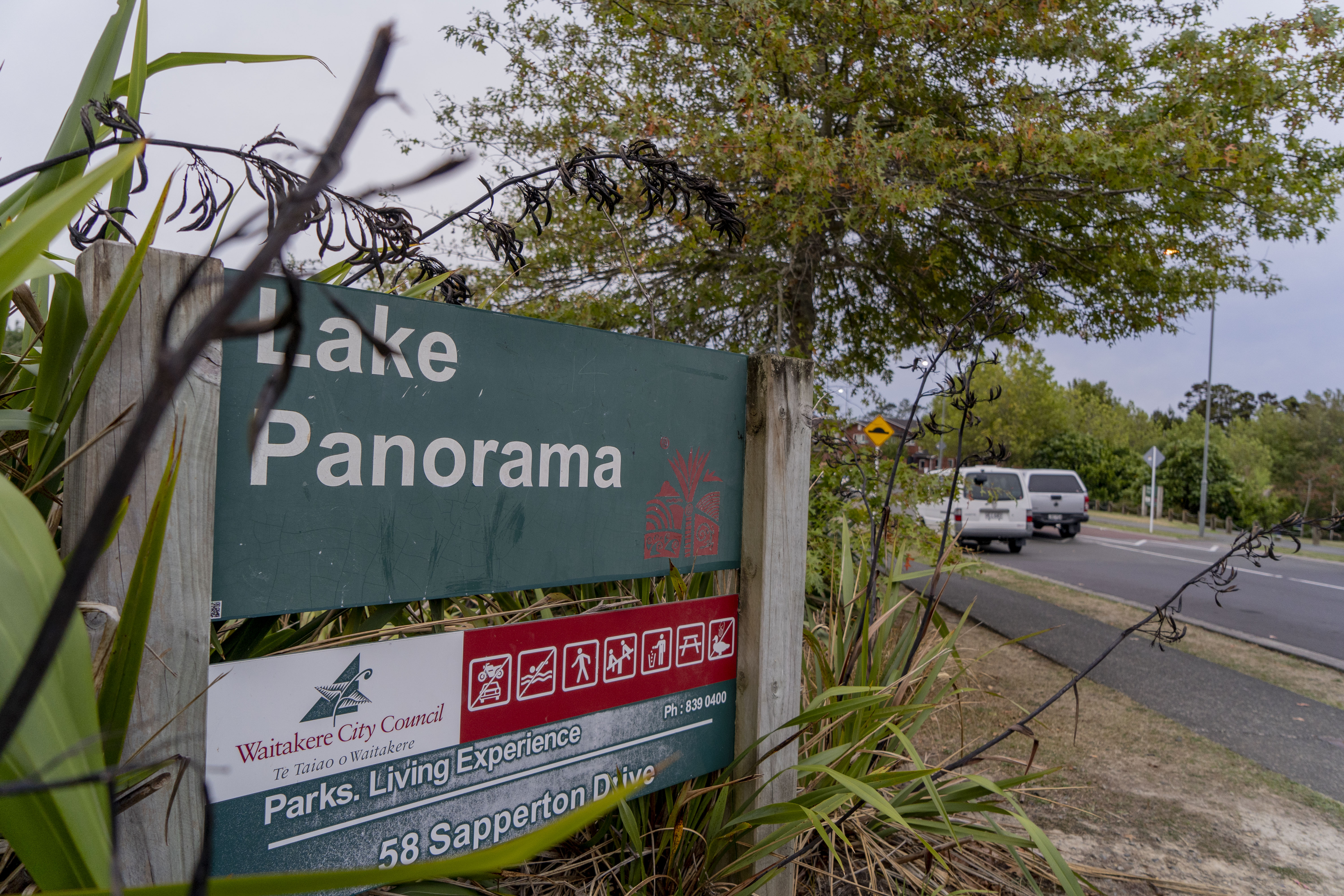
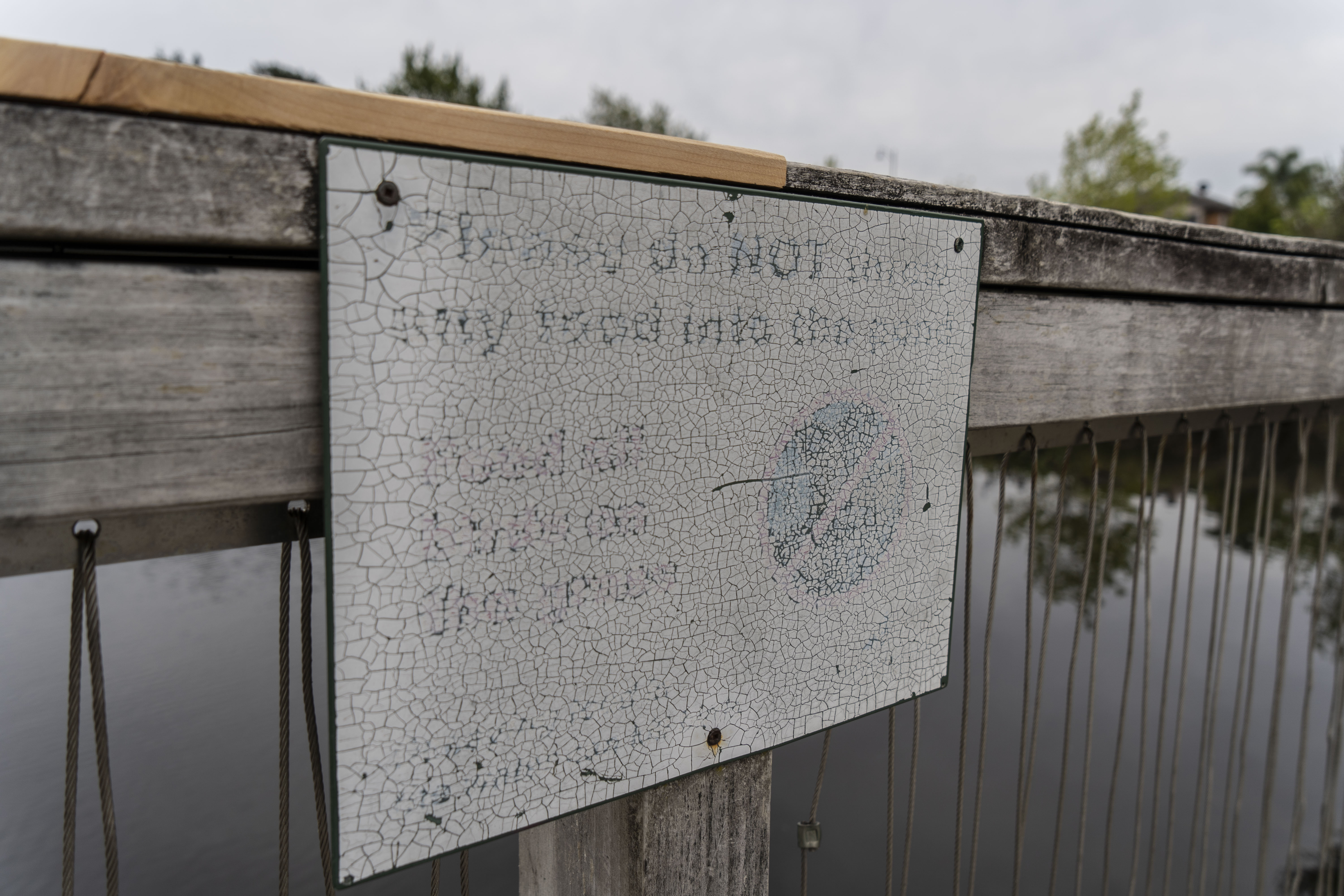
As I was walking around my place, I was trying to look for any form of typography and I came across a few signs around the Lake that had actual typographic fonts; all the signs used the same geometric san serif font, which seemed simple and readable. There was also an old sign that I found at one of the look out spots of the Lake, but is not as readable because it seems to be quite an old sign due to the fading of the letters and cracking of sign. (I found the look of the cracked sign to be quite interesting and could possibly be looked further into as a pattern or texture for a typeface.)
Handwritten Typography seen:
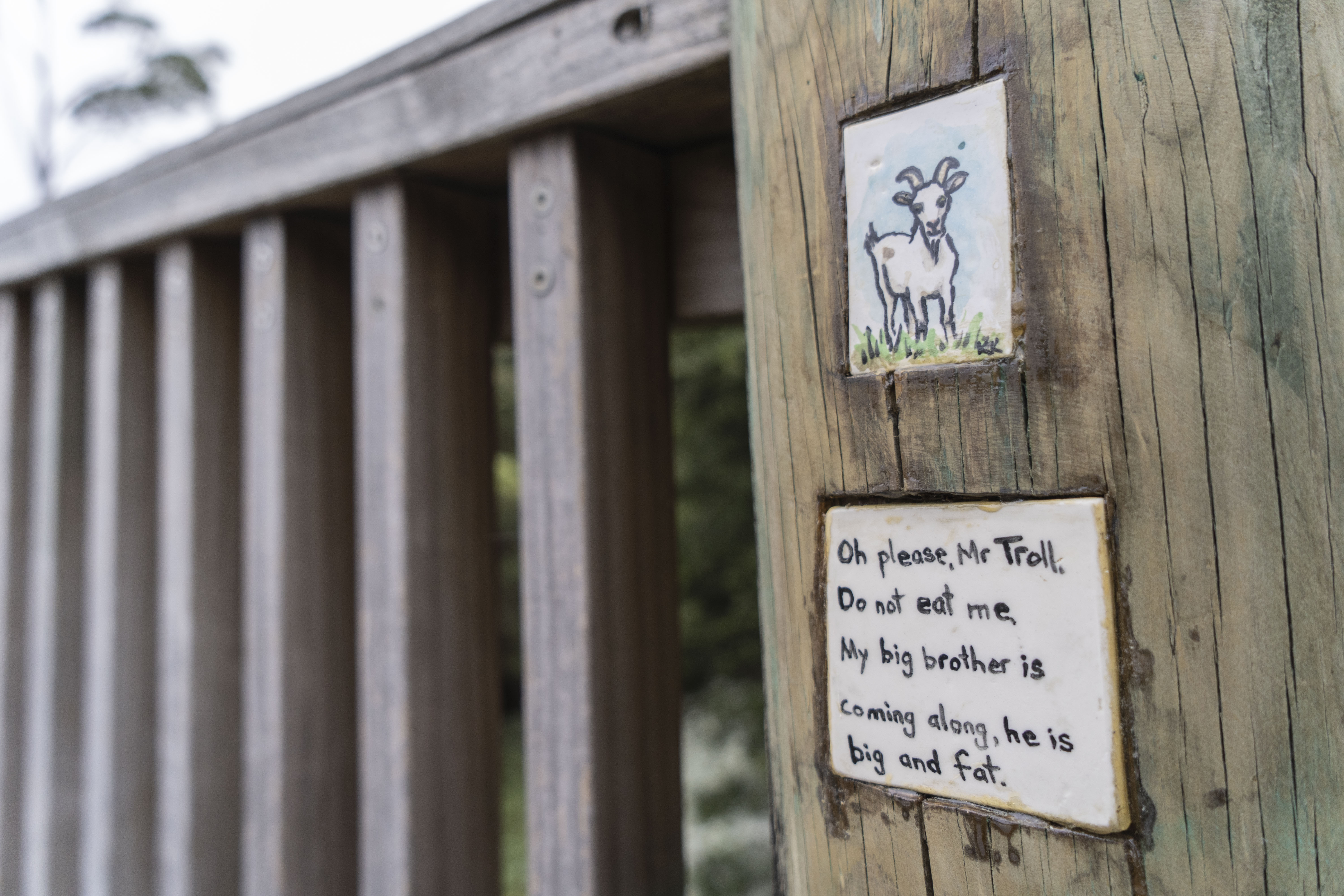
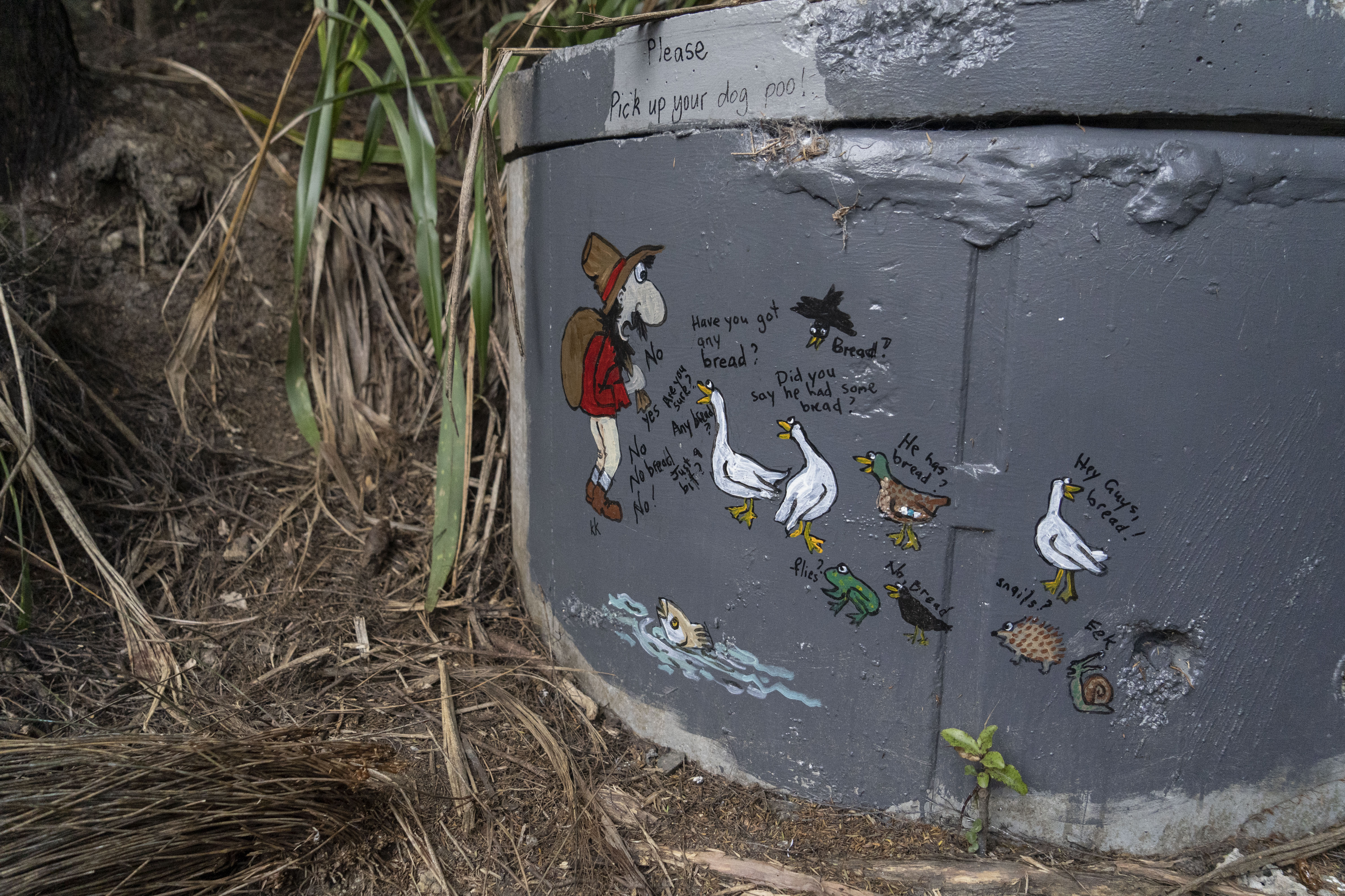
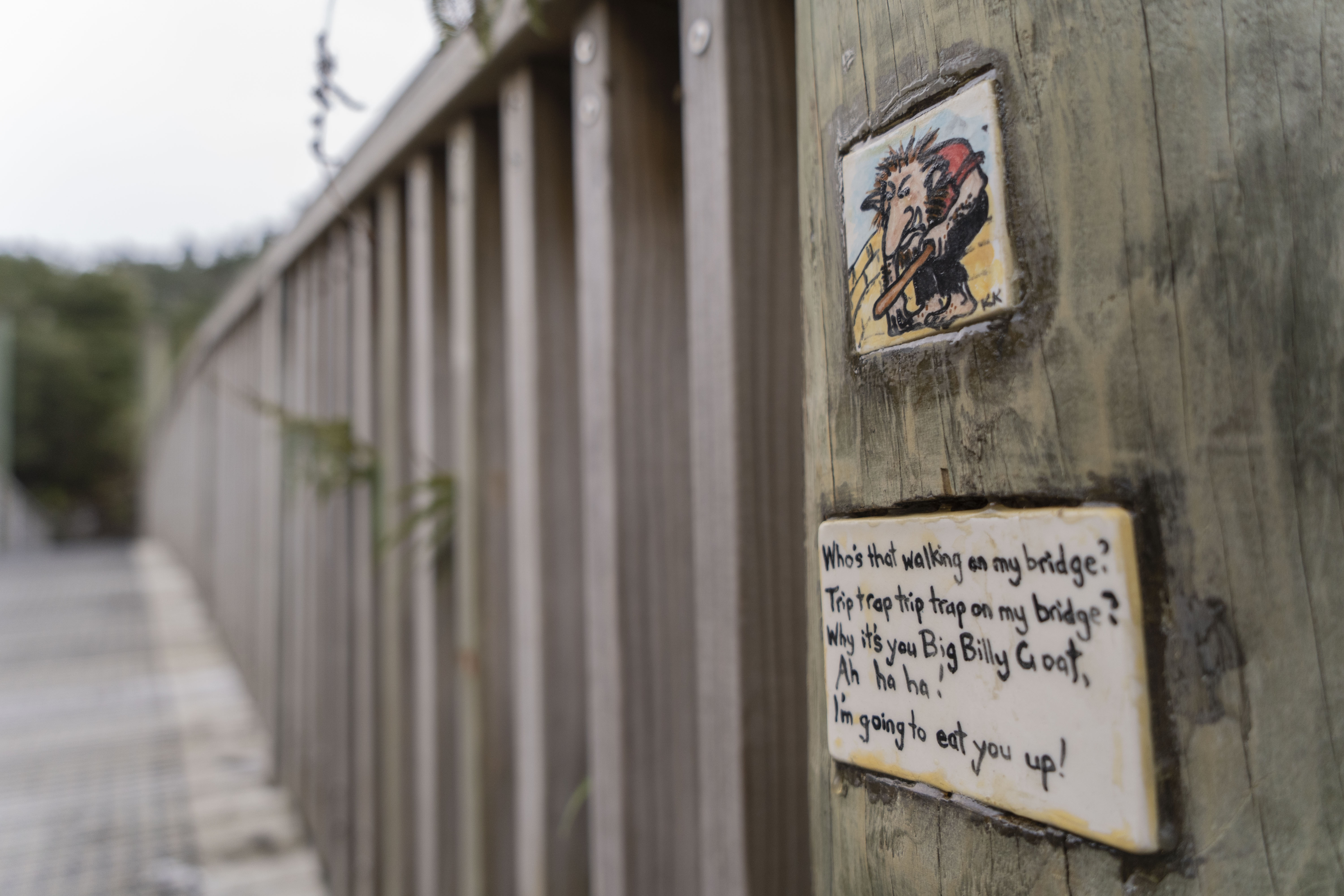
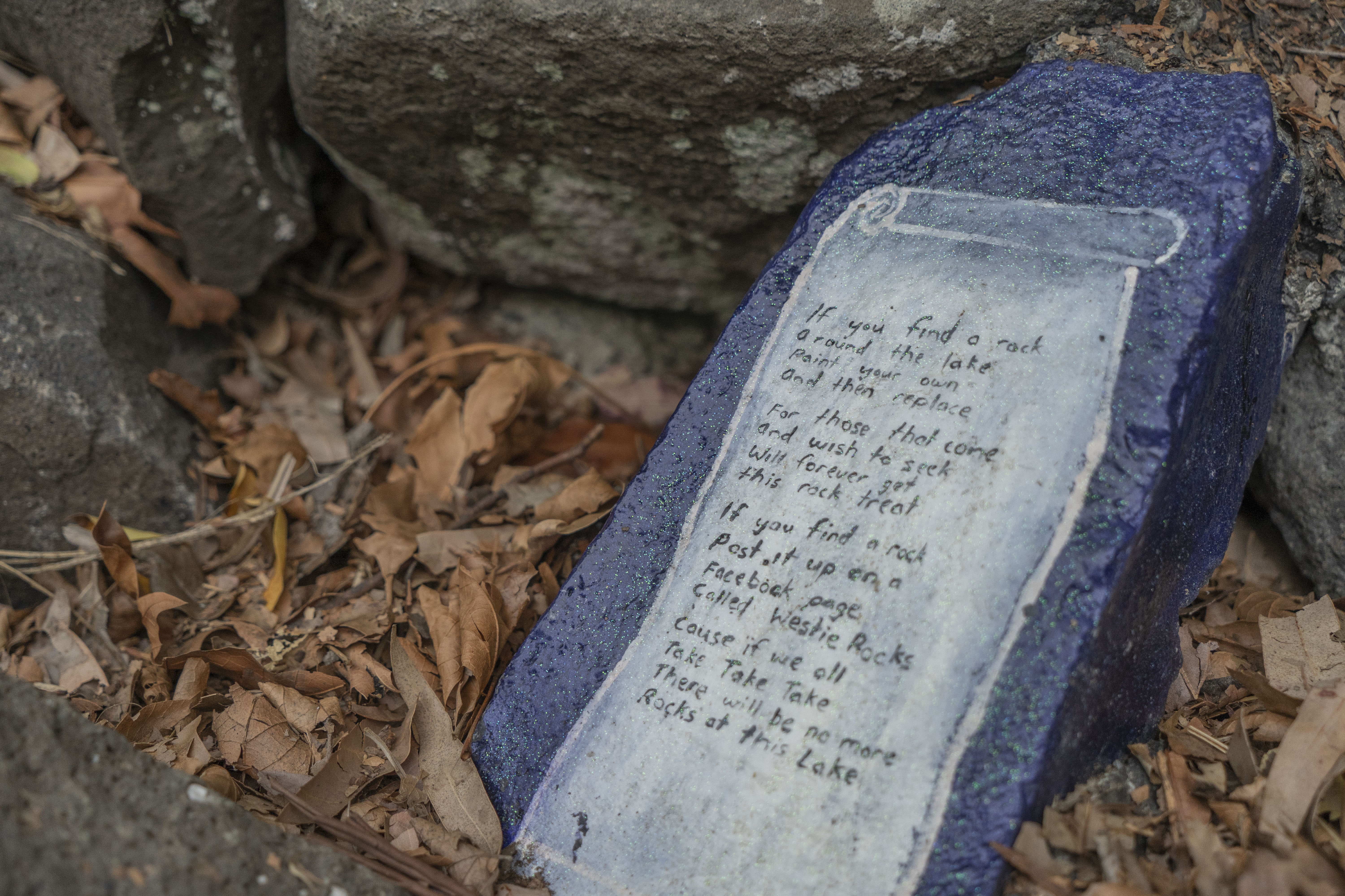
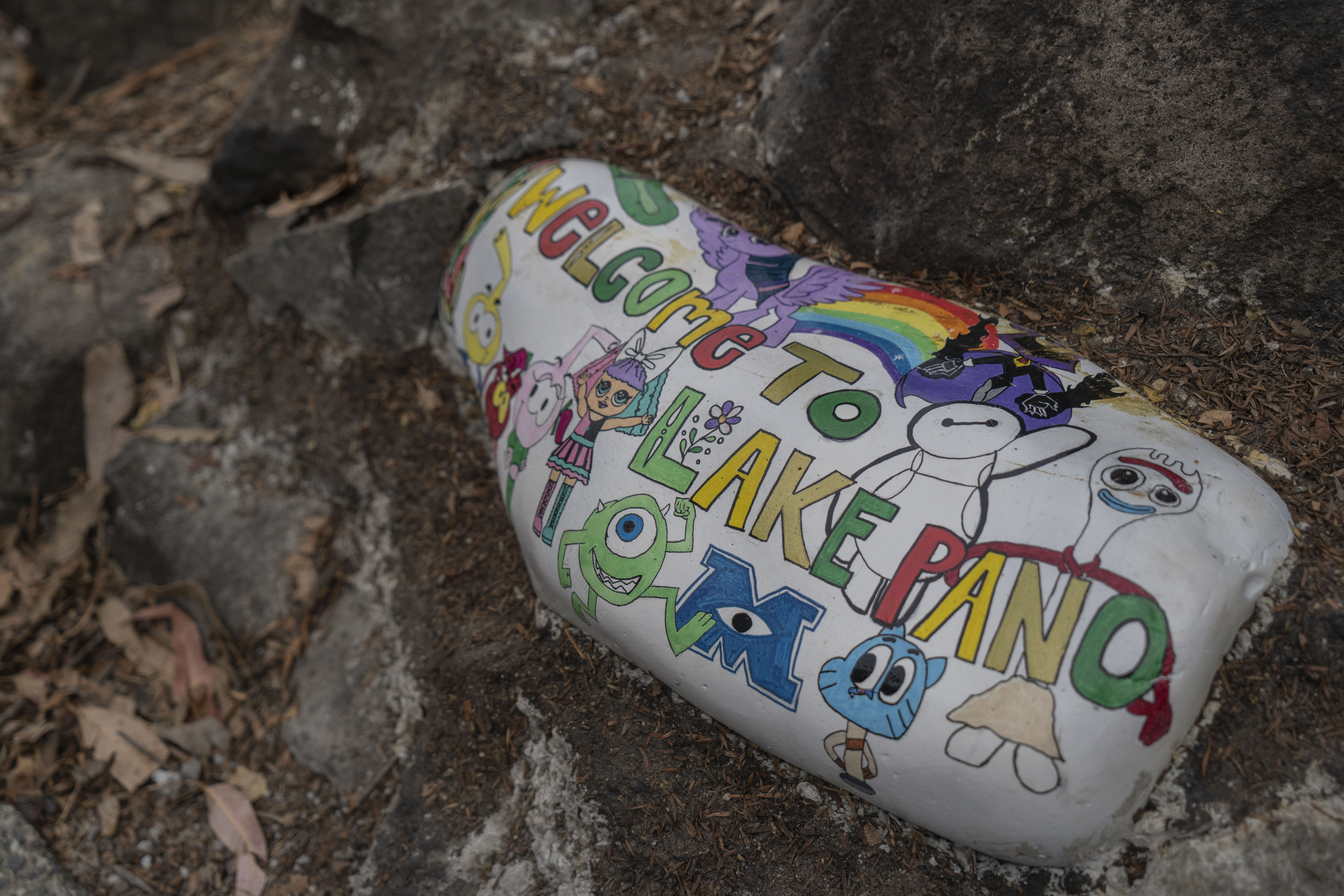
These were other types of typography that I had found around the Lake but they appear to be hand-drawn/written. Some of these handwritten typefaces were painted onto rocks or on a tile looking board which was stuck on the bridge. On the tile boards, they had parts of the ‘Billy goat gruff’ fairytale written on it. I think that it was put on here as a reference to the ‘troll under the bridge’ from the story. So I could see that whoever put it on the bridge was also trying to connect the physical bridge to this child’s fairytale story.
Created Typography:
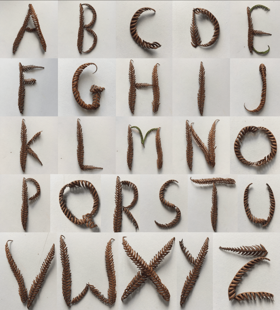
After seeing the amount of typography shown throughout the Lake, I decided to try and make my own typography using old fern fall-offs from the Lake. I think that this came out quite cool and interesting and looks quite similar to when I used the adobe capture to create a typeface out of it. This was quite challenging for me to do when it came to some letters because some ferns were not as curved as I wanted them to be so I had to pick apart some of the ferns to create the letter. I like how you are still able to tell what letter I was trying to create.
