Link to other Moodboards: https://janinecarlos.photo.blog/2020/04/01/type-moodboards-week-5-6/
These are two of my earlier moodboards that I did during the break regarding typefaces that inspire me. Some of these typefaces are a mixture of handmade, moving -kinetic typefaces and digital ones. (There are more explanations behind why these typefaces inspire me in terms of my place on the link at the top of this post.)
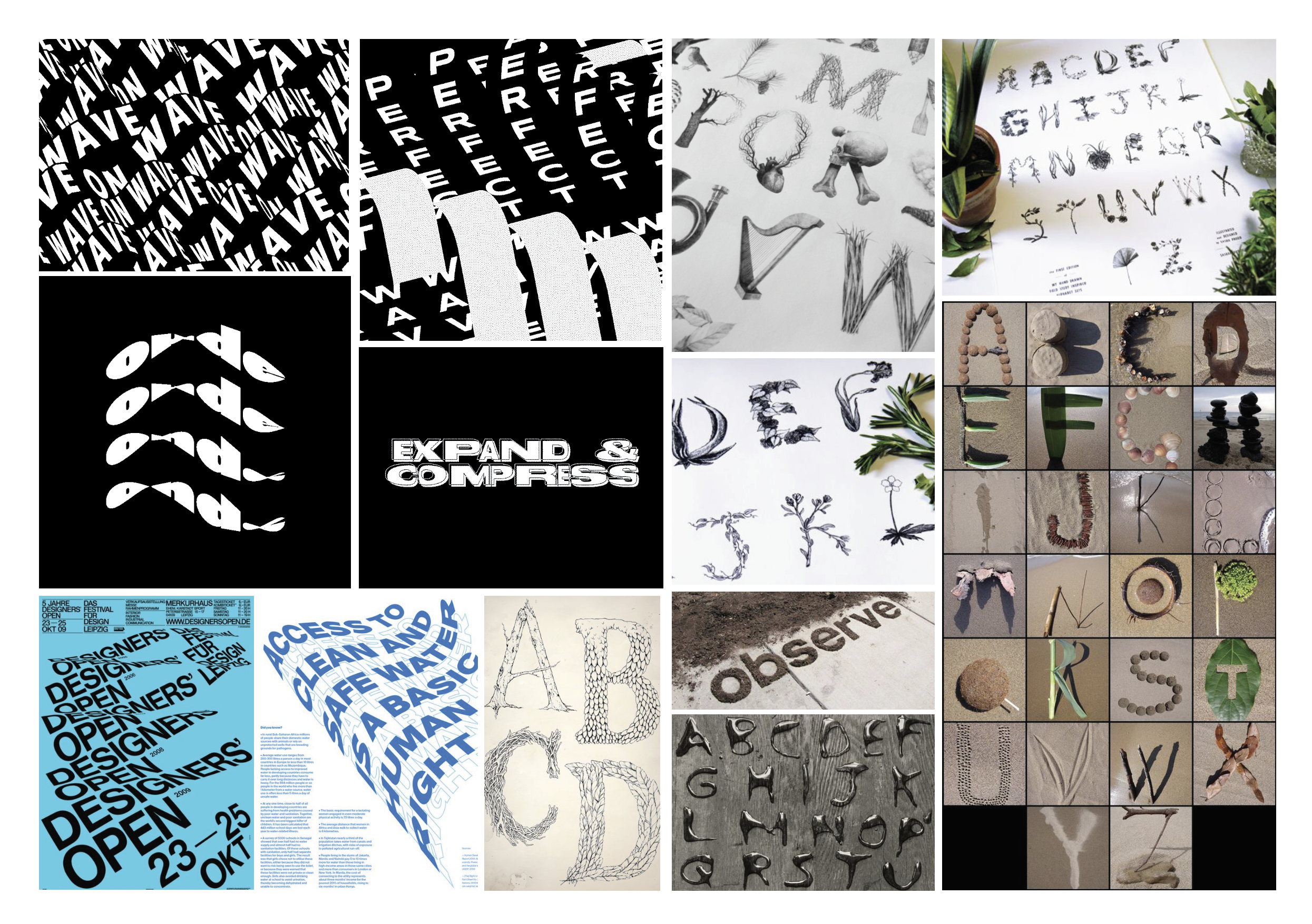
MOODBOARD 1:
For this moodboard, I gathered some ideas that had inspired me regarding my own typeface and what I wanted to do or try out with it. (Also, some of these photos were taken from my first set of moodboards too.) Moreover, after looking at this moodboard, I had realised that the things that mostly caught my eye for my project was typefaces that had natural elements to them like leaves, plants and textures. Another thing that I noticed was that I liked typefaces that had some sort of still movement to them but moved in a fluid gentle matter. (Nothing too crazy.) This reminded me of the water at my place because the way the gentle movements the water would make. Also, I liked typefaces that were mixed with images and or made up the images too. (Found it quite interesting.)
Lastly, the typefaces on this moodboard reminded me a lot of my place regarding the environment and it’s naturalistic, green and peaceful atmosphere. Whereas only 2 of the images (the yellow image of the lady with word used as her shirt and the man made up of letters) were just something I quite liked and it reminded me of the concrete poems we did earlier in the semester.
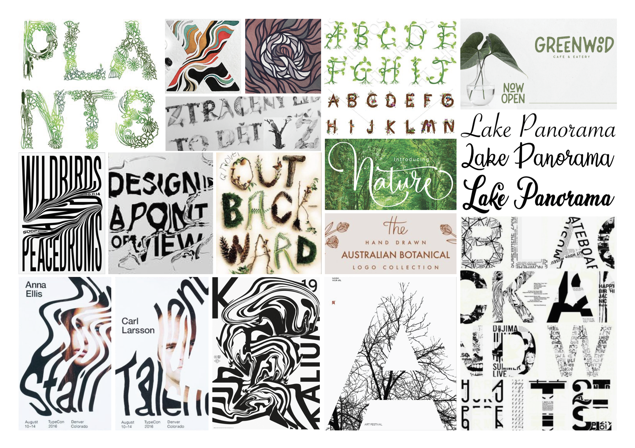
MOODBOARD 2:
For Moodboard 2, I chose these typefaces for similar reason as my moodboard 1. They play with natural elements (like leaves and plants), movement and with some of these typefaces I like the look of repetition and the look of layering the typefaces on top of each other, for me this reminds me a bit of chaos (more so the layering) but I just found these quite interesting. I liked how they-(The pink posts) had typefaces that were just outlines, while some were solid. I liked how there was contrast there. Another new type of typeface that inspired me were linked, cursive and more calligraphic fonts. They have such a natural, hand-written and simple feel to them also.
(side note: I had some kinetic typefaces I found quite interesting but were put on the earlier moodboards I did before.)
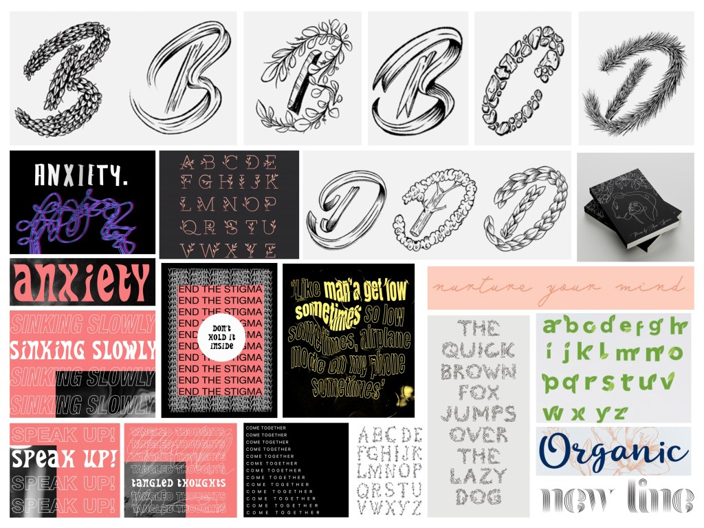
Links to some work: https://www.behance.net/gallery/90395241/Illustrative-Capitals?tracking_source=for_you_feed_recommended
https://www.behance.net/gallery/90898925/Mental-Health/moodboard
https://www.behance.net/gallery/68281533/ANXIETY
EXTRA WORK/ INSPIRATION:
REFLECTION:
After having created these two moodboards (alongside the other moodboards, I had realised that the things that had inspired me the most (regarding my place to make my own typeface) were typefaces that had ‘texture’; typefaces that had natural elements (Like plants and leaves) and or felt organic as well as had movement and or felt fluid like the kinetic typefaces, calligraphic typefaces and curvy typefaces. Through the moodboards, I tried to keep the idea of mental health/anxiety and the atmosphere of Lake Panorama (my place) in mind. I tried to look for interesting typefaces that did not feel like too much was going on but also was interesting to look at, at the same time. Considering the emotion of peace that I get from my place, I think that I am leaning towards more calligraphic fonts (typefaces that look quite simple) but then again I still want to experiment with the idea of mixing natural elements into the typeface (as shown in the moodboard.) I could possibly combine these two ideas together when sketching ideas.
