Visual Research:
What are the main ideas emerging from your visual research (moodboards, photographs of location or drawings)? What do they speak about your location? After having looked at all the visual research, the main ideas emerging from the research is the idea of nature; ideas of slow-paced movement, natural and organic elements (like plants), feelings of serenity and peace. My visual research speaks about the atmosphere of my place; it speaks of its natural surrounding and elements; It speaks about my location’s peaceful atmosphere and slow-paced environment.
Experimentations:
What are the main experimentations you have conducted so far? What are the ideas/concepts emerging from these experimentations?
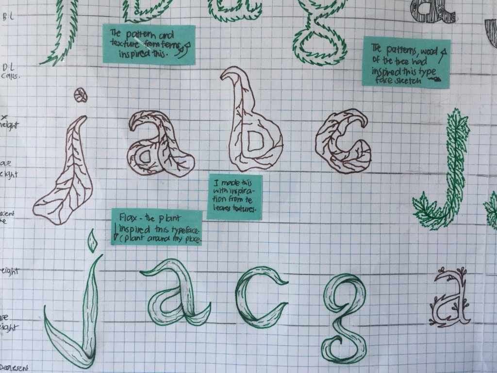
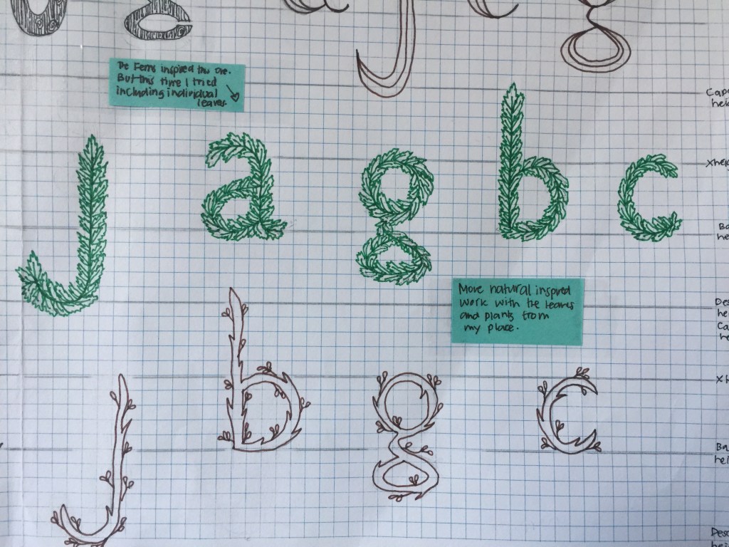
The Main experiments: The main things that I have experimented with were textures, lines, curves and plant/ nature-inspired typefaces. Also, I have been interested in playing around with shapes and textures from plants as well as experimenting with lines, curves and curved serifs. I found the curves and lines to be quite interesting; the lines and curves from the wood-like typefaces had reminded me of fingerprints as well as the lines and curves from our brain. (This was interesting to think about.)
The ideas/concepts behind the explorations: The concept behind my explored typeface sketches were more to do with the natural elements of my place. I had noticed that I did not really experiment with the idea of mental health for I was more intrigued with the natural elements during the process. For me, I think that surrounding yourself with nature and nature itself is quite an stress-relieving remedy for any form of stress and anxiety which is why I focused more on the natural aspects of my place. But for the bottom explored typefaces, I tried to explore the connection between mind and place by trying to connect line and curves like the interesting lines and curves you would see on the wood trunk of a tree and the curves and lines from the brain.
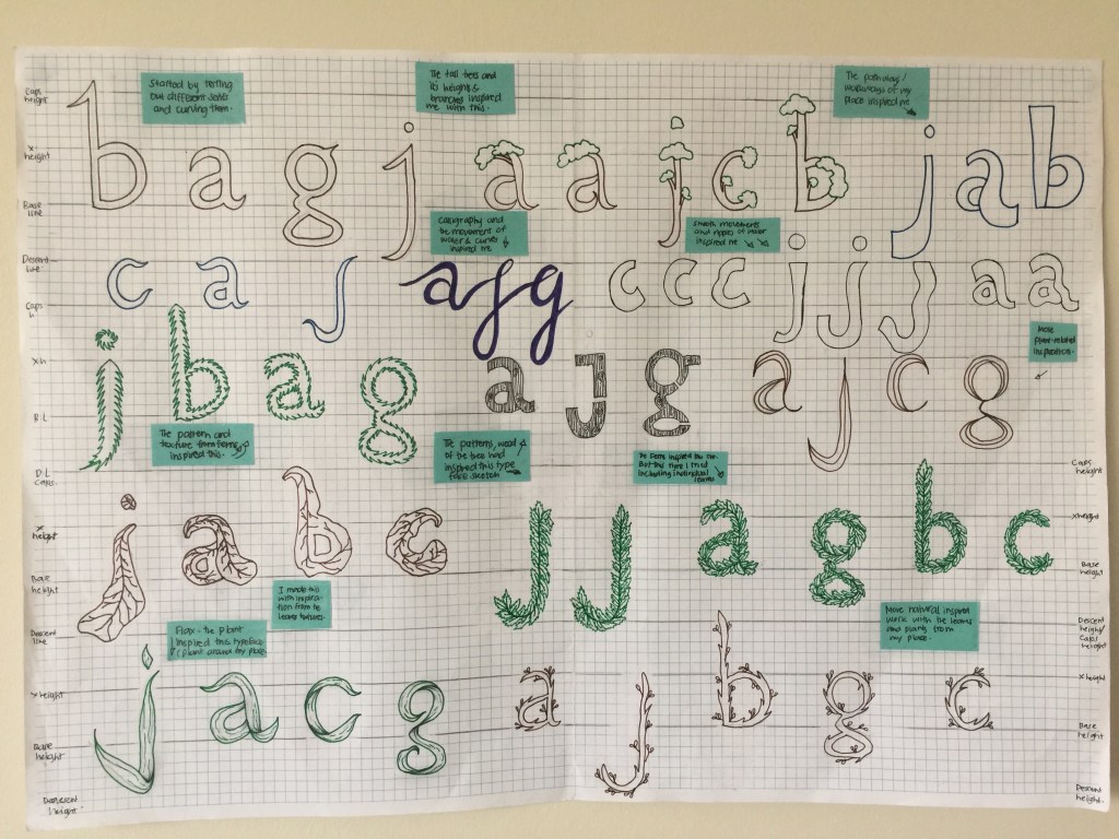
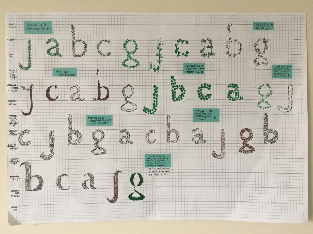
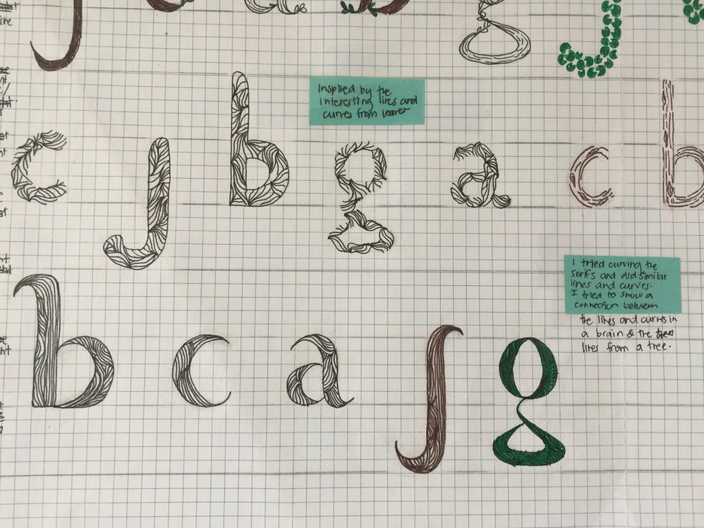
What are the main characteristics of your typefaces (one or more favourite selections)? I have noticed that the main characteristics of my typeface sketches are quite illustrative and have natural characteristics due to the exploration of leaves and plants from my place. Another main characteristic that some of the my typefaces have, is that typefaces have a medium weight; they have a regular width and is not condensed. filled typefaces as well as curved points. Moreover, the corners of my letters are mainly rounded or curved and sharp rather than squared. I could also see there is some contrast in some of the experiments- thinner points and curves but heavier weight in the middle of the letter.
What are the improvements on the letter structure, skeleton or dressing up you are intended to conduct? For the next steps of creating my typeface, I have decided that I will try and improve the lines and curves on the leaf and plant inspired typefaces to make them have more detailed and similar texture shown. I will also try looking at the space between each letter (kearning.) I might try dressing some letters with serifs. I am also looking at improving the width of the skeleton. I had noticed that some parts of the letters are thicker and heavier in width compared to other parts and letters-I will try to be more consistent with size between the letterforms.
Literal transfers and conceptual ideas:
What are the literal transfers of location identified on your typeface designs? Focus on details and try to explain in-depth decisions. The literal transfers from my place are mainly to do with the textures from the leaves and plants from my place. I have tried to transfer the lines and curves I could see on the leaves from my place. So the literal transfers were of the natural elements from my place.
What are the abstract and conceptual ideas identified on your typeface designs? The conceptual ideas that I had tried to identify in my typeface designs was the connection between mind and place. I had experimented with lines and curves to represent the connection between mind (line and curves from the mind/brain) and place (the lines and curves from the natural elements of my place. (but looking at the sketches, I feel as if this is not that clear so it might be another thing I can improve on trying to show through my improvement stage.
How much do you know and can explain about your conceptual idea? Have you done some research about any area (or concept) that you want to investigate that informs your design? What are they or could be? I think that I have some idea towards my idea about mental health and its connection to nature. After having done some more research about this, I realised that there are lots of different mental illnesses and disorders; mental health within itself is a broad term. But to be more specific and to clarify, I will focus more on stress and anxiety and how nature helps to reduce this. So in relation to this idea, I am going to try and show the connection between mind and place; the connection between nature and how it reduces stress and anxiety in regards to my place through my typeface. Moreover, another characteristic about my place is that it is slow-paced, so I wanted to explore the idea of movement, specifically slow movements; I will try and do this by exploring kinetic letterforms and or sketch letterforms that reflect the slow-paced atmosphere and the slow movement of the water from my place.
How can any of these conceptual ideas or literal transfers be transported into your publication design and poster design (in the use of layout, materials, colour and structure)?
I think that I could include some of the interesting patterns, line and curves from the leaves and plants onto my publication design and or my poster design. Moreover, I want to include the concept of the connection between mind and place.
My place is like a remedy to reduce stress and anxiety which is why I keep talking about the ideas of de-stressing, peace as well as trying to showcase how nature can reduce anxiety and stress which is what my place does for me.
I also wanted to stick to a natural colour palette. Mainly green tones and colours that are shown throughout my place. My place is all about nature which is why I want to keep the publication and poster design looking organic and natural to give off a peaceful feeling, yet I want it to look interesting and imaginative too. (Will be explained and explored more as I do work.)
I was also considering exploring the idea of movement. My place is slow-paced and has a peaceful atmosphere; so I am considering to experiment with movement within my typefaces and or even the illustrations. Another thing I am considering to experiment with is sound and trying to incorporate the sound from my place into my digital design.
