Refined and Improved Typeface designs:


On the left, you will see that these are the two typeface sketches that I had decided to refine and develop for my refinement stage. I chose these ones for they were the ones that I had liked and wanted to explore more.
Refinement and Sketches 2:
After receiving some feedback from Tatiana about my ideas/ concepts through the questionnaire, (as well as my first set of sketches), I could not have agreed more with what she had advised me.
Through her feedback, I was able to get confirmation that although the literal transfer were interesting, they seemed a bit too obvious; she had told me that the danger of literal transfers could show a superficial understanding of my location.
So, I decided to push myself with the concept of the connection between mind and place.

‘Connection between Mind and Place.’
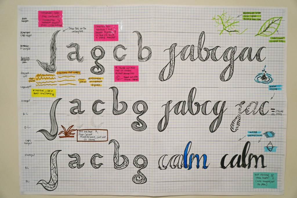
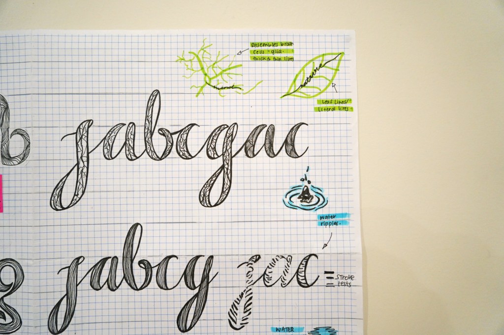
For this typeface, I had explored a calligraphic style typeface filling it with lines and curves of different sizes to represent the idea of brain cells. From a different perspective, it could also represent the concept of nature through its lines and textures without being so literal (which is what I did for one of my earlier typeface sketches.)
I decided to use this concept with a calligraphic style typeface to also represent the peaceful aspect of my place. Personally, I think that there is something soothing about calligraphic fonts which is why I used it. Also, I also found this one interesting for I can see that there is a contrast between the curved, smooth outlines and the wiggly and messy lines within the font.

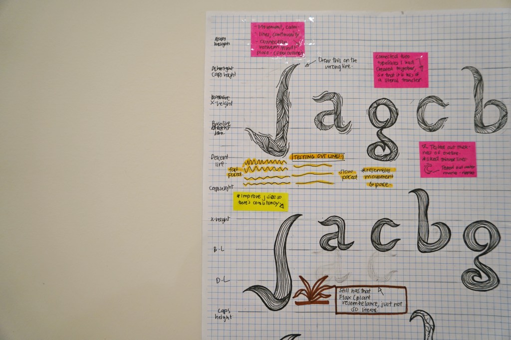
More lines and curves explorations:
This typeface also has a similar concept with the first one regarding continuity, mind and place.
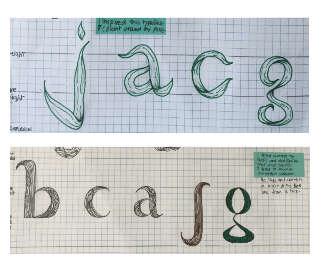
For this typeface, I had combined the two older typefaces that I had chosen to refine into one to see its affect. I had combined something a literal shape of the flax leaves with the interesting lines and curves.
Although I had experimented with the literal flax shape, I don’t think that it is as obvious as when I had also copied its plants lines.
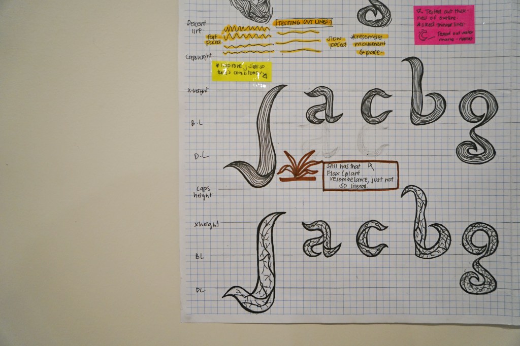
Flax, lines, curves and mind:
This has the same concept as the one above, but this time instead of making the lines go different directions and go against the shape of the flax, I had followed the Flax’s outlines using it as a guide for the lines, just like how Lake Panorama is a guide for me. This place is a guide for me destress and reduce anxiety.
Also, the way that the lines are following the outlines of the flax, give a sense of flow, and slow movement. Reminded me of the water at my place too.
Looking into it further, the lines had resembled the pathways and walkways of my place.
For the bottom one, I had tried to put the representation of brain cells through lines and curves with the flax to see what that would look like. This came out quite interesting also.
Reflections:
Lastly, for the one to the left refinement exploration, I had tried the guiding line concept onto the calligraphic font style. This one came out quite nice but looked less interesting compared to the one with the flax outlines.
For the second to last typeface, I tried resembling the water ripples and mixed it with the calligraphic font. Looked interesting but could possibly clash if I were to do my more lines and curves on the background or my illustrations. Also, doesn’t seem as readable without outlines but it would look better without them.
Lastly, I had tried one last exploration just to test out the concept of reflection to represent thoughts and reflections of ones self or life. The one filled with blue seemed to work better rather than filling it solid with one colour for it did not show as much.
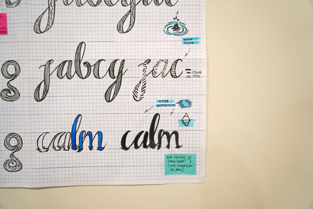
Reflection: I had enjoyed this set of exploration and had found the this refined set to look more interesting
Digitalisation Version:
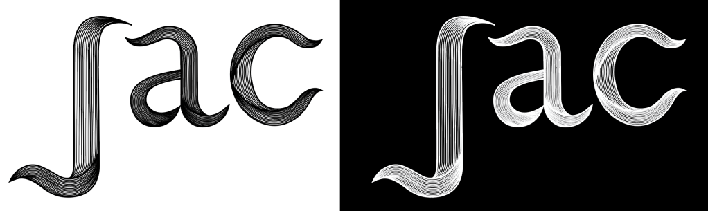
Continuity through repetition of lines: For the digitalisation phase of our typefaces, the linear looking typeface was the first one I had tried. After having tried it out on the computer, it looked quite interesting but I did not end up liking it as much as I did when I drew it out on paper. But one thing I liked about it, is that from afar, it looked like a normal curvy font, until you come closer, you start to notice that it is not a filled typeface but the are filled with smaller line outlines.
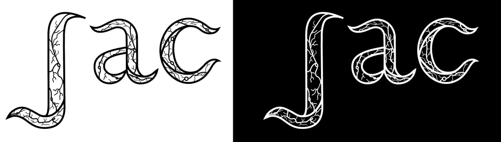
Mind and Nature: So for my second exploration and digitalisation testing, I had explored a similar looking typeface but with a different inside. For this typeface, I found this to be the one I had liked better and found to be more interesting. Moreover, as I talk about the different inside, I thought of how the placement of this linear and curved pattern represents not only nature with natures interesting textures but the mind-brain cells. The placement of the pattern is in the inside for it represents our minds, while the outward outlines resemble and represent the flax plants from my place showing the connection between the two through this typeface.
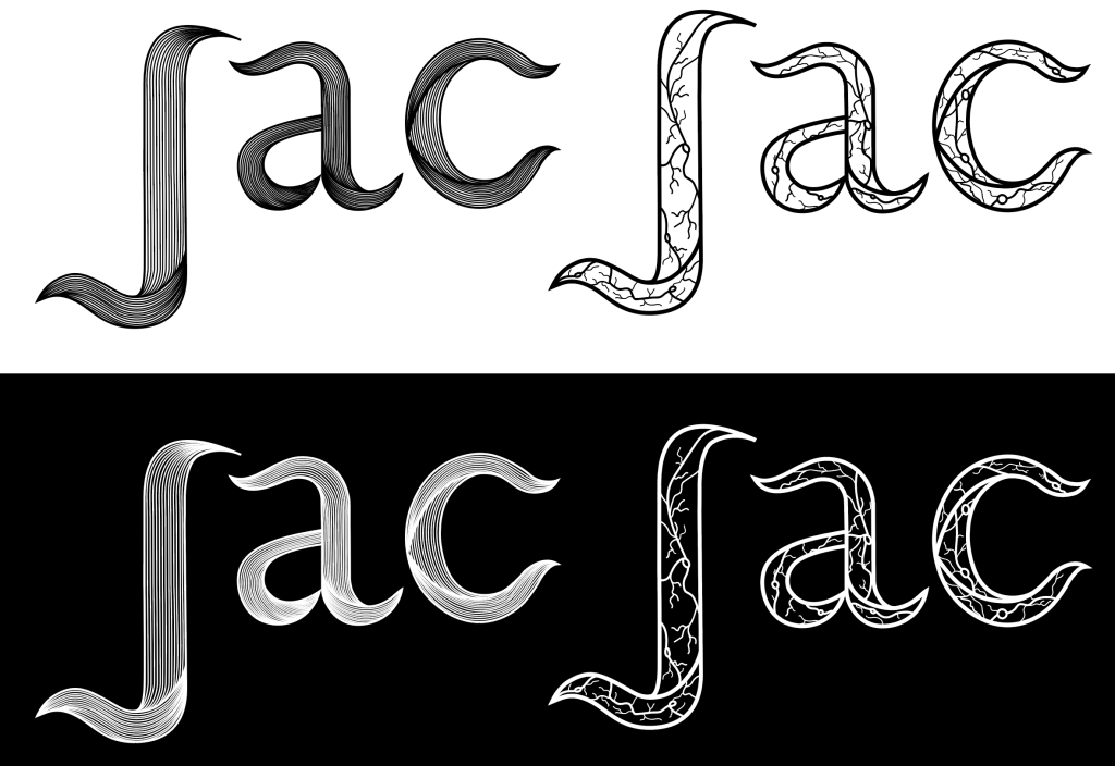
Overall, I found this set of explorations to be better since they were more refined and it represented my place and concept without being too literal. (Compared to my literal transfers in my first set of sketches and explorations, I think that this had a balance between a bit of literal but also explorative and abstract.) Moreover, I had noticed that my choices have changed when it came to my final choice of typeface. After my second set of sketches, I thought that I would like the linear looking one more since I liked them during the sketching process, but once they were digitalised, I ended up liking the mind one better for my place typeface.
Another thing I forgot to mention was that, I decided to explore these two instead of the calligraphic looking ones because it looked a little more simpler then these two. The 2 ones I ended up digitalising, had more of an interesting shape to them rather than the calligraphic looking one where it was more of a copy of a normal calligraphic typeface.
