Character Inspiration:
Link: https://animal-crossing.com/
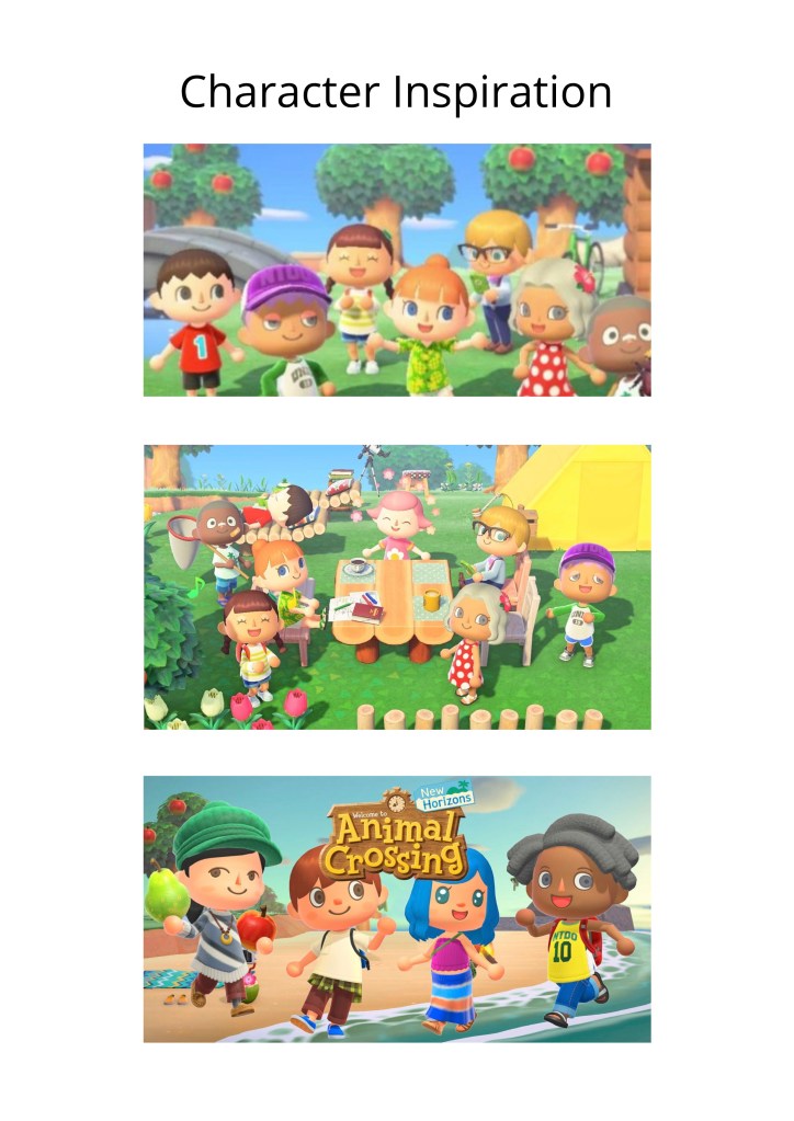
For the making of my main character, (as well as some antagonist characters,) I was inspired by the character design from a game called Animal Crossing. Animal Crossing has been a popular social simulation video game series published by Nintendo. After having seen this game being played by lots of people during the lockdown, I decided to look at some videos and their graphics (since I don’t own this game.) After looking at their graphics, I was inspired by their design and it had some influence on the way that I had created my characters.
Character Design Process:
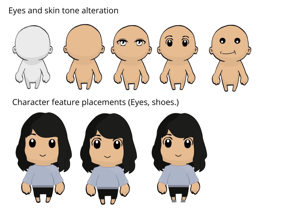
Main Character Process:
(Here was the process of my main character.) For my main character, I wanted to keep the influence of Animal Crossing features included, but also have my own take on it. Through the design process, I had explored different elements for my character like the eyes, hair, skin tone and clothes.
For my main character, I wanted to keep her simple representing my simple taste. Moreover, I also created her this way to resemble me in character form.
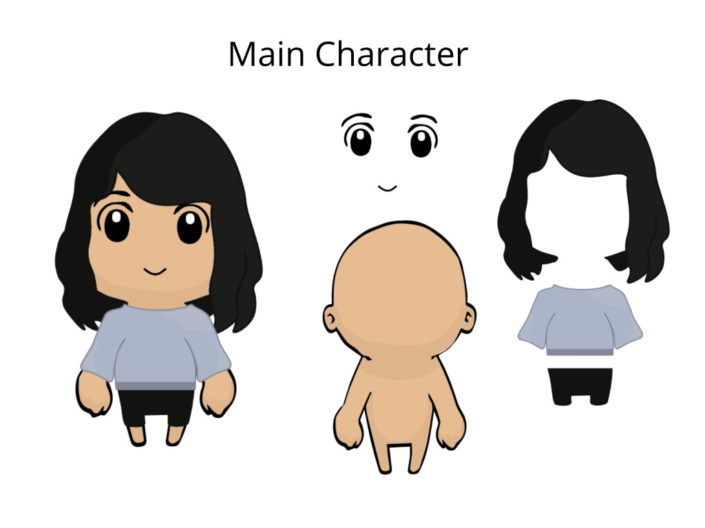
Main Character Layers:
Here is a cleaner and more in-depth look of the layers of my character.
First Antagonist Design Process:
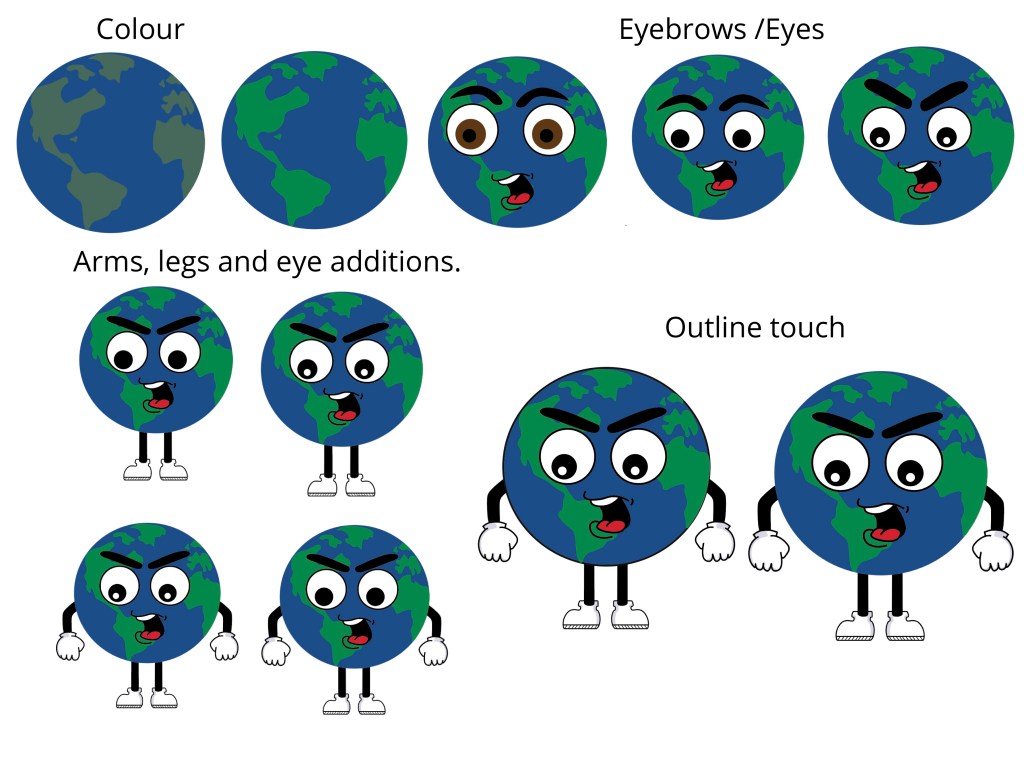
#1 Antagonist Character Process- Mr. World:
For my next character, I had decided to digitalise my first antagonist which is Mr. World, who represents society problems and worries.
In the process, I too have explored different facial features and body features.
After my first prototype, I had really liked the way my antagonists looked, for they looked like bad guys, yet they did not look too scary which was what I was going for because I want to keep my game quite peaceful and a game where my user can play to de-stress.
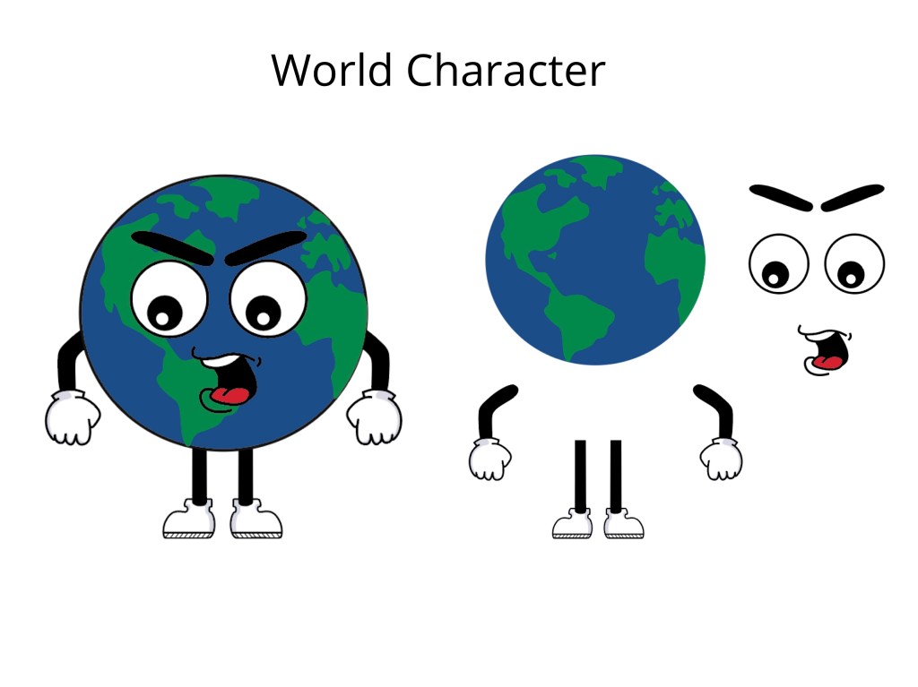
Mr. World Character Process:
Here is a cleaner and more in-depth look of the layers of my first antagonist character- Mr.World.
Background Inspiration:
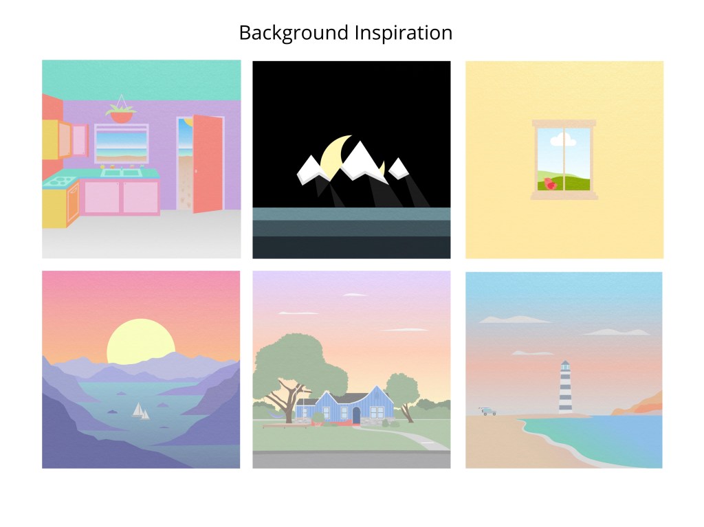
Link: http://www.surfacesmusic.com/
For my Game background, I decided to not continue with my line art exploration and have decided to keep that for my studio, for I thought that it was probably too simple/minimal for a game. Instead, I was inspired by one of my favourite bands album cover designs. I really liked the way one of the singers had designed their album covers. I liked the look of the flat layers of landscape images, so I had decided to do my background based on their style of album covers. Also, I really liked the use of colour palette, how they have very peaceful and happy colours (besides the black cover.) Which is the mood I want for my background since my place (lake Panorama) is all about reducing stress and anxiety.
Background Design process:
Background Process:
For my background, I kept my design quite simple and minimal while being inspired by ‘Surface’s’ (band above) style of album cover designs.
For my background design, I kept a similar cool and natural colour palette to resemble Lake Panorama as well as include simple plant elements too.
Side note: I’m still thinking if I want to reduce the amount of leaves on the background design.
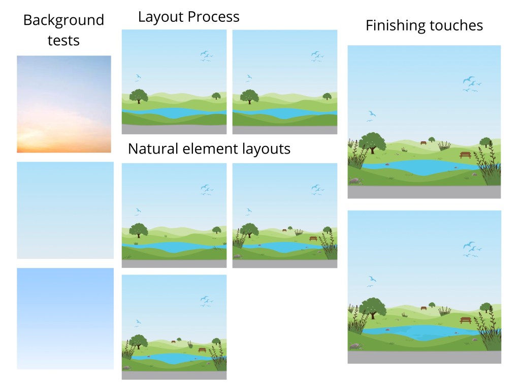
Background Process:
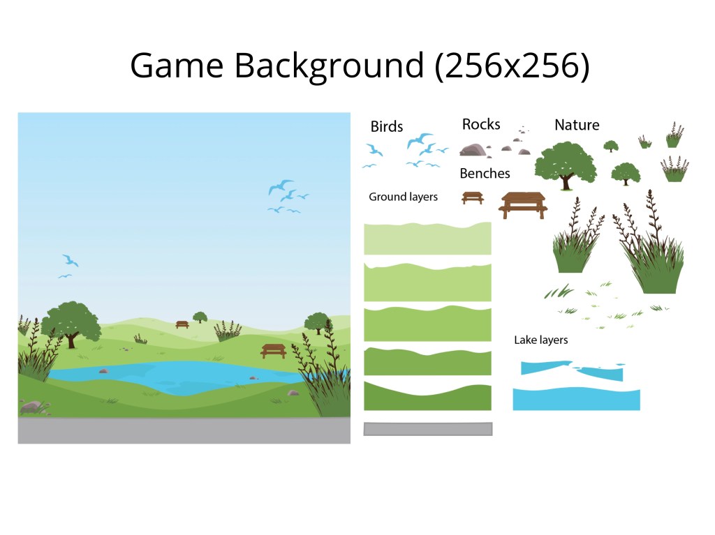
Here is a cleaner and more in-depth look of the layers of my first background.
Moreover, I’m still thinking if I want to remove some plants and leaves for my final background for the game. But for now, here is my background design.
