Poster Layout Sketches:
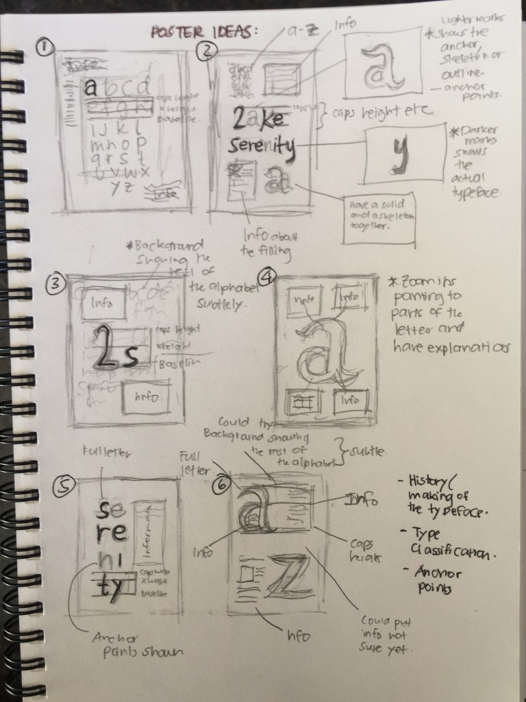
After having finished my video formative presentation, I had started to sketch up some possible poster layouts. Through the sketches, I had sketched up about 6 ideas that I could explore when putting my poster together. Moreover, I also looked at the possible typeface anatomy information I could include on the poster such as x-height, weight, dressings, etc (and even the story behind the typeface.) Now it’s just time to explore these ideas, or at least find the direction I want to focus on and explore it digitally.
Publication Layout Sketches:
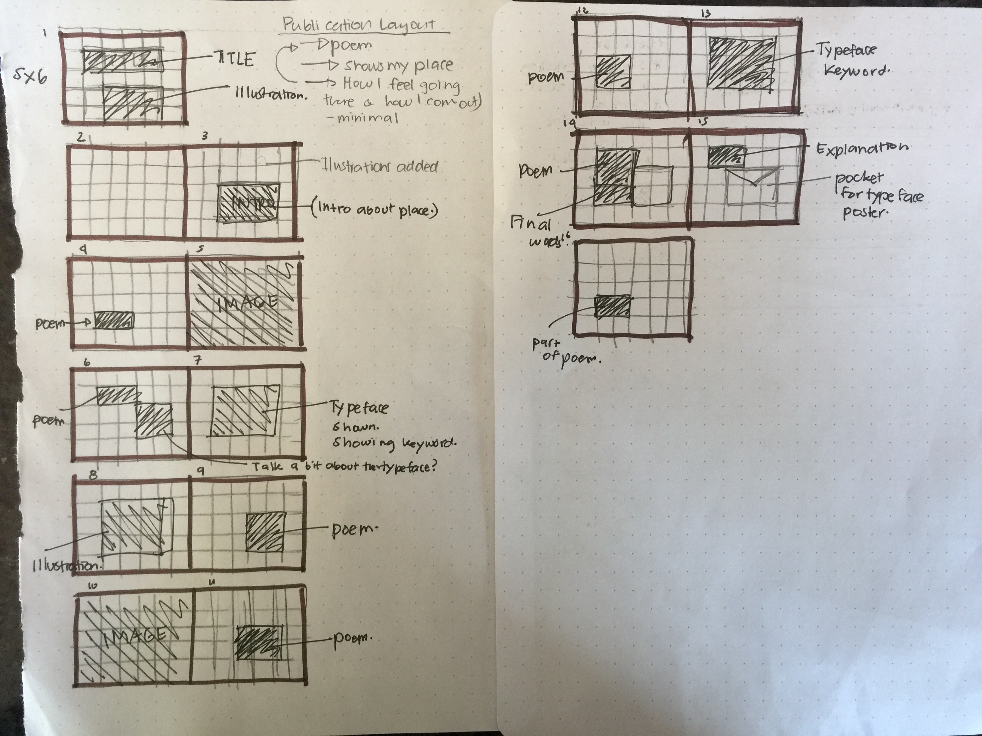
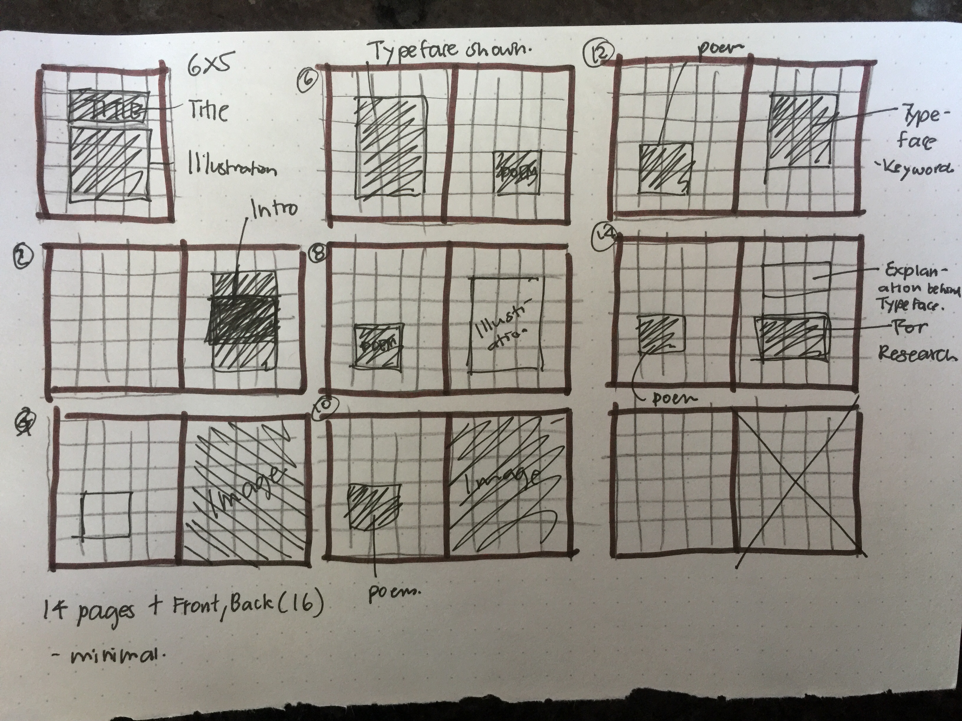
Here were my first publication sketches that I had tried exploring in terms of where I would want to layout my elements of work like photography, illustrations and typeface. With these sketches, I tried out both portrait and landscape sizes to see what would work better. So far I thought that landscape would be nice to explore, but I had realised that most of my illustrations fit better on the portrait sketch but I am still considering to do landscape as the long width has that sense of continuity in size just like a story board. Lastly, for my publication, I realised that I wanted to focus on my place and the poem. Through these directions, I want to showcase the feeling and atmosphere of my place since that is what I had mainly focused on through my research. (I want to showcase the meaning of my place, literal meanings and abstract meanings.)
(Side note: still going to explore other grid ideas too.)
