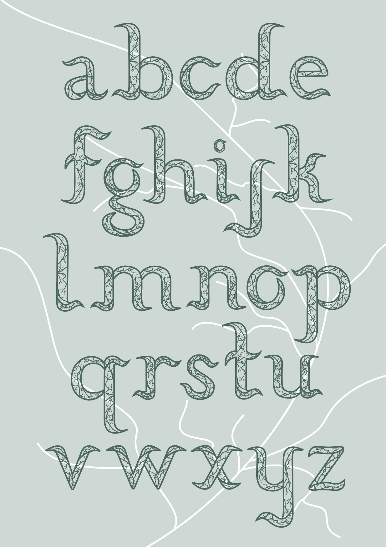
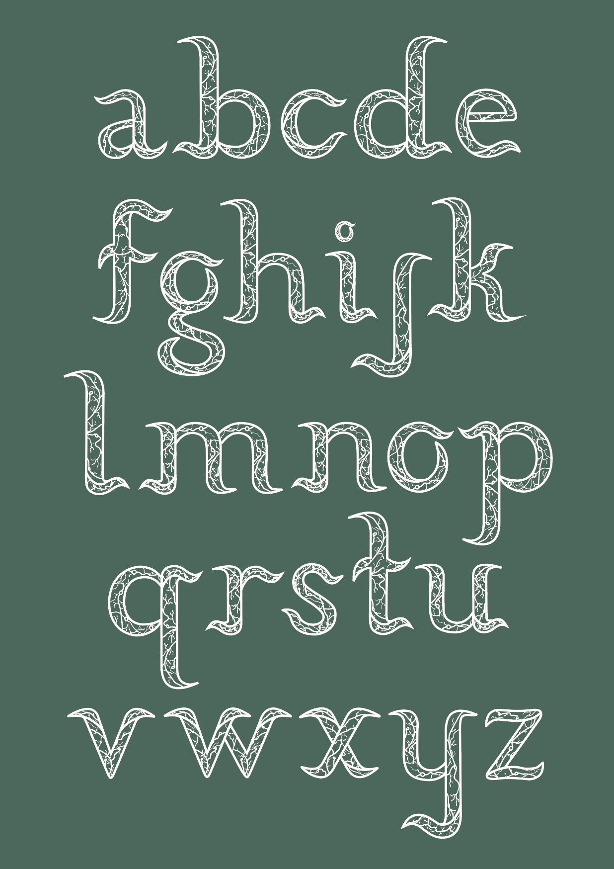
Exploration of layout Process:
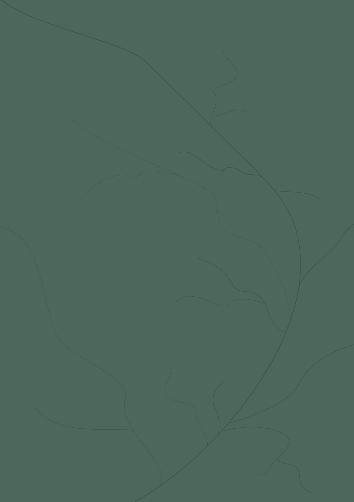
For the background colour, I wanted to keep the green hue and tones to keep that nature element. Also, I tried experimenting with veins from the typeface to see how it would look in the background but as I was placing it, I tried to also not make the veins stand out too much.
Reflection after trial:
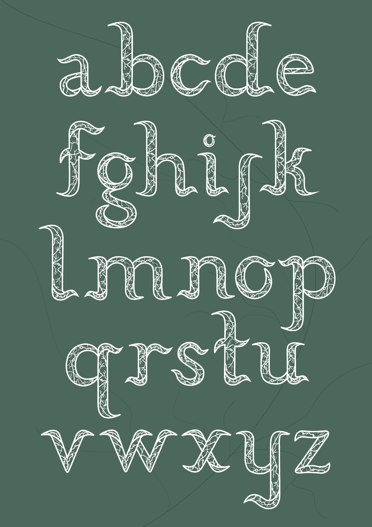
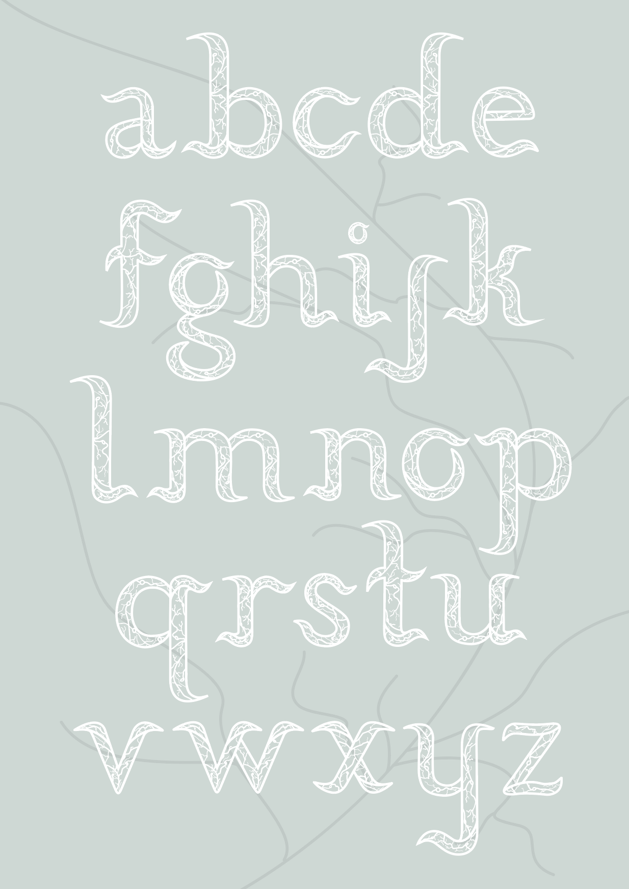
After having placed the typeface together with the curves in the background, I realised that no matter what colour I tried to place the vein background with the typeface, it still seemed too busy, so I decided that it was better not too add this as it was clashing with the the veins inside the typeface. I decided to take Marcos’ advice and let the typeface shine on its own.
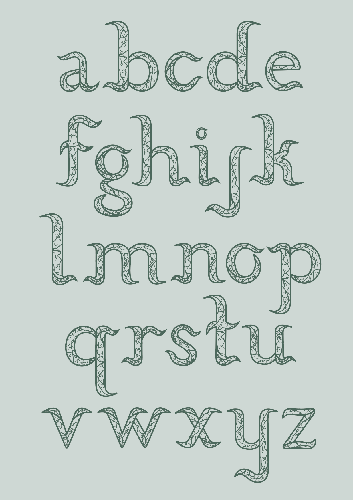
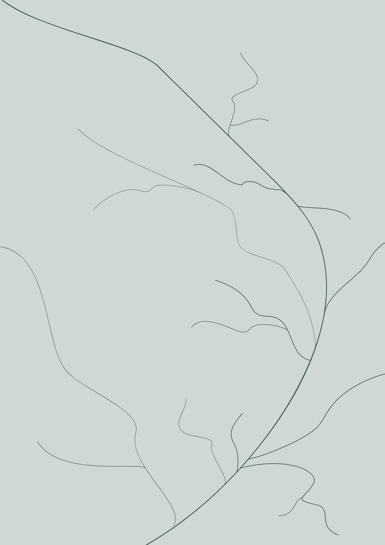
Here was the affect of the specimen without including the veins in the background and it seemed too look a lot better. the focus was truly on the typeface as there were no distractions in the background.
Trial with keywords:
After having finished my typeface from a-z, I experimented with keywords to see the how the kearning/space between the letters would look like.
Reflection:
After having experimented with the keywords, I had some feedback from Tatiana about the small curves of the letter specifically the letters of ‘o’ and ‘v’ as they looked too tight compared to the other letters.
So I’m going to do a bit more finishing touchings on the curves of the letters to make the letters fit better together as they sit side by side.