Colour Combinations and Explorations:
After getting some feedback, I was pretty happy with the comments both positive and the constructive comments. One of the comments involved colour and how I could try explore some colour combos or other colours besides being monochromatic. For my work, I started exploring a monochromatic style but I do agree about exploring more options to see if it would look good having different colours too.
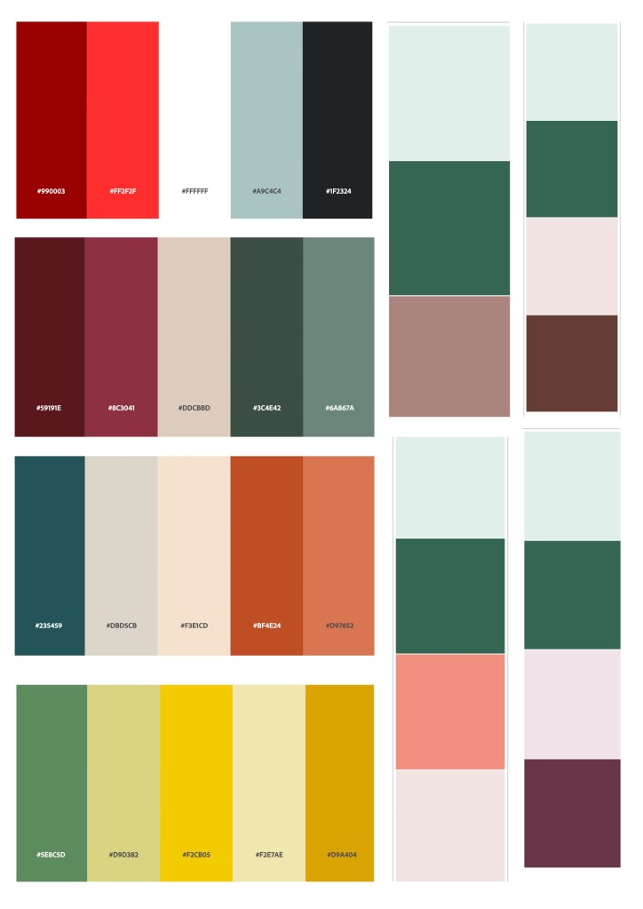
Here were some of the swatches I was trying out and have took from the adobe colour calculator to see what other colours could go well with the light green colour that I had been using.
Also, I’ve been using green colours as it represents a calming , organic feeling of my place. I also chose it because it was a colour that I extracted from one of my images.
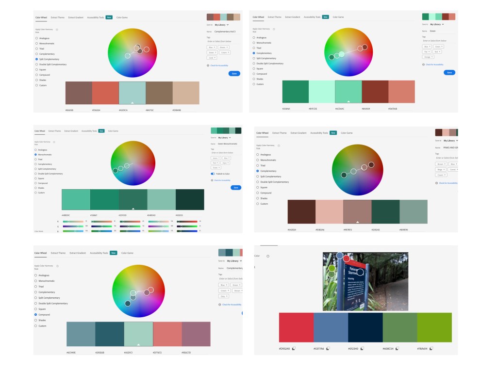
Here were some more explorations that I tried looking at using the adobe colour wheel. For my work, I was mainly trying to look at complementary colours and split complementary.
Feedback on my typeface:
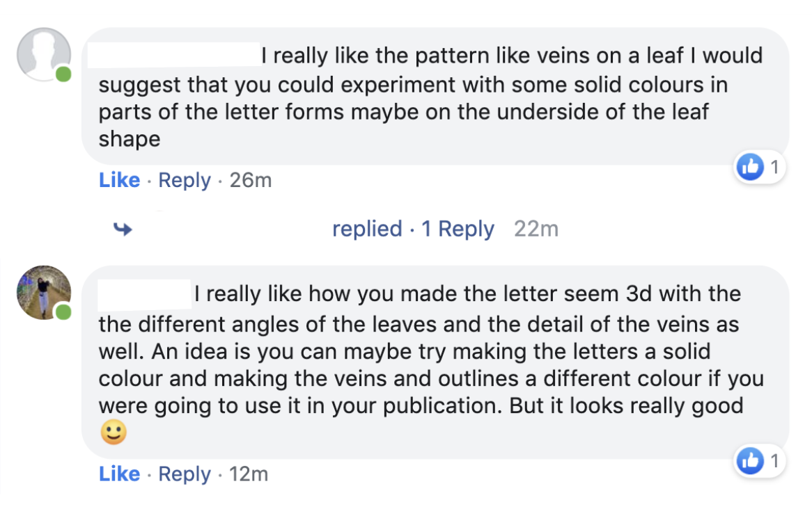
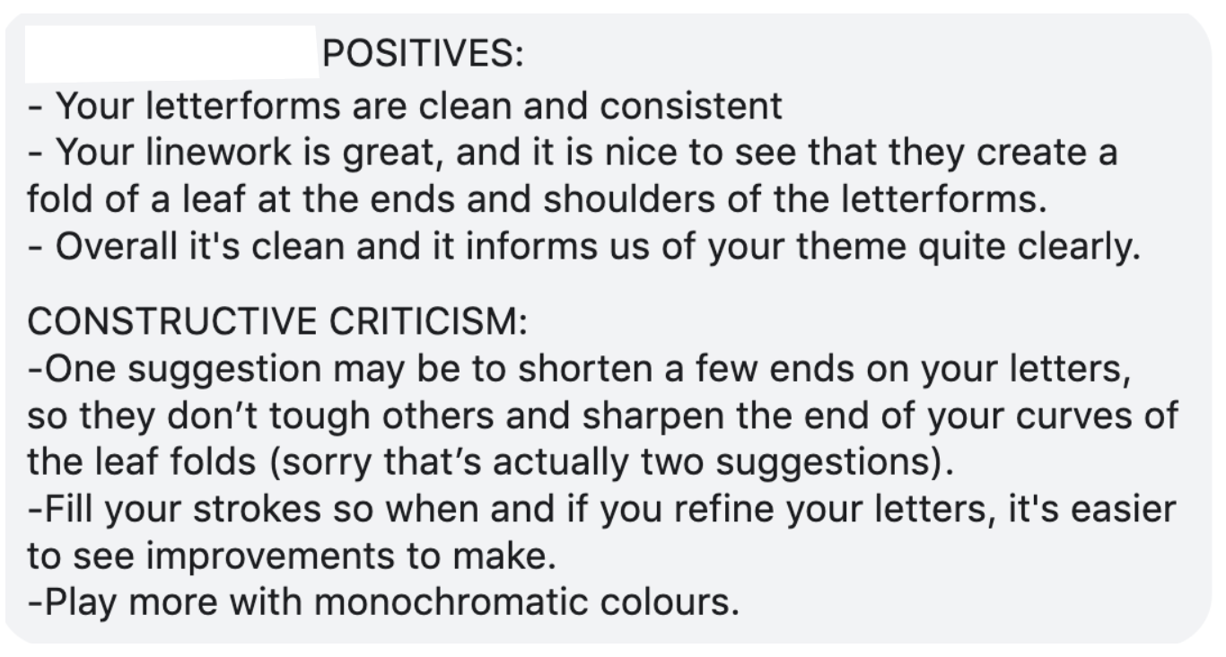
Reflection: For the feedback from my classmates, they had said the same thing in regards to colours and about refinements like Tatiana had suggested. So I will be taking on board their comments like refinement of the curves of some of my letterforms so that they’re not touching each other as well as trying the solid idea that they have mentioned. I’ll also be starting to explore some more colours onto my poster and publication.
