Refinements from comments:
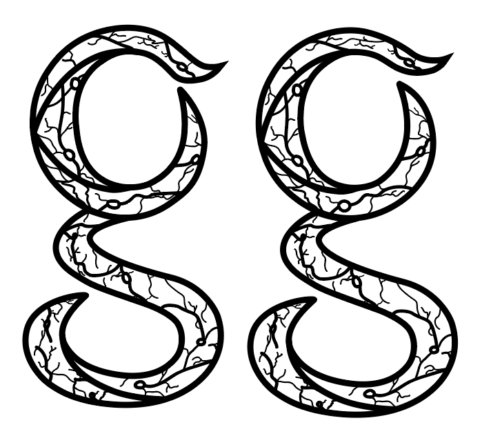
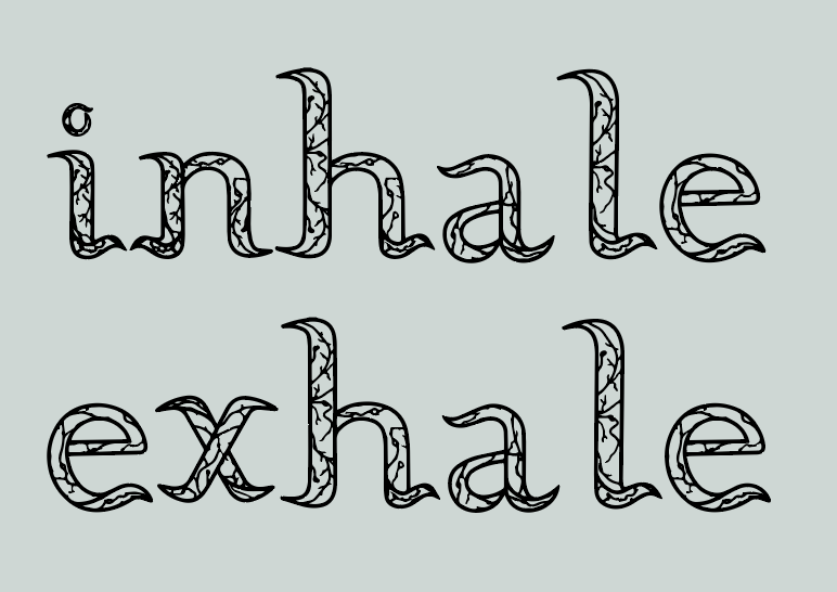
After receiving the feedback, I decided to refine the small curves and the serifs so that they don’t end up touching each other and each letter has space to themselves and has space to breathe. I think this was a good point and comment that people had for me to work on for it turned out much cleaner in terms of the kearning.
Refinement from A-Z:
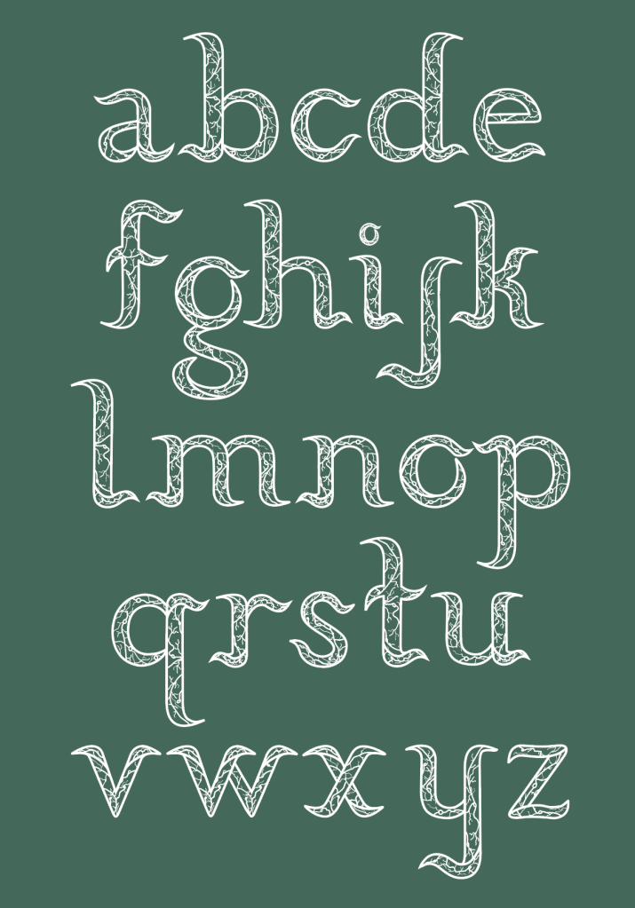
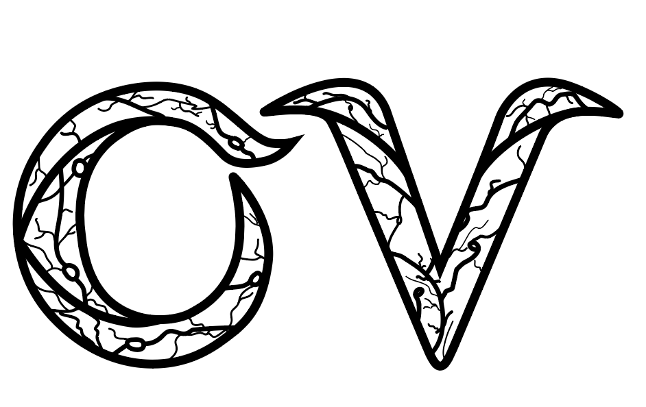
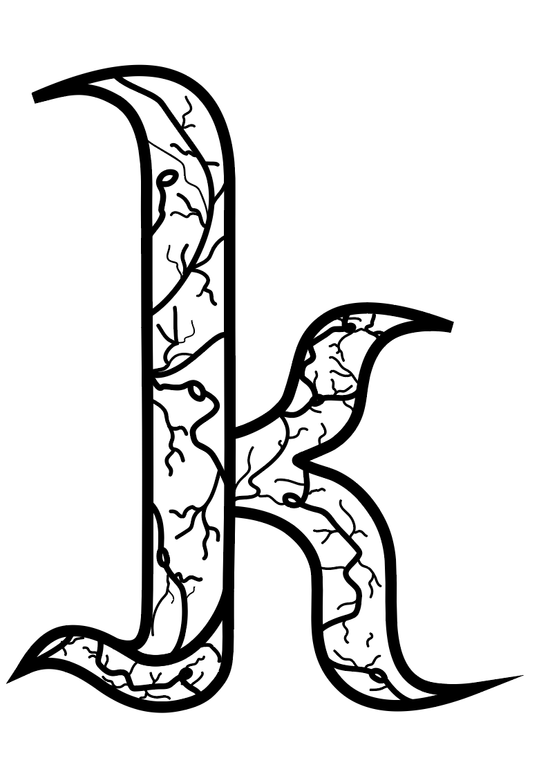
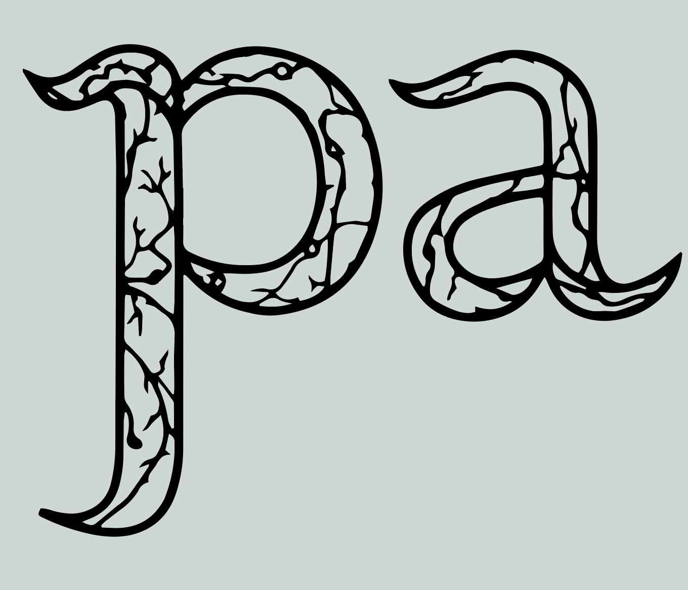
Here was the finished typeface with the refinements of the curves. it looks cleaner even though it was just minor changes. Turned out awesome in my opinion. (Side note: this is not the final kearning, I will explain this down below.
Turning my typeface into a font I can use:
After having a chat with Johnny about making my typeface into a working font, he was able to help me out with doing it with mine. I wanted to do this, to see what my typeface would like as a working font and it turned out quite good. The only difference is that the lines within my typeface has changed and has become more vine like but I think that it still looks quite cool!I liked how it made it more vine like. In away at some points, it looks like crack happening within my typeface. After thinking of this, it kind of gave me the concept of your mind slowly opening open. Since my concept is to to with mind and nature/ mixing literal and abstract, I think that adding the concept of opening up and racks fits quite well. When I say it reminds me of cracks, it’s as if it resembles the mind/ me opening up to my place. All the bottling emotions and feelings are being slowly opened. But yeah this was something interesting to think about.
(Side note: just fixing the kearning a bit but overall I think it looks good.)
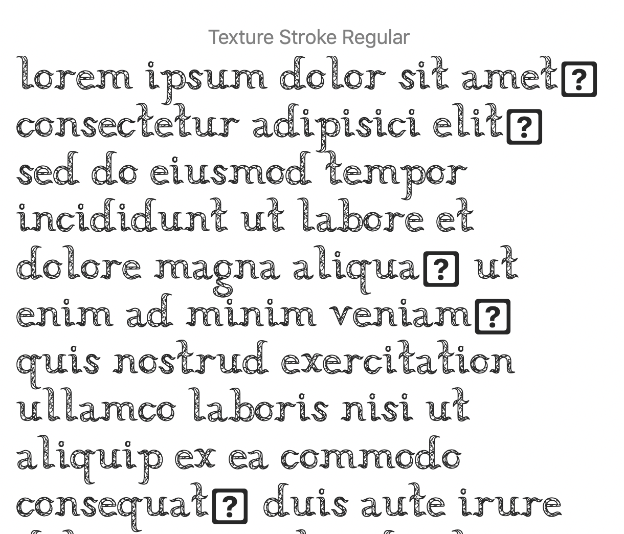
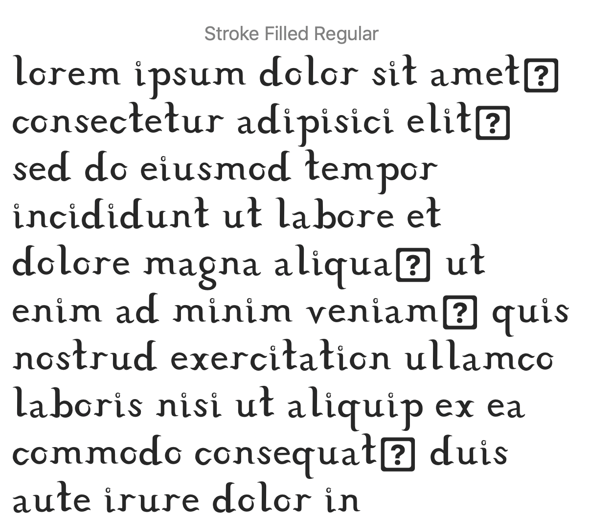
Here was my typeface in font form. I had given two versions for Johnny to try out. One with strokes and one where it’s completely and solid. Looking at them side by side, the filled one feels like an outer layer of my original typeface…It’s as if the original typeface resembles the inside of a person’s mind (where we can see the veins,) While the solid one, it resembles/ looks like the outer layer since the veins are covered and or hidden. But I think that if I were to use the solid one, it kind of beats the purpose from the concept about the mind; as well as opening up and releasing anxiety/ reducing stress. But in saying this, this version does give me a chance to play around and expand my ideas and thinking.
After writing this I just had an idea of possibly using this typeface to use as a possible layer underneath just like the rock idea of layering. Moreover, I want to try explore this, for the filled typeface still relates to the concept of the mind.. The solid/filled typeface resembles he idea of a closed mind, (since we cannot see the lines/curves/veins and textures anymore), while the one with the veins/texture resembles the open mind (where the texture is more visible.) But just thought that this could be an open-door to explore more ideas, layout ideas and looks that relate to the idea of the mind and nature.
(Side note: It’s interesting that the nature aspect is still shown in the filled one since it literally resembles the flax plant from my place, the only difference is that the abstract meaning is about the mind being closed rather than opened. It’s hidden.) Just like in real life, we can’t see what people are thinking and what people are feeling. It’s easy for someone to mask their emotions and feelings. E.g someone could be smiling but deep inside they’re full of worry and anxiety. (Hmm just another interesting thing to think about.)
