Refinements/ Process:
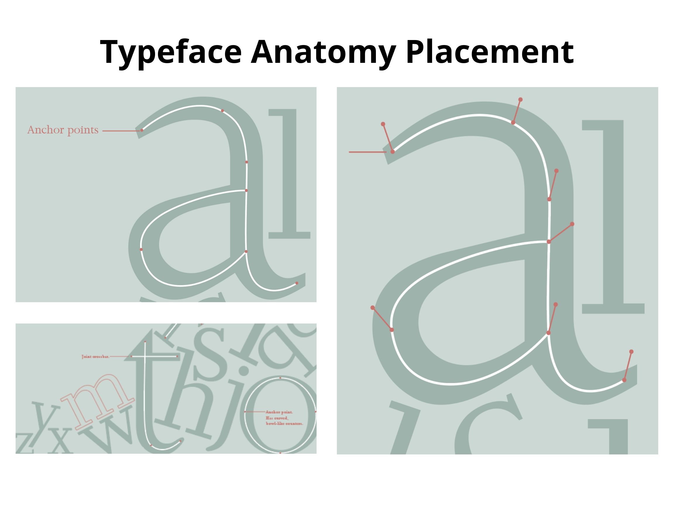
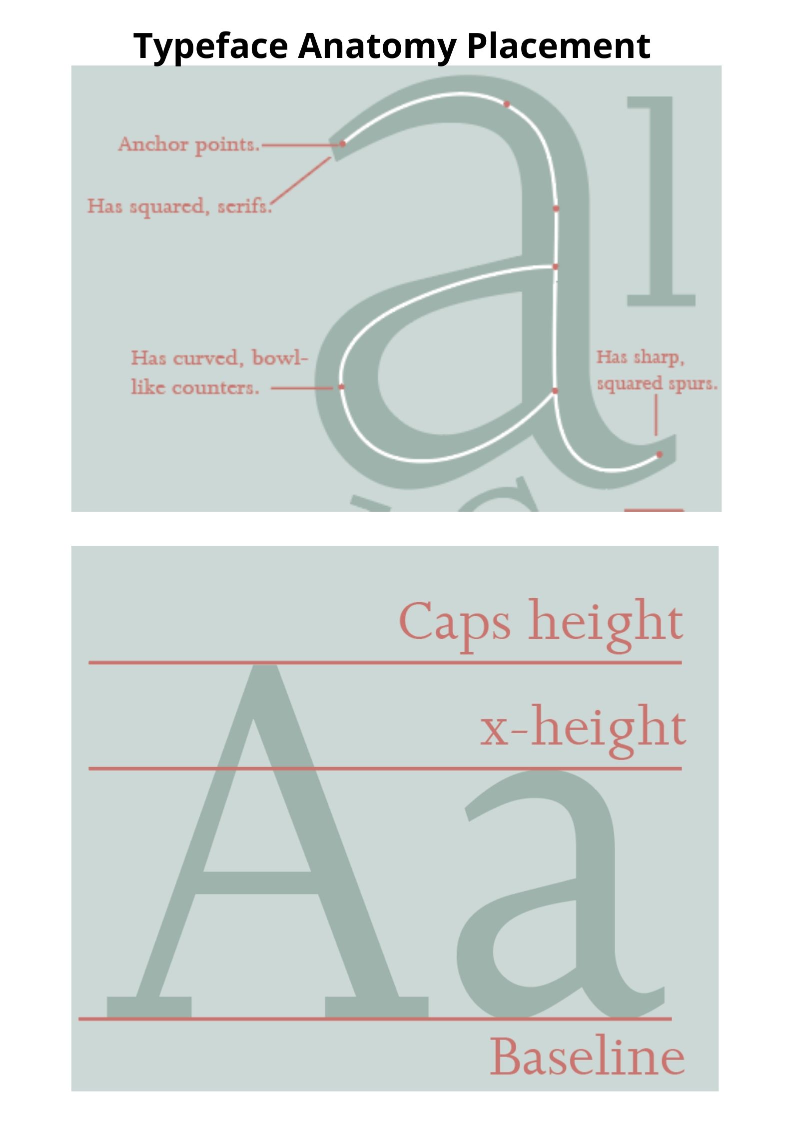
For my Joanna poster, I had decided to just expand it and refine it in terms of adding more description and the typeface anatomy, for it did not include that in the second trial. Here was the process of exploring ways of how can I point out the skeleton of the typeface, it’s anchor points and heights. With my design, I had the idea of using pointers, pointing to the parts of each description. Moreover, I did it this way for I had already liked the set up of my second porter trial.
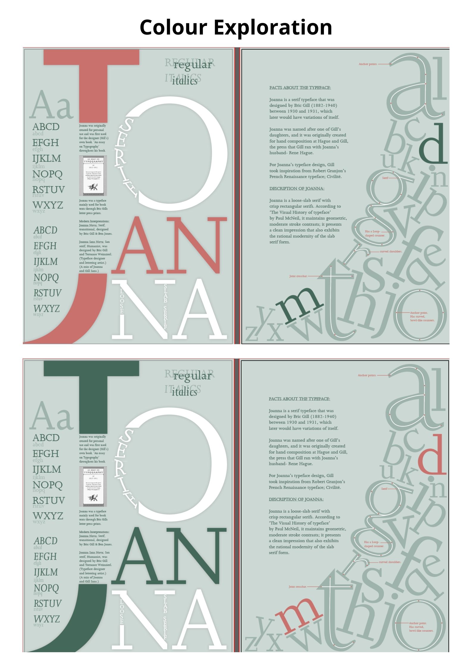
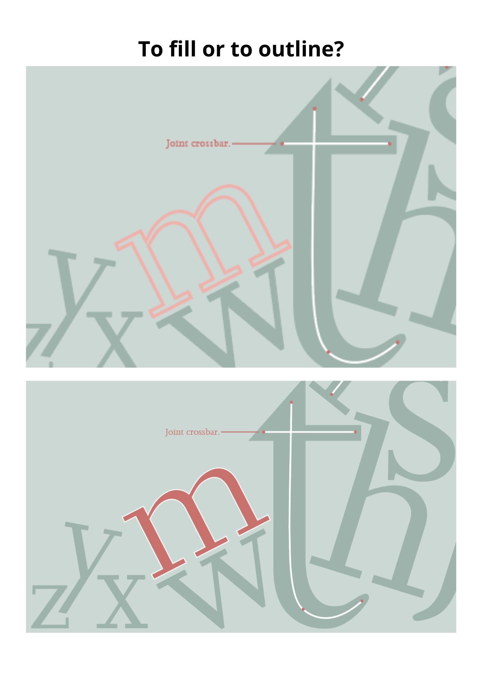
Here were some screenshots of the colour explorations. With the colour exploration, I had taken some light warm red tones from the combos I had researched and explored. Also, I wanted to show the outline of the shape. With this testing, I tried exploring how the outline of the letterform should look like. I tried having a fill and an outline but it seemed a bit too distracting when I filled it (since it is a red tone which attracts the eye.) So, I tried flipping the colours between the the title and the small letterforms but it didn’t look as nice. So, I had tried doing an outline which looked better but just with the other red colour rather than the bring neon pink tone.
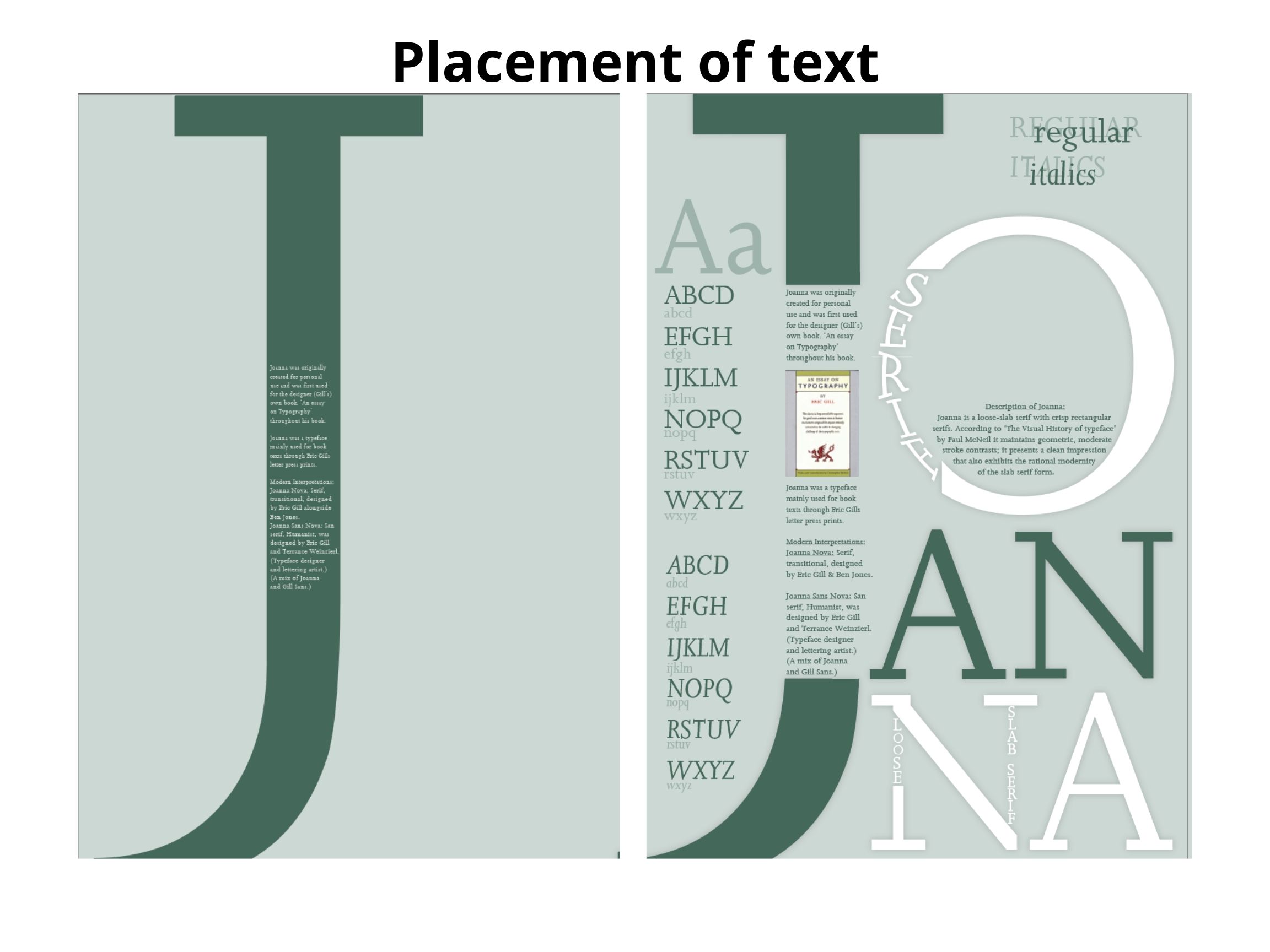
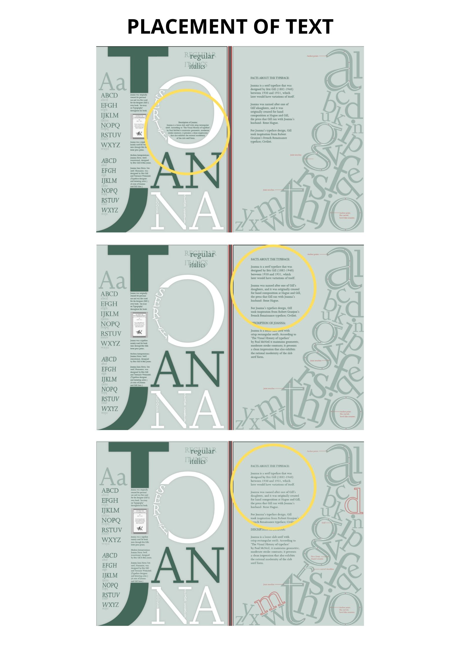
With this part of the process, I explored a different placement for the written description of Joanna. I tried placing it inside the o. Then I tried adding it to the history text which seemed cleaner and less spread out, since I wanted the letters to do more of the talking. Also I think that it allows some positive space; It allows some space to breathe between elements.
Joanna Poster:
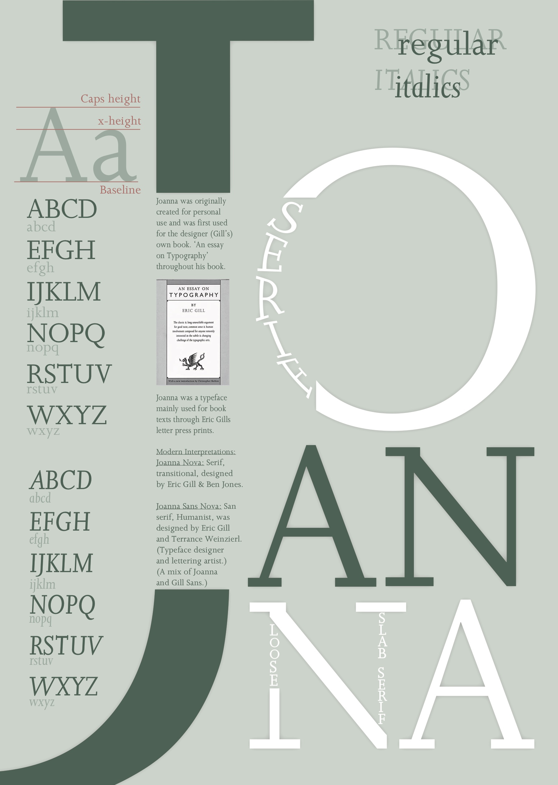
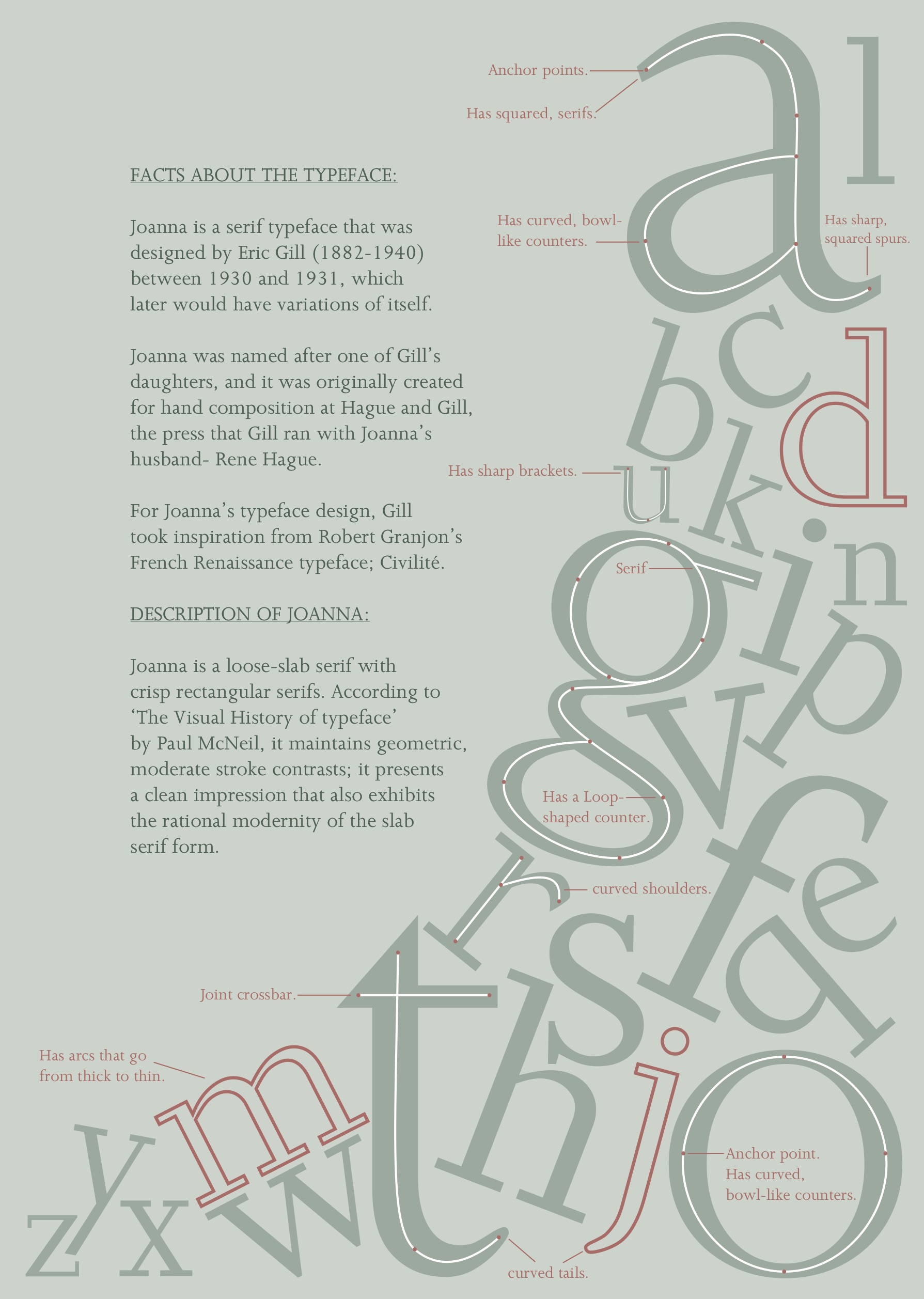
(Side note: You might notice that green colours are different, it is because I did this in CMYK, which is why the colour looks different onscreen. The original colour is shown through the screenshots of my poster process.)
Overall, I feel pleased with the outcome. Moreover, I decided to keep the green tones for I wanted it to look cohesive with my publication and other poster. But with the publication and my own typeface poster, I think I’m going to try some different approaches (regarding main colours and layout) so that it doesn’t all just look the same thing but in different forms of work. I want to keep my work cohesive but not too repetitive. I want it to have some balance without being too boring too.
