The earlier process and layout explorations:
So moving forward, after having sketched out some layout explorations, I had started to explore the layout sketches and first place them in Illustrator before I put them into indesign, so that I still have room to play around with my illustrations.
With my publication, I had decided to stick with a landscape B5 size. I decided to go with the landscape size for I see that there is a sense of continuity and story movement by its length compared to a portrait size. Also, I thought that my elements would fit nicely within a landscape size.
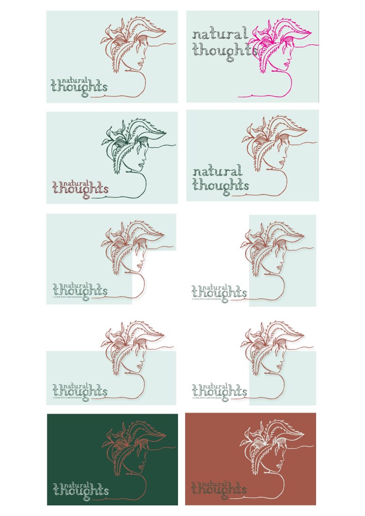
Here are some screen grabs of my exploration in terms of the front page. With the the front page, I knew that I wanted to use an illustration alongside my typeface. For the front page, I had decided to go with the plant minded image of a girl for I feel like it sums up the concept quite nicely, in regards to mind and nature (which represents Lake Panorama.) I also did not want to just draw an image of my place for that felt too literal not does not show the abstract concept behind the place. Also, I knew that I wanted to keep it peaceful, simple and not too busy which is why I have gone for this illustration and my typeface.
For the title, I took a while thinking of it for I really wanted a good one. For the final title, I decide to go with Natural thoughts. I decided to go with this title for I thought that it also sums up my concept in a short and simple way. It involves literal meanings and abstract meanings too.
Other Title Ideas I had: Lake Serenity, Slowing down, Pondering through Lake Panorama.
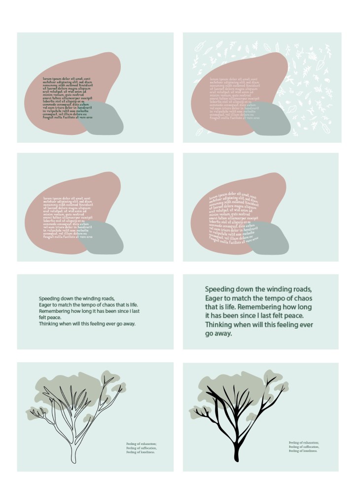
Throughout my publication, I wanted to just focus on my poem while complementing it with my illustrations, typeface and a few photographs.
This was my first exploration on the first page of my publication which includes plant illustrations and the rock layers.
On the first page, I’m planning to write up a little introduction about my place and my project and its concept without giving too much away.
Here I tried to explore the way my text would look on the rock layers which represent the painted rocks from my place.
Also, I had decided to use the Joanna typeface in my publication to keep it cohesive since my own typeface was created from the Joanna skeleton.
Here was one of the other illustrations that I also started to explore and mix with a filled version of my typeface.
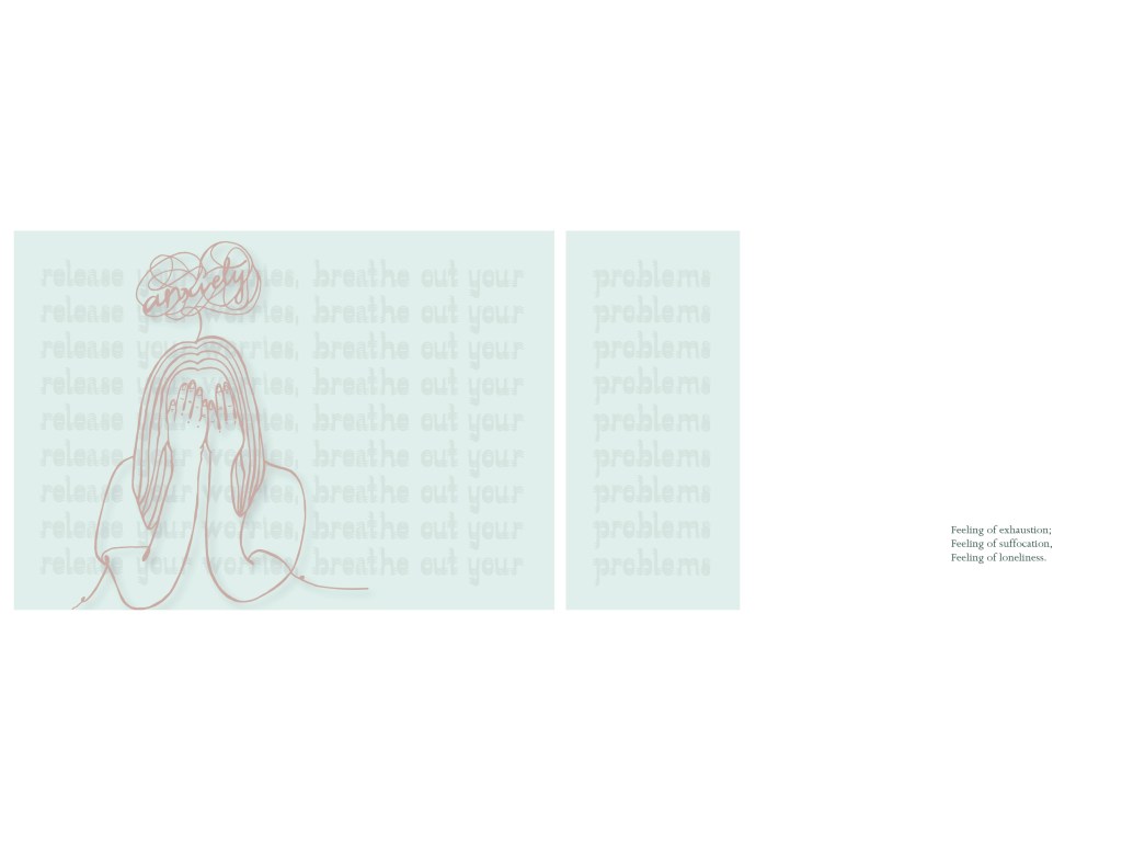
For this piece, I had taken a line from my poem and typed it up with the filled typeface, and had layered it on top of each other. I decided to do this, for it had given this blur effect which felt like what a person’s mind looks like when they are worried or full of anxiety. Also, I decided to do this for I though that it would match the illustration which says anxiety.
I actually came across this idea by accident, but I ended up liking it. For it gave me the idea of blurred and mixed thoughts. Although this affect contradicts with the poem line, I think that it still works well together. For me, it’ resembles the way a person with anxiety would hear encouragement to calm themselves down. For e.g. when I get stressed, my mind goes everywhere and I don’t know what to focus on which is why the blurred layering affect reminded me of this.
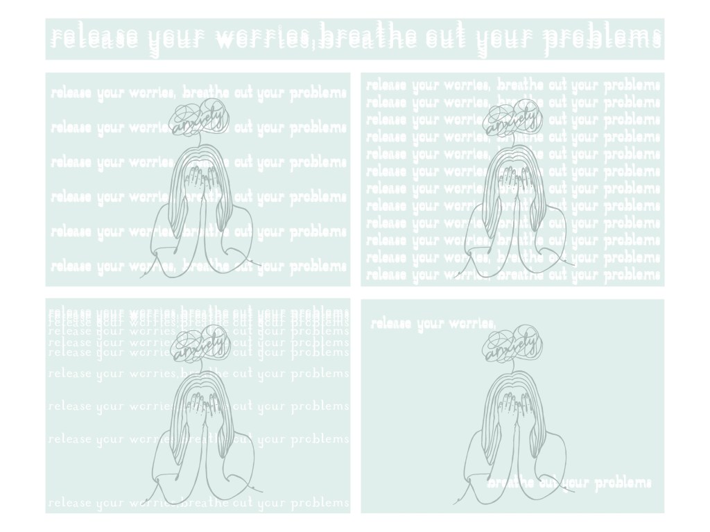
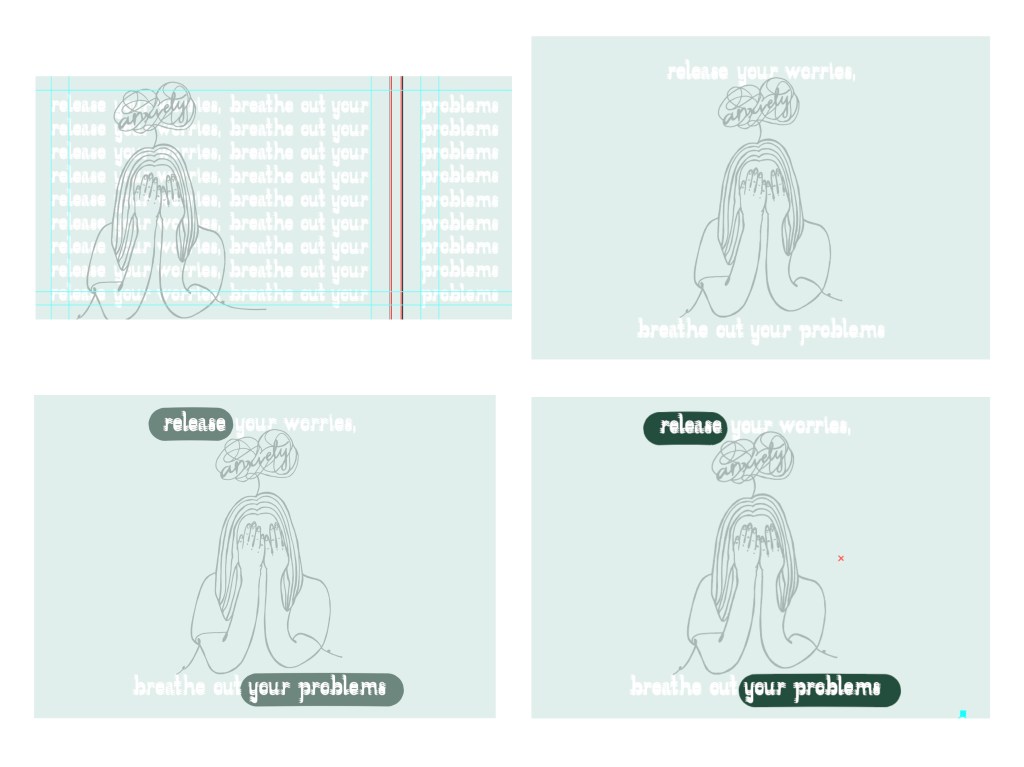
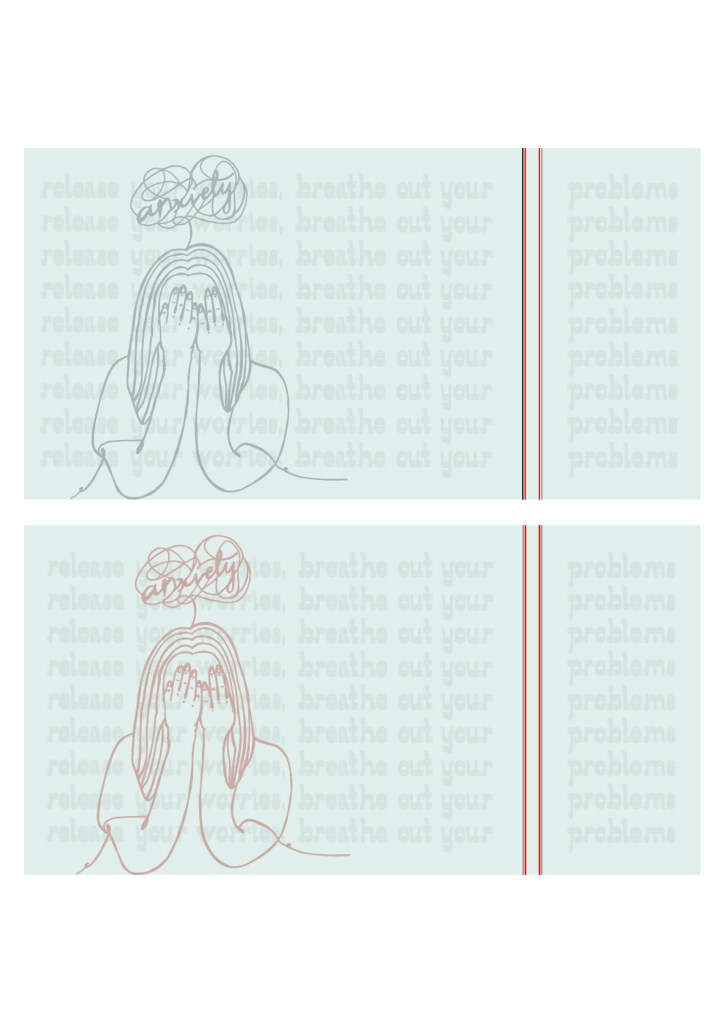
Here were some more exploration layouts of the anxiety piece. I had also tried exploring layers with the words too but I think it looked a little to heavy; I felt like it was too much compared to the weigh of the illustration.
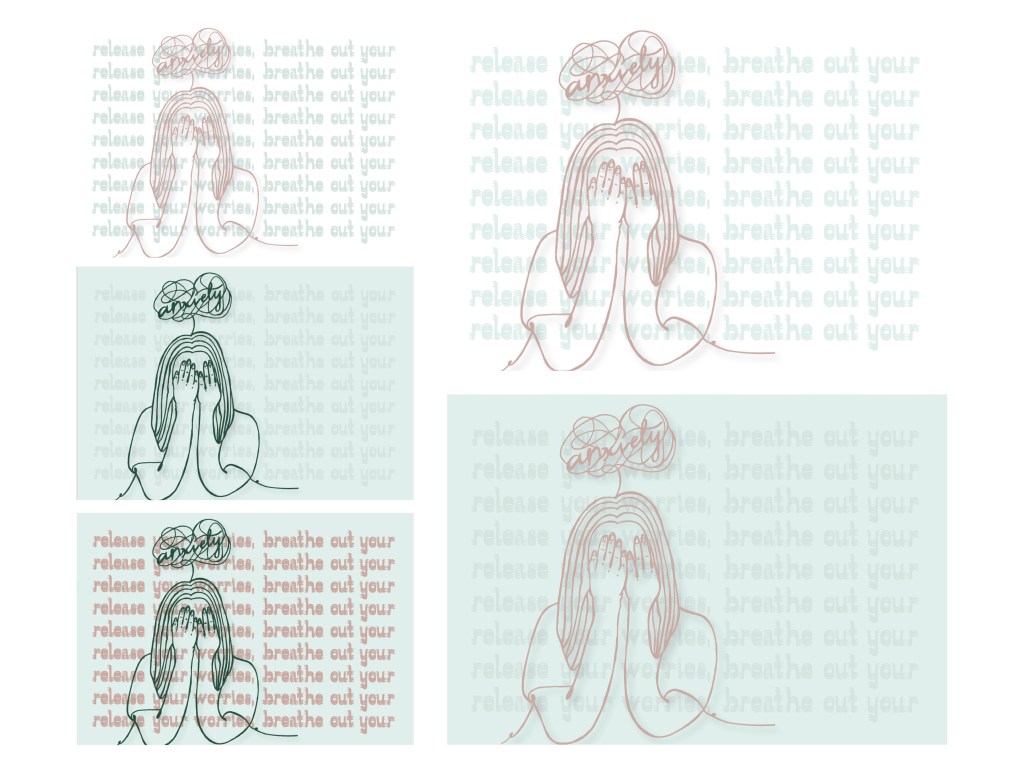
I also tried swapping the colours between each other, so that I could get the one that works the best.
More explorations:
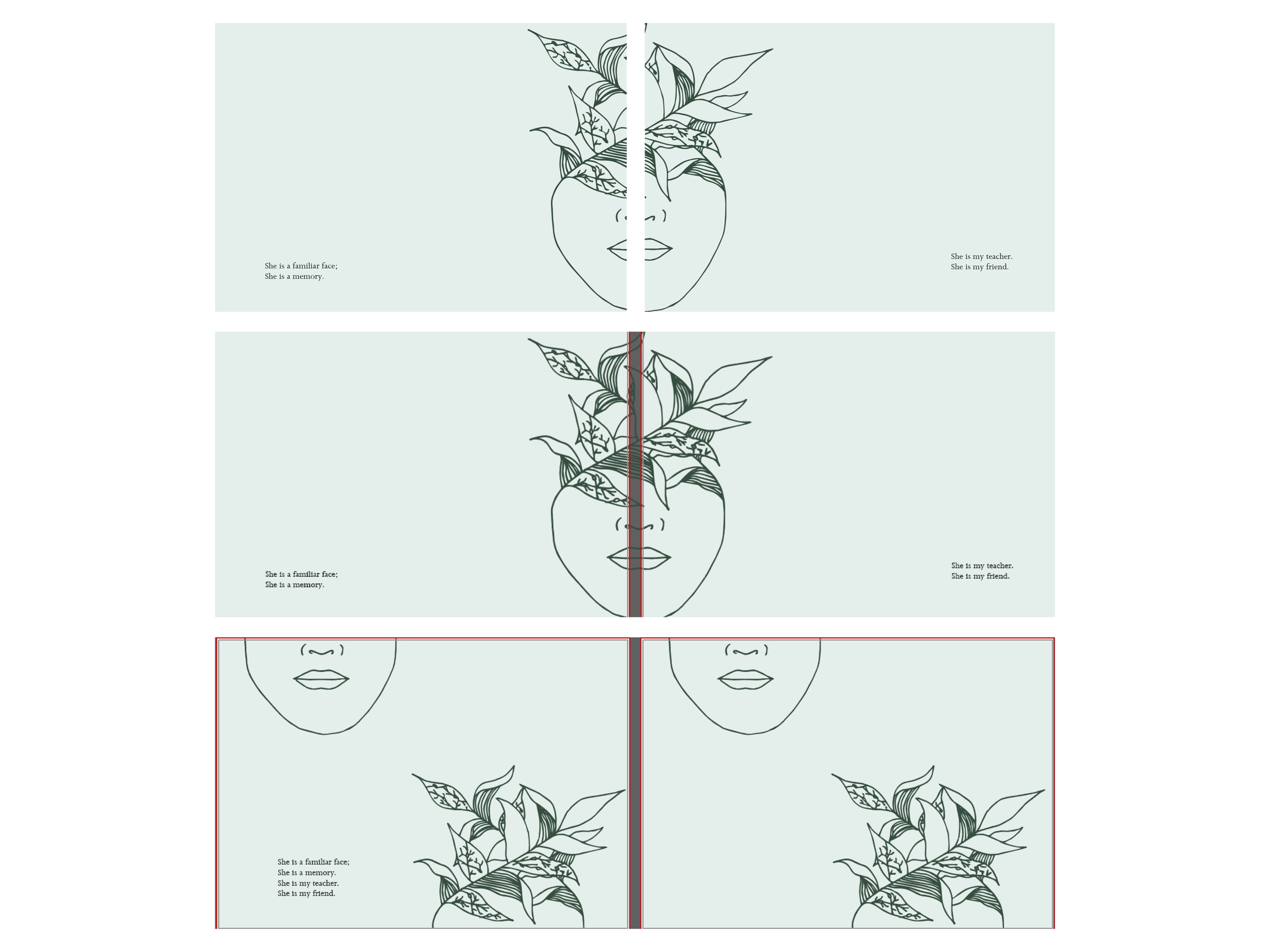
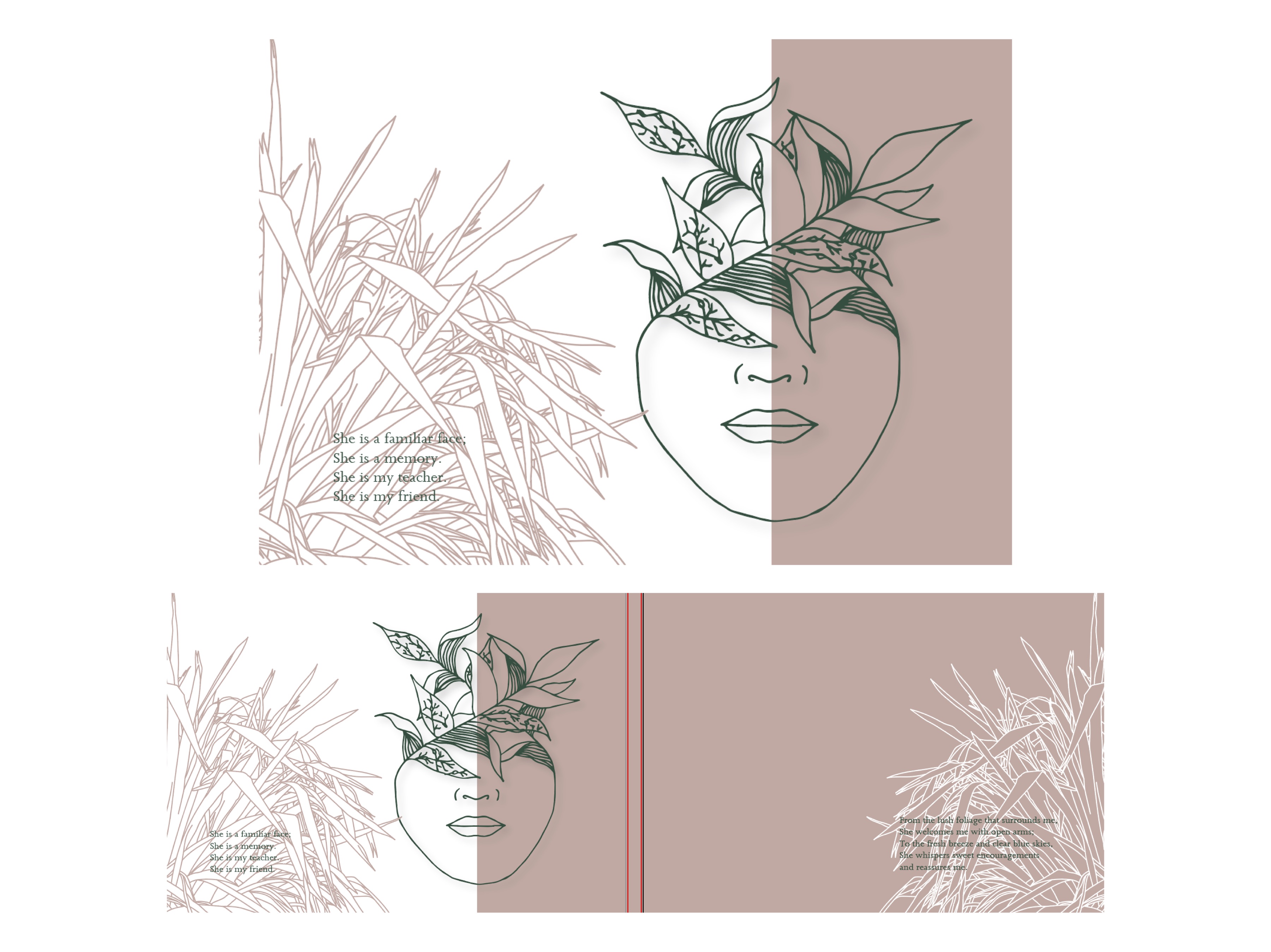
Moreover, here were some more illustration exploration placements I tried with. With my illustrations, I had tried to place them alongside parts of the poem that would match and connect well and keep the publication flowing.
Colour palette:
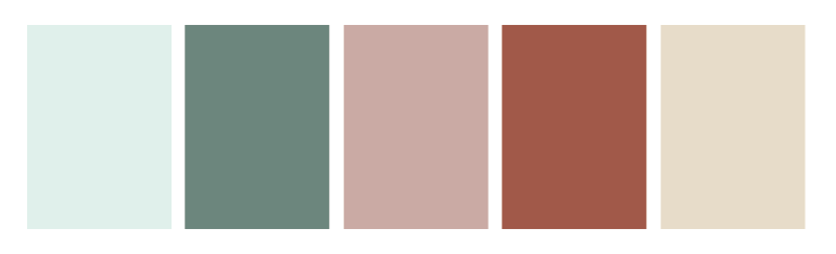
Here was the colour palette that I had created using split complementary colours. I think that adding these colours had lifted the pieces and had developed my work. Rather than just using the green hues (which I did before), it seemed too monochromatic, so adding these colours helped develop my work while still working well with the concept and other elements of my work.
