Poster explorations and process:
Before I learnt about the 6 elements, I started to just explore some ways of showcasing my typeface but this time, I had tried doing a layout where I initially thought of including the anatomy of typeface. But this seemed a little too structured to the point where it looked boring. (I’m talking about the layout and not the typeface itself.) With these first experimentations, I tried experimenting with the poster layout sketches I did earlier, but none of them worked for they felt too informative (full of information.) My original ideas did not really give the concept of my place but it just felt like a poster full of information. So I decided to just leave these ideas behind.
Exploring Simplifying, Overlapping, Focusing the eye out of the 6 poster elements:
Poster 1 Process:
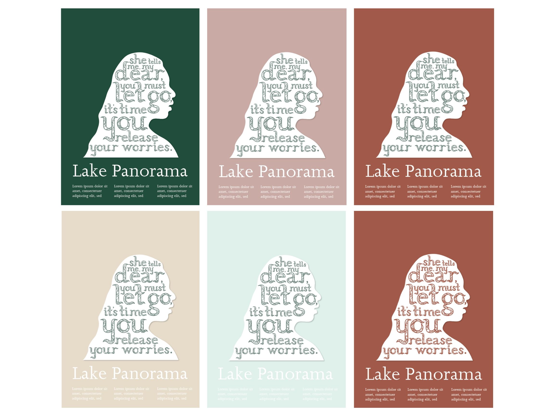
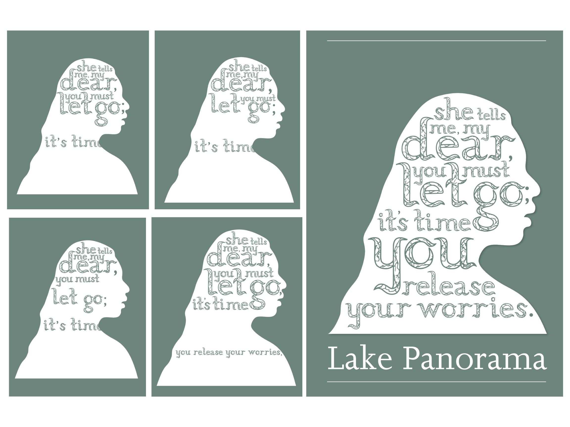
Here was the first approach I tried using the simplifying method. With this poster, I had tried to explore my own silhouette and turned it into a shadow layer for my poem typeface. I first took a side profile photograph of me and had turned it into a silhouette layer. Then, I explored the layout of my typeface within the layer.
Moreover, the idea behind this poster idea was to try and incorporate my connection with the typeface and place by transferring an ‘image’ of me onto the poster. But I had decided to keep it faceless so that no one would know it was me (for people who first see this.) All you know is that it’s some faceless person (mainly looks like a girl.) It’s as if there is no real identity.
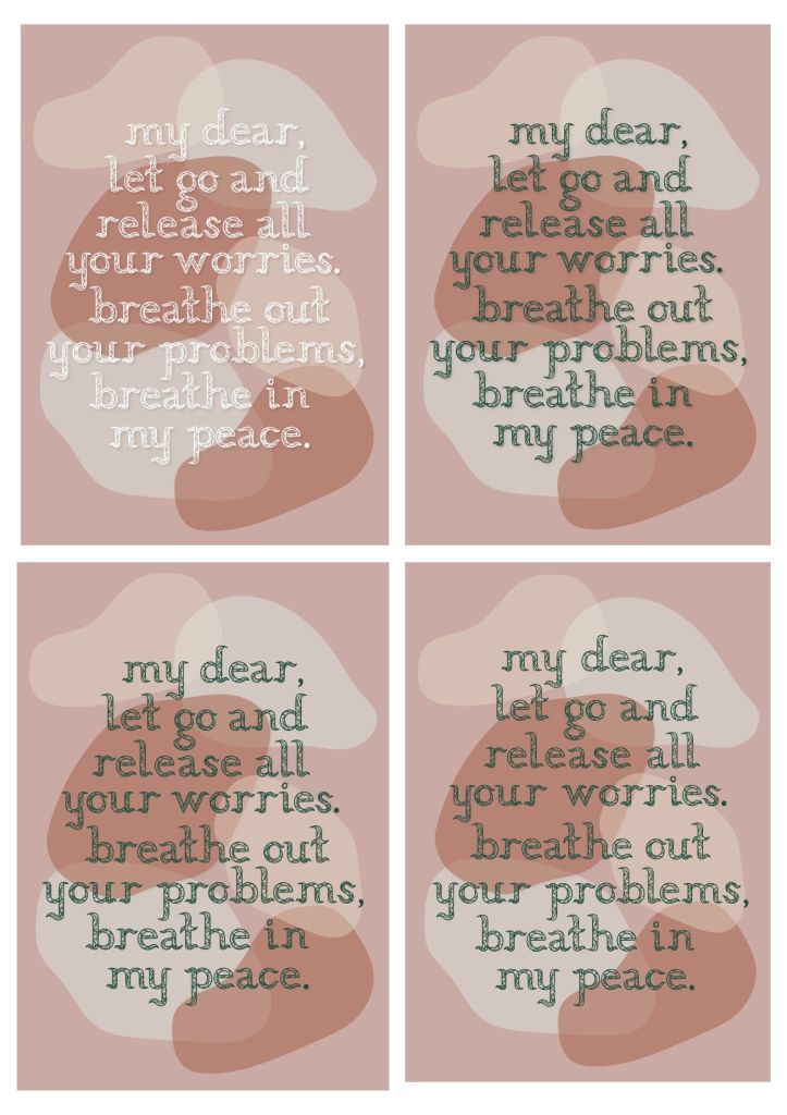
I wanted people to try imagine that the faceless silhouette was them. I also chose this specific line from my poem for I felt that this had fit best for the image since it talks about a girl (which is actually the place) reminding us to stay calm through this line. By using this line, I wanted the place (Lake Panorama) not only to talk to me but to them (whoever looks at this poster), reminding whoever sees this poster to let go, release worries and calm down.
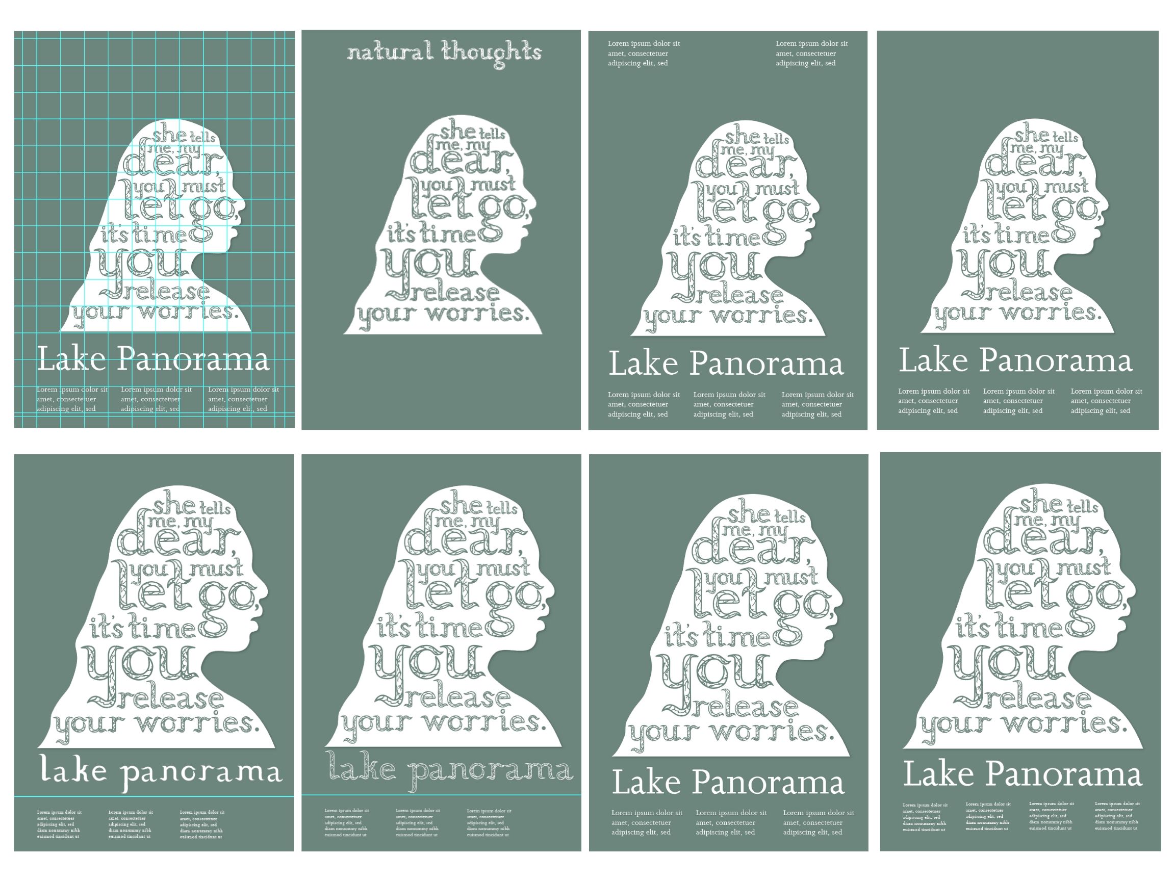
Poster 1:
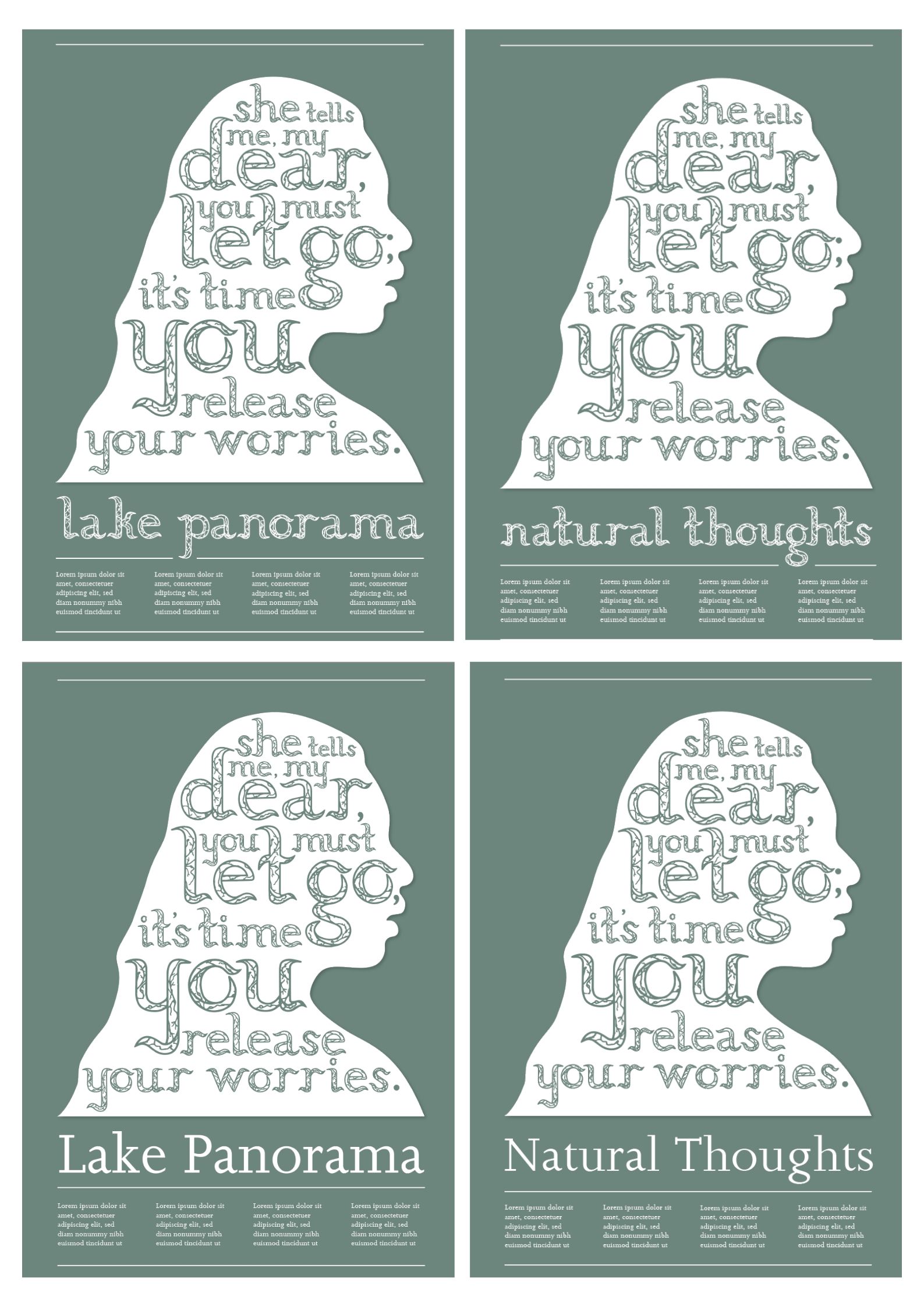
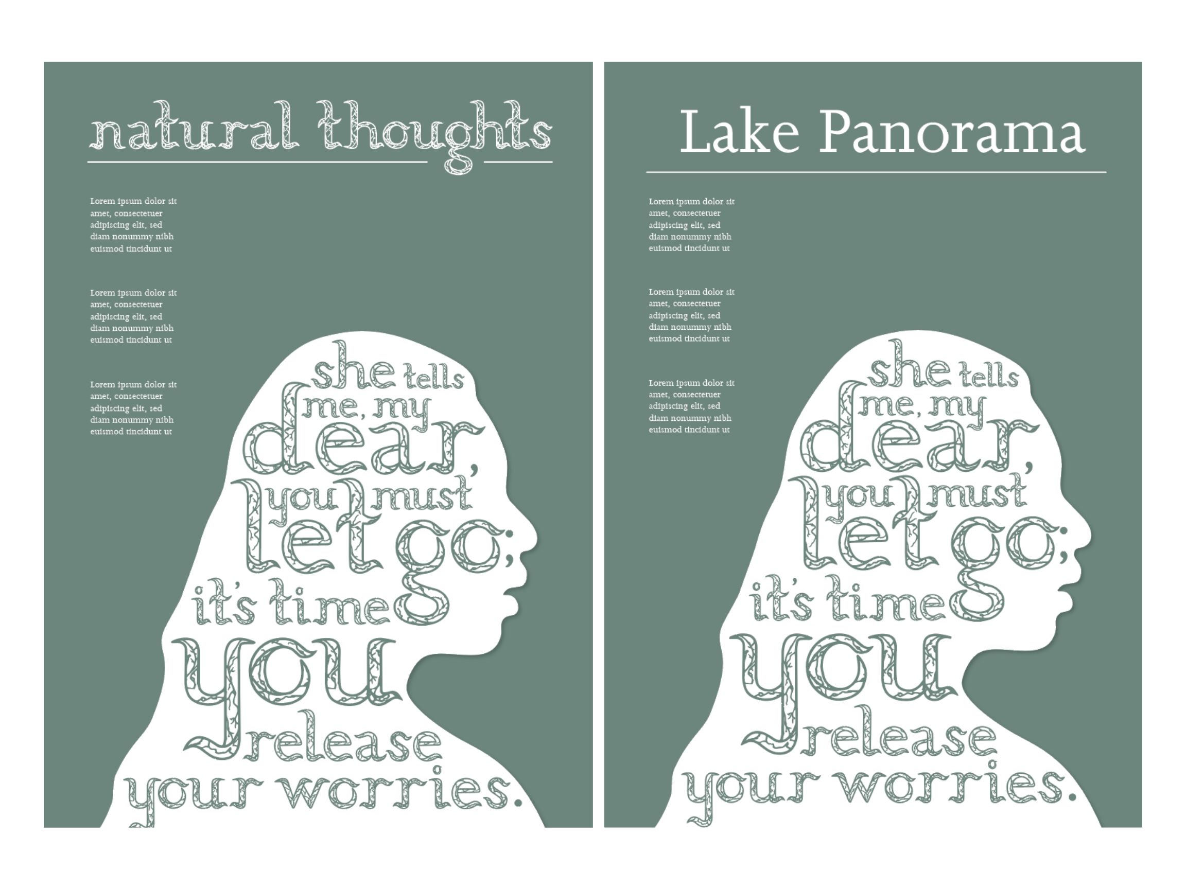
Here were the different layout approaches of the silhouette idea. I tried exploring different layout ideas and placements of the text, title, typeface and image. I tried to explore whether I should use ‘natural thoughts’ (the title of my publication) or the actual name of the place as the poster title.
Reflection: So far, I think that having the silhouette all the way to the bottom looked better but I’m still debating what name and font looked better. (Still deciding whether to use the Joanna typeface or my own.) I’m just wondering whether the Joanna title is more attracting rather then my own typeface inside the silhouette.
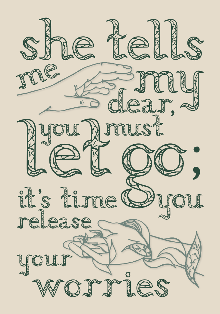
Poster 2 Process:
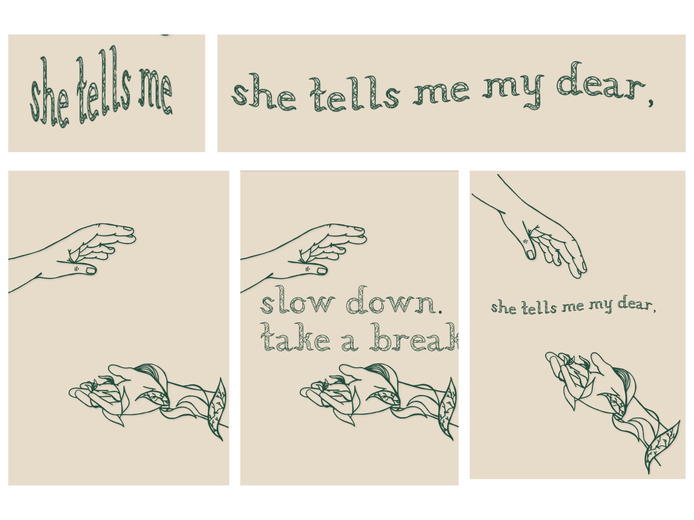
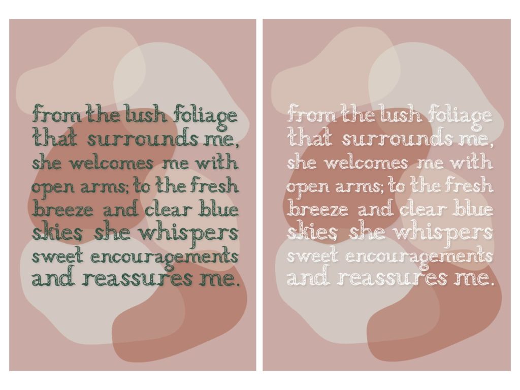
For my second approach, I decided to incorporate one of the illustrations from my publication which is of the one where hand a re reaching out towards each other. I also thought that this one would look nice with the same line that I had use earlier.
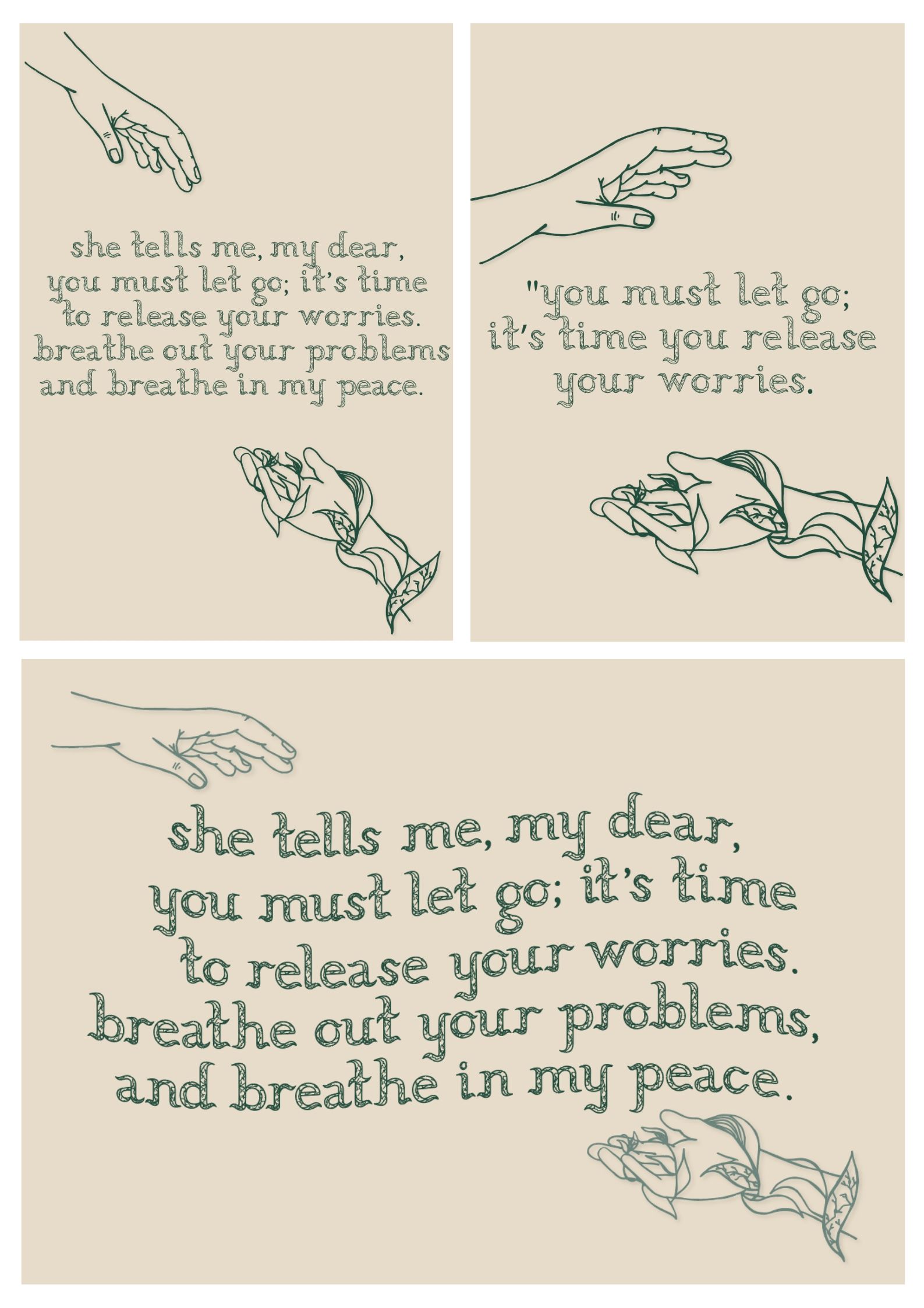
Here were some layout explorations and different layout approaches. I wanted to explore the positive and negative spaces but trying to fill the whole page, whereas I tried to give a bit of outer space for it to breathe. I had also tried doing it landscape as well to try and make the sentence fit better if I were to go for the waved typeface approach to give a look that the typeface flows.
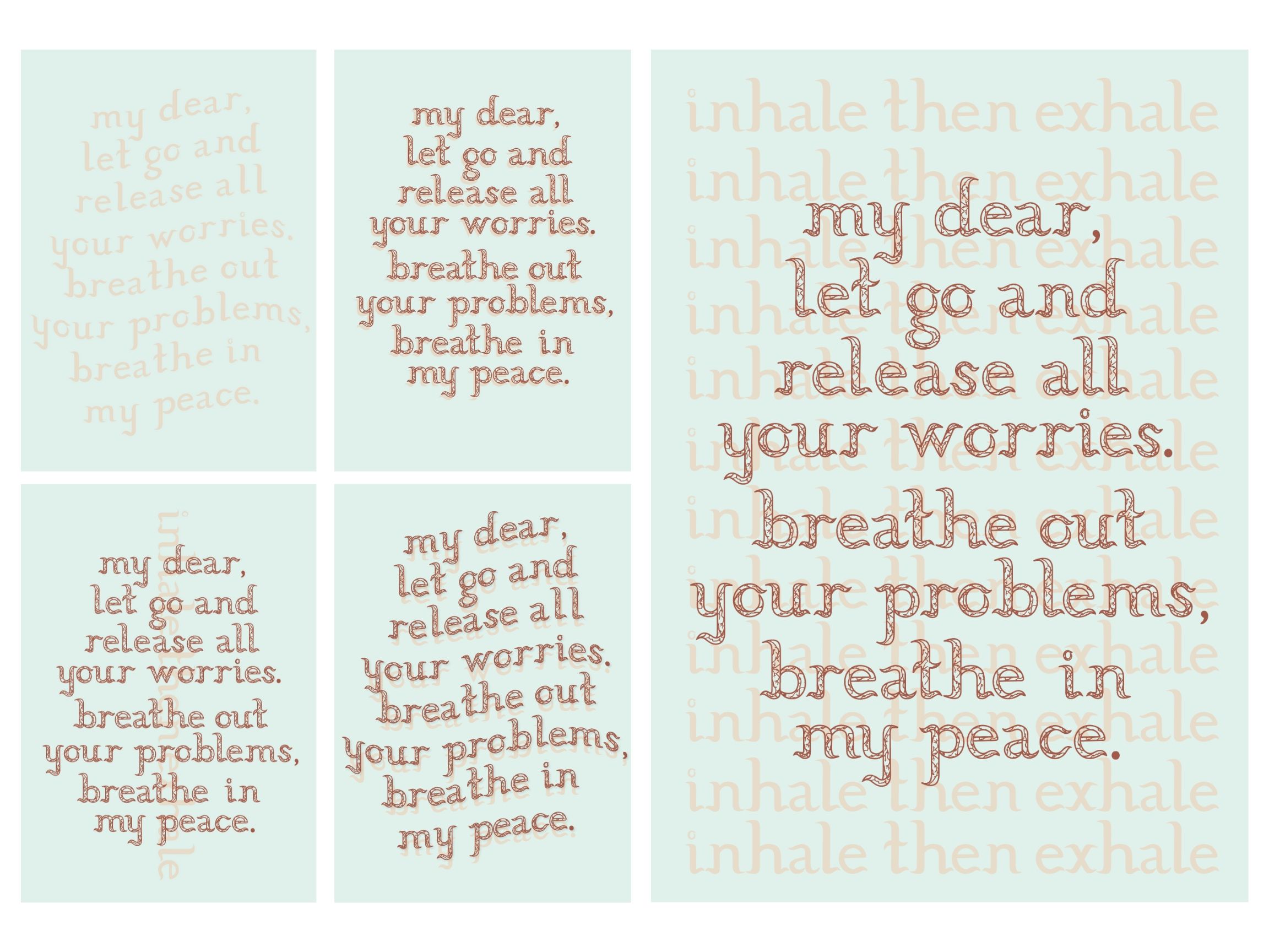
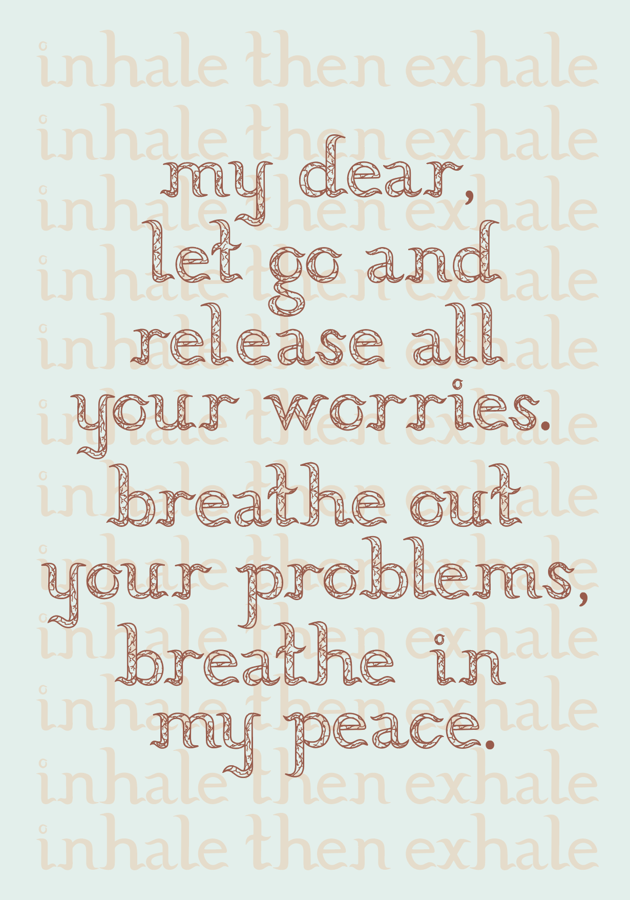
Poster 2 (Variation)2:
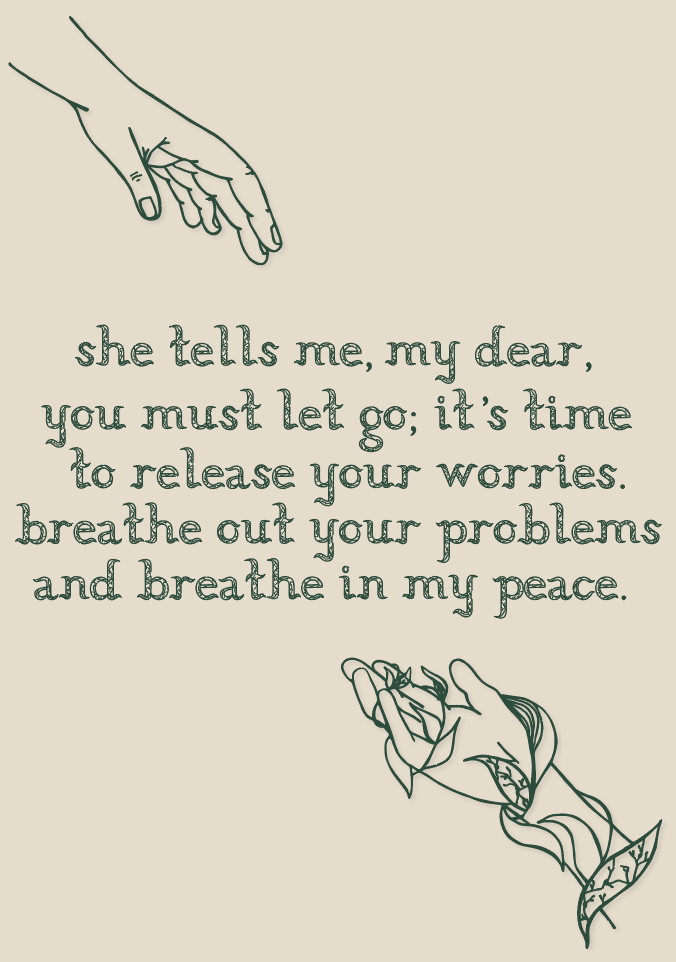
These were the two explorations that I had found to be my better ones of the trials. I just like how there’s more space to breathe by adding some space around the letters. But I’m still considering whether to change the colour palette or just stick with this pale beige yellow and green or another colour combo from my colour combo. Also, still thinking of working on the text placements.
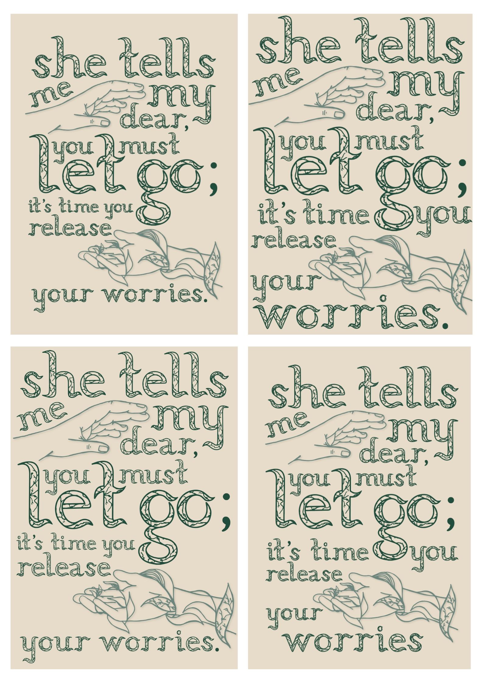
Poster 3 and 4 Process:
For poster 3, I had started to do the overlapping idea but without any graphic elements and just focus on the text. Out of all of these trials, I liked the waved one but I think this would need to be brought into the middle a bit more and be more smaller. I think the other one (the bigger one) felt too busy and distracting as I did not know what to look at. So I don’t think I’ll be going further with this one since the words about being peaceful and breathing doesn’t fit the distracting layout of typeface.
(Side note: I did the filled typeface as the background and the actual stroked typeface on top.)
Poster 3 & 4:
These were probably my least favourite out of the one’s that I had tested for they felt too distracting with the layering idea and I dis not like it as much. Was still interesting idea to explore though. I might look into using this colour combo though for the other posters that I liked more.
Poster 5 Process:
This was another poster exploration I tried with overlapping of graphic elements. I think that this one also looked a little busy since the outlines of the rock layers were fighting with the text for attention. But could explore this further and try putting the text inside the rocks instead of overlapping it.
Poster 5:
here were the same explorations but I had tried to use a different sentence as the graphic element did not make sense with the other poem line. But not so sure if this graphic element matches this line either?
Overall Reflection: Over all the posters that I tried to explore, I think that I’m leaning towards poster 1 and 2 the most as it feels stronger in terms of connection between illustration, poem line, my concept/theme and publication. Just have to push further and refine the poster/s.
