Publication layout process:
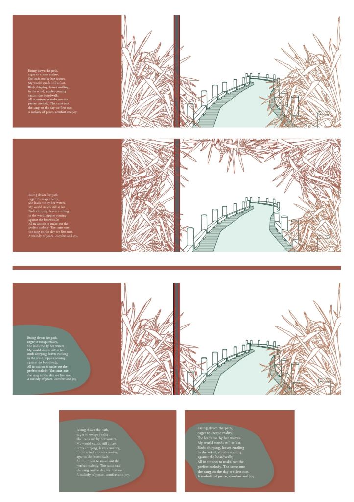
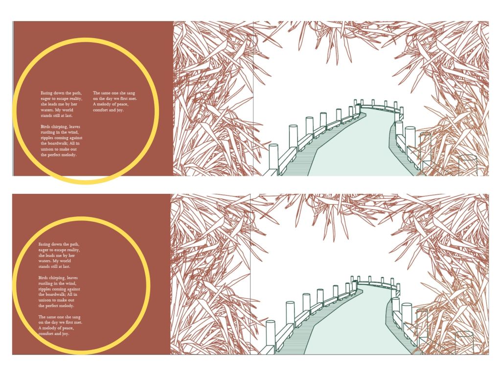
With the recent developments, I have been developing the layout as well as refining the placement of elements like the rock layers and the typeface placements (as shown on the left.) With the image on the left, I tried experimenting with the placement of rock layers to see what it would look like under the poem text. I think looking at it behind the text, it seemed a little too distracting which is why I did not want to proceed with this layout idea. Moreover, I also tried experimenting with the illustrations. With the pathway illustration, I decided to include this illustration for it had visually explained the poem. I also decided to fill the white space with more flax plants to give it more of an enclosed look to really focus on the pathway. I also decided to keep the white space to allow the illustration to breathe as well as focus on the scene of the pathway.
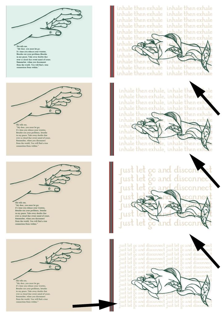
On the left image of processes, I experimented with the filled version of my typeface and explored ways of communicating with the typeface and poem. For example, I initially started with the words inhale and exhale as it related to the idea of slowing down and related to the line of breathing in peace and breathing out problems in my poem. But I don’t think that it was working well with the illustration of hands for it visually shows hands reaching out to each other, yet the typeface behind doesn’t make sense with the illustration. So I changed the typeface words from ‘inhale then exhale’ to ‘Just let go and disconnect.’
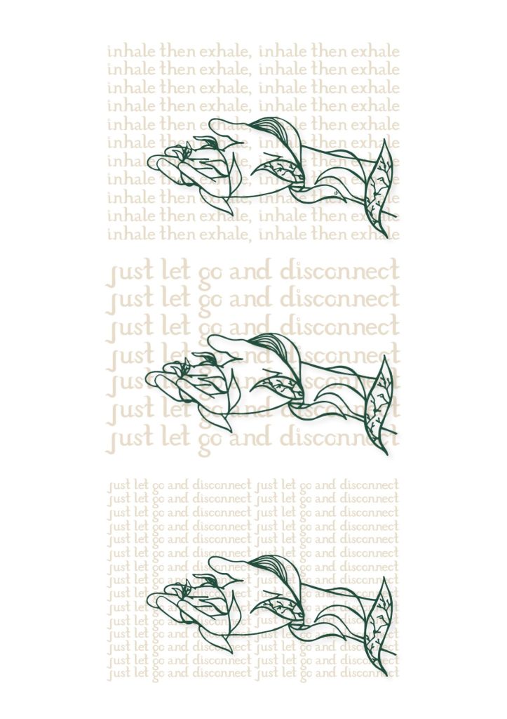
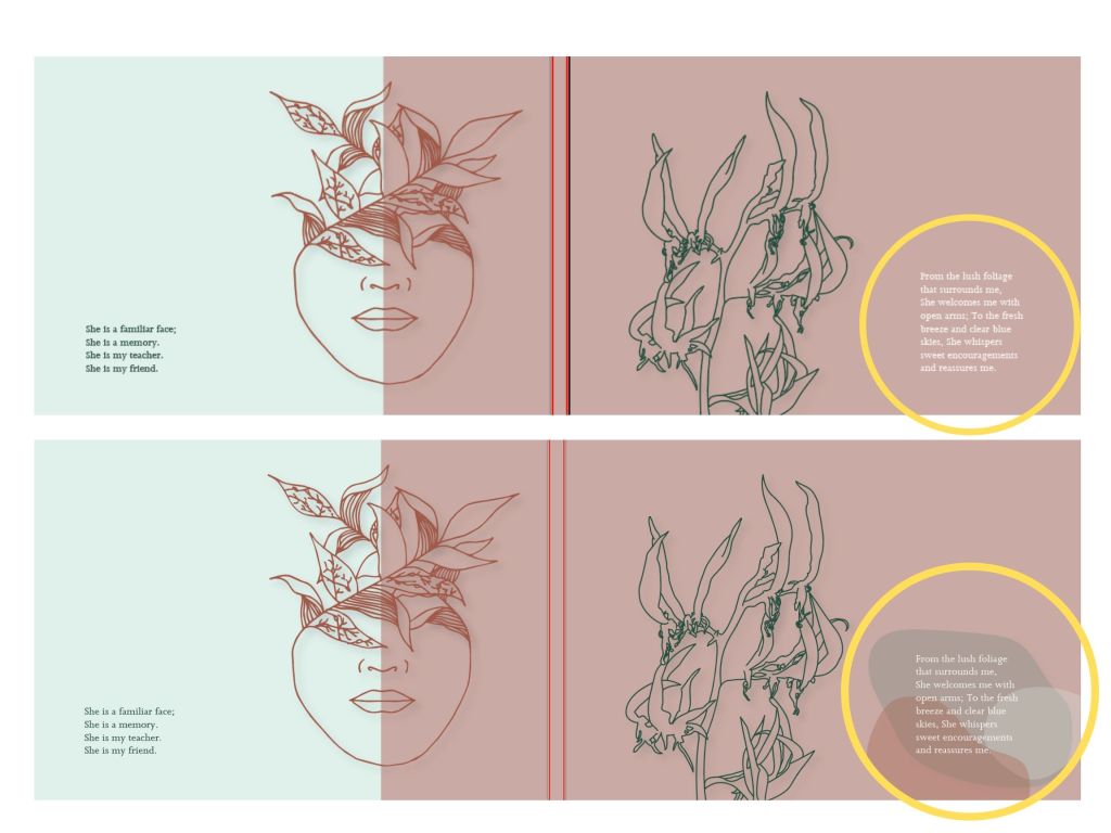
Here were some more screenshots of my exploration of layout between my poem, typeface and illustrations. I tried to keep my work cohesive and really tried to communicate the concept of mind and nature through mixing these elements. I had also experimented with the sizing of text as shown on the right image. For the final intro page, I decided to go with the green image without the rocks for I did not like how the text looked on top of the rock layers.
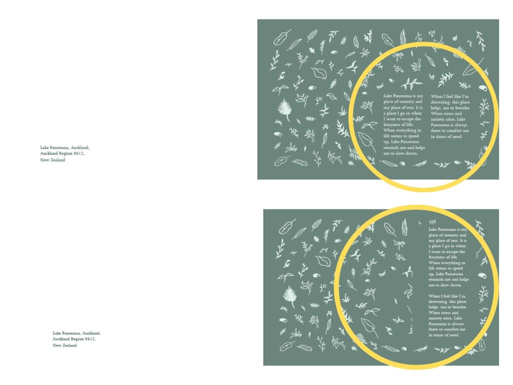
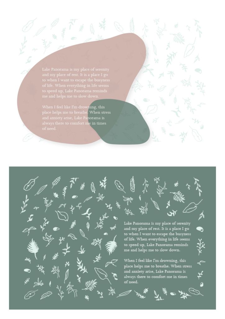
Lastly, I continued to experiment with the text layout and tried to look at how the text layout would look onto the publication. I experimented with the longer layout of the text as well as put them into shorter groups. I decided to mix it a little bit for some pages looked better with the longer text while some looked better with the shorter groups.
