Development Process:
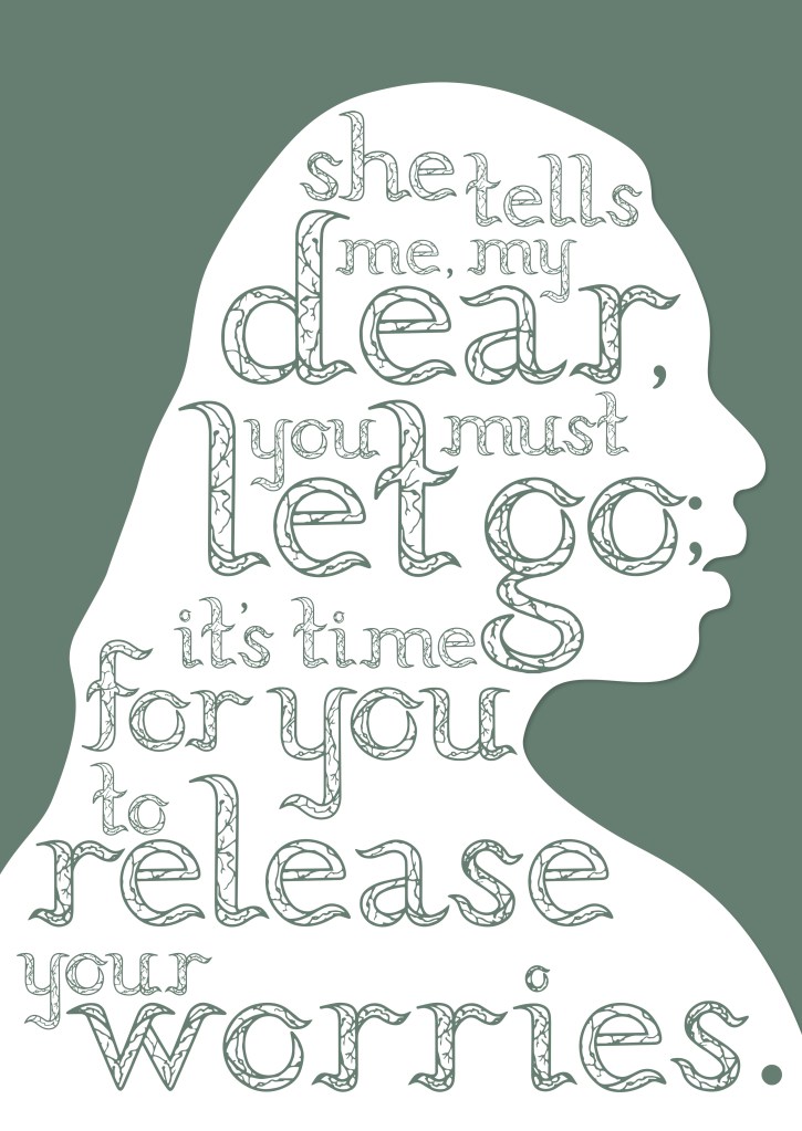
Here was one of the two poster ideas that I decided to develop and refine more. After receiving the comments about removing the smaller text, I decided to listen to the comments and just enlarge the silhouette which will also emphasise the typeface more. For when I originally had the smaller text around the silhouette, it did feel quite distracting. So by removing it, I really think that it gave more attention for the typeface to be looked at. The only thing I struggled with was the placement of my typeface, Since it is serif based and had curves, it was hard to stack the letters on top of each other. If I were to use a san serif and or a more blocked letter, this concept could have worked out better. But still was worth exploring and developing.
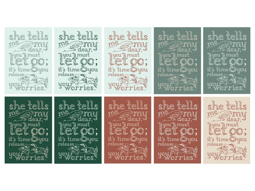
Here was the other poster that I had developed and refined as well as the one I wanted to develop more. In terms of refinements from my first exploration and trial, I had fixed up the alignment of the typeface as well as removed the drop shadow on the illustration. As you can see I had also explored many colour combos to see what would fit best for the poster. With the colours, I had also tried to keep it cohesive by using the colours from my publication.
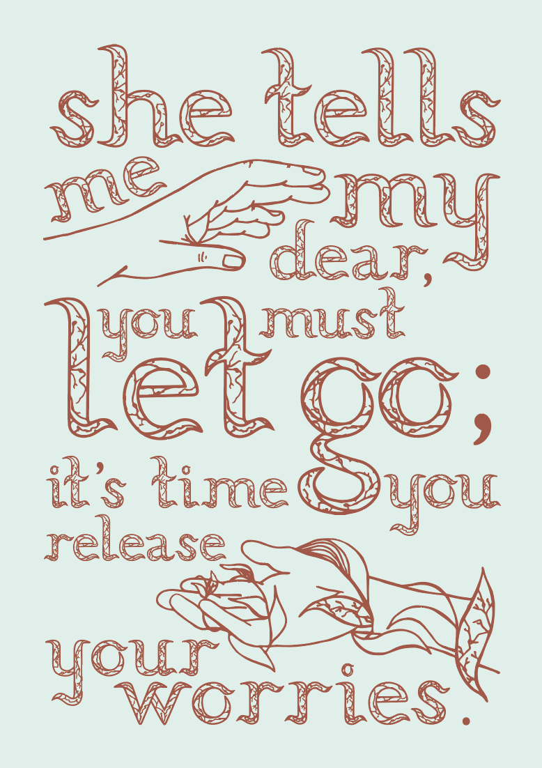
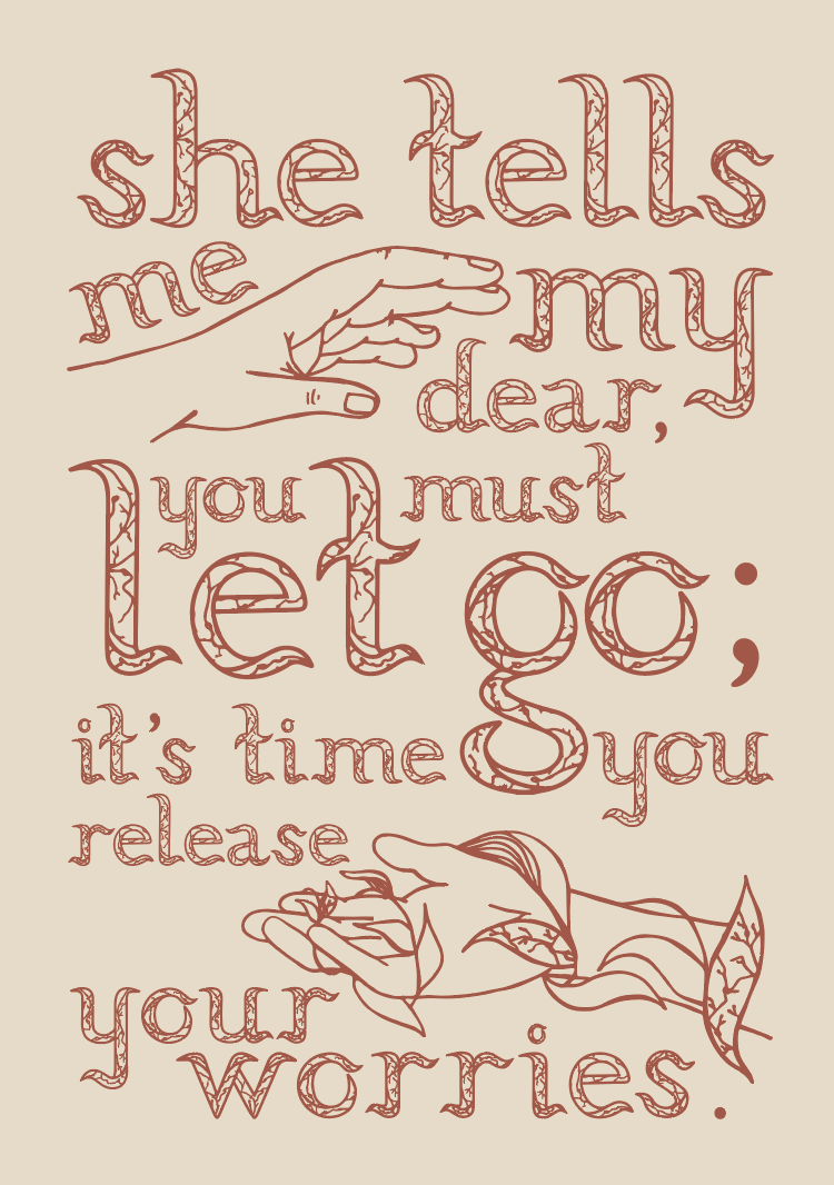
From the colour combo explorations, I liked the light blue with the earthy brown colour as well as the yellow background. In the end, I decided to go with the light blue with earthy tones as it stood out to me just a little bit more in terms of the colour combo.
