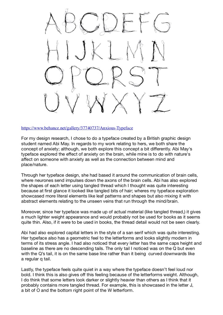
The uncontrollable mind by Abi May:
Link: https://www.behance.net/gallery/37740737/Anxious-Typeface
For my design research, I chose to do a typeface created by a British graphic design student named Abi May. In regards to my work relating to hers, we both share the concept of anxiety; although, we both explore this concept a bit differently. Abi May’s typeface explored the effect of anxiety on the brain, while mine is to do with nature’s affect on someone with anxiety as well as the connection between mind and place/nature.
Through her typeface design, she had based it around the communication of brain cells, where neurones send impulses down the axons of the brain cells. Abi has also explored the shapes of each letter using tangled thread which I thought was quite interesting because at first glance it looked like tangled bits of hair; wheres my typeface exploration showcased more literal elements like leaf patterns and shapes but also mixing it with abstract elements relating to the unseen veins that run through the mind/brain.
Moreover, since her typeface was made up of actual material (like tangled thread,) it gives a much lighter weight appearance and would probably not be used for books as it seems quite thin. Also, if it were to be used in books, the thread detail would not be seen clearly.
Abi had also explored capital letters in the style of a san serif which was quite interesting. Her typeface also has a geometric feel to the letterforms and looks slightly modern in terms of its stress angle. I had also noticed that every letter has the same caps height and baseline as there are no descending tails. The only tail I noticed was on the Q but even with the Q’s tail, it is on the same base line rather than it being curved downwards like a regular q tail.
Lastly, the typeface feels quite quiet in a way where the typeface doesn’t feel loud nor bold. I think this is also gives off this feeling because of the letterforms weight. Although, I do think that some letters look darker or slightly heavier than others as I think that it probably contains more tangled thread. For example, this is showcased in the letter J, a bit of O and the bottom right point of the W letterform.
PDF Form Essay: