Grid sketches, explorations and the process:
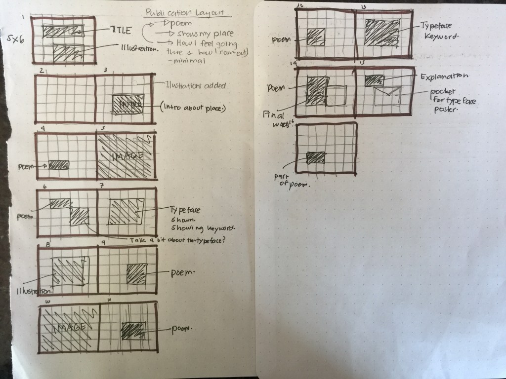
So here was one of the original sketches that I had done in regards to the layout of my publication. I wanted to keep it quite simple yet fun to look at (basically balanced.) Also this was the sketch layout idea that I had decided to explore on indesign and illustrator. (I’ll go over it more but I constantly made changes to the layout .)
After having done some sketches, I finally started to digitalise it and see how the layout would look on Indesign. I had also started to explore my colour palette too.
With the grid I had still used the landscape 5×6 ratio for I still liked the idea of using landscape. (B5 landscape.)
Moreover, with the placements itself, I was constantly changing the placements to see what elements, illustrations would look better on what page. I had also kept changing what colours would go where because I wanted to keep a steady pace. I also wanted to repeat some elements like my typeface but also keep it evenly spread out but cohesive.
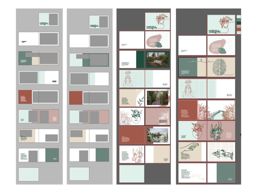
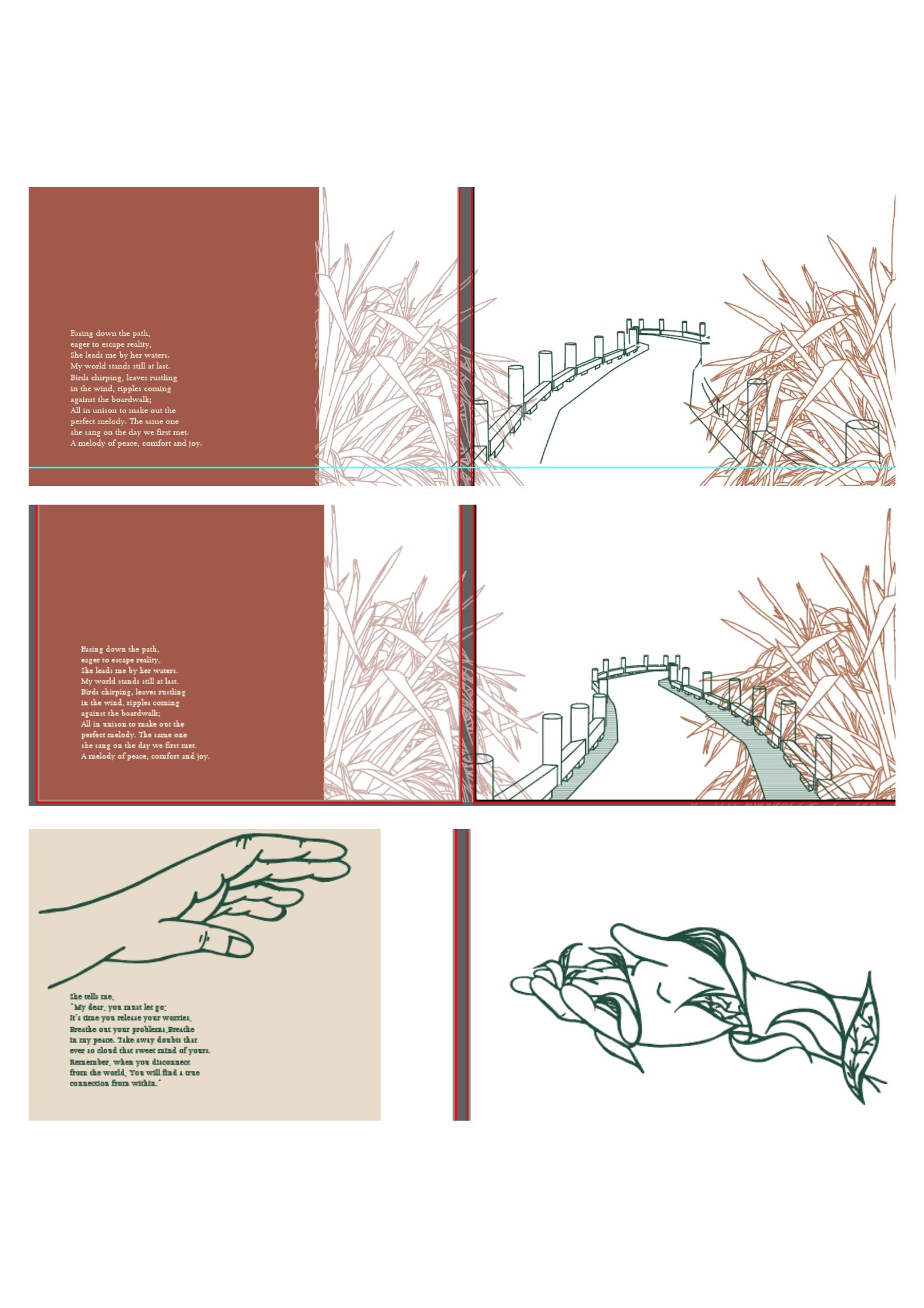
At the start of my layout exploration, I started out wanting to use my photographs and illustrations together but as I had originally sketched out. But it not feel like they were working well together as I had hoped so I had to to make the decision to just focus on my illustrations since they felt stronger to me.
For the publication, I had decided to focus on my illustration, typeface and poem for they felt like they were more cohesive and had shown my concept better. Showing the literal and abstract concepts.
More layout and placement explorations:
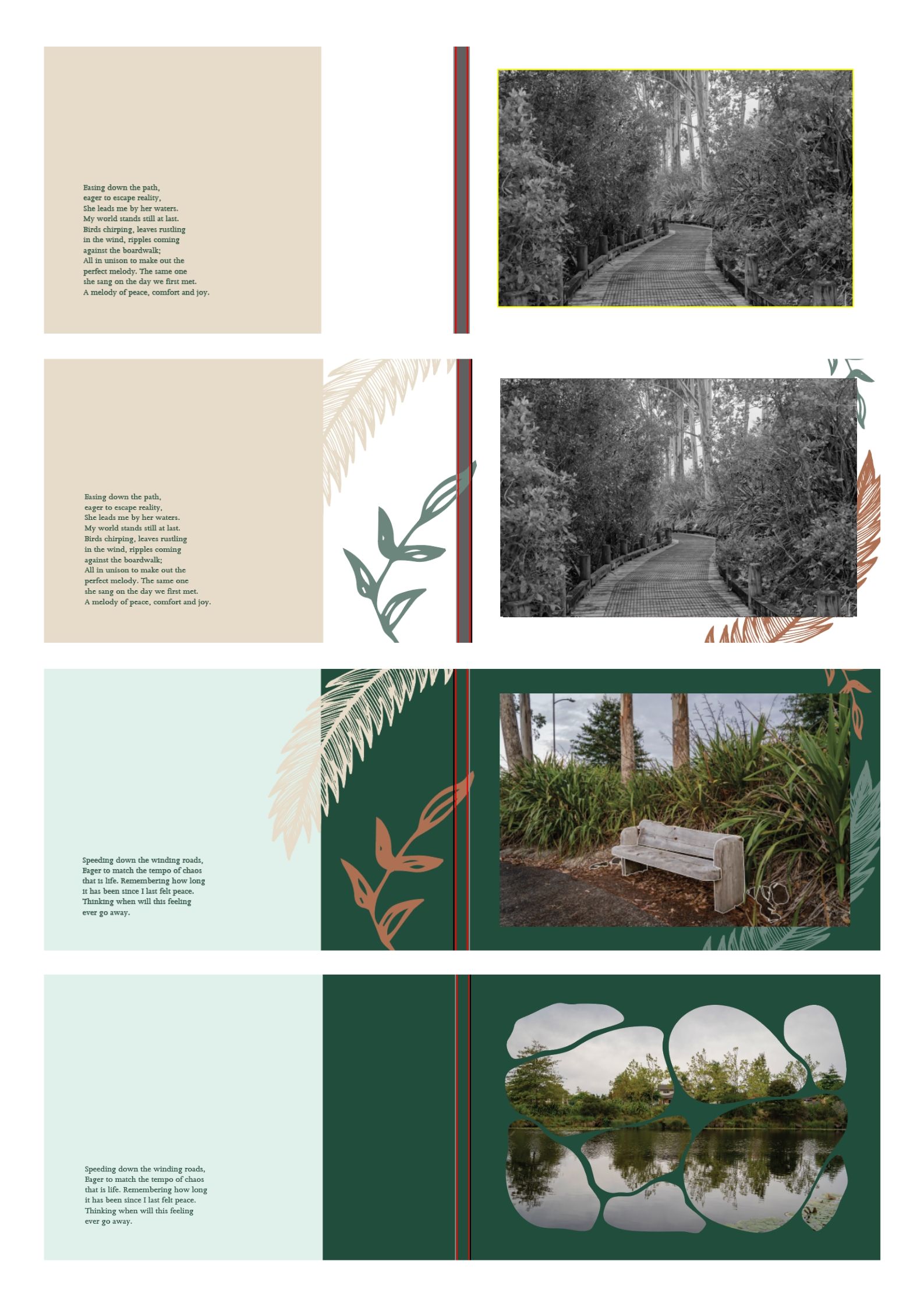
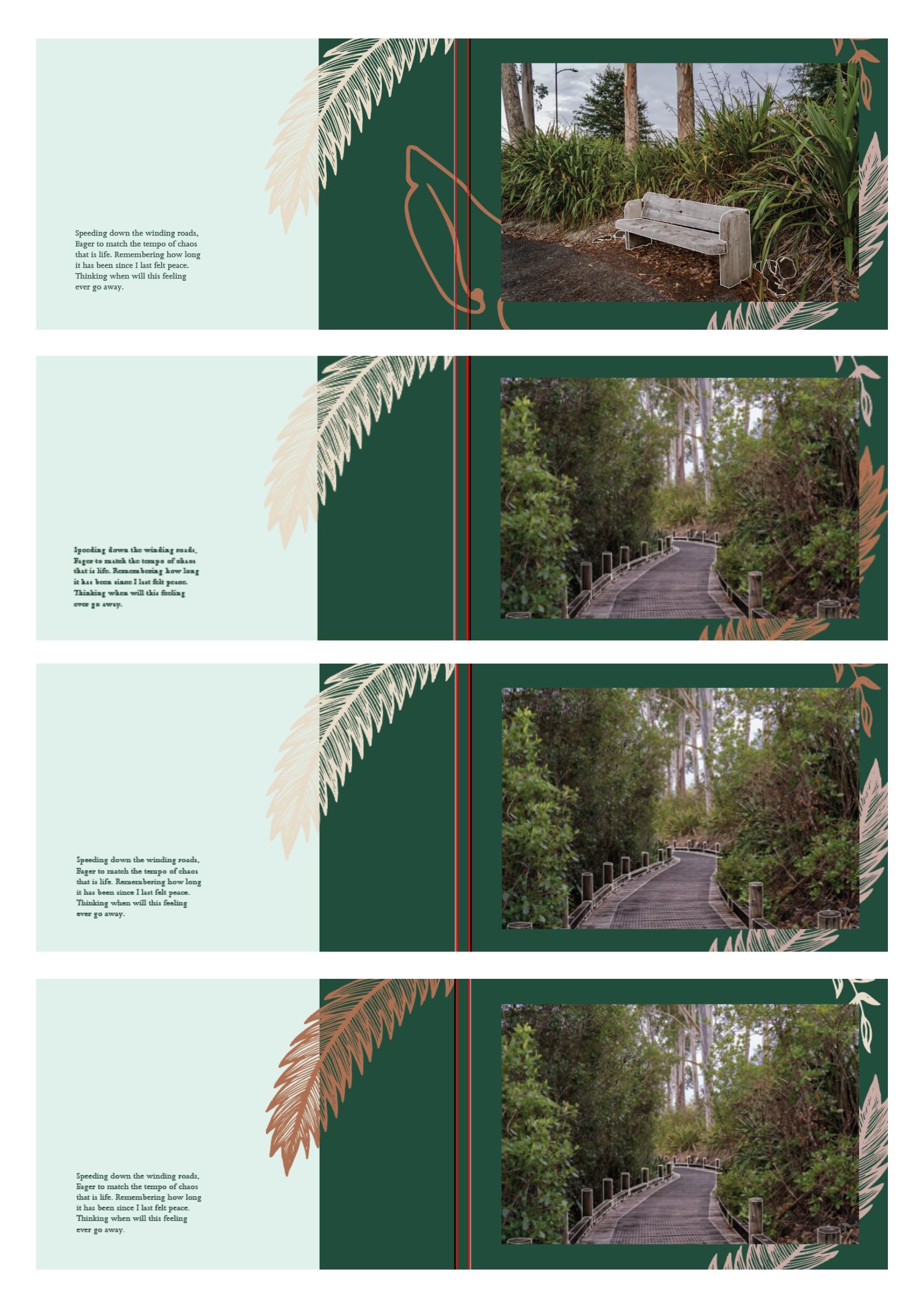
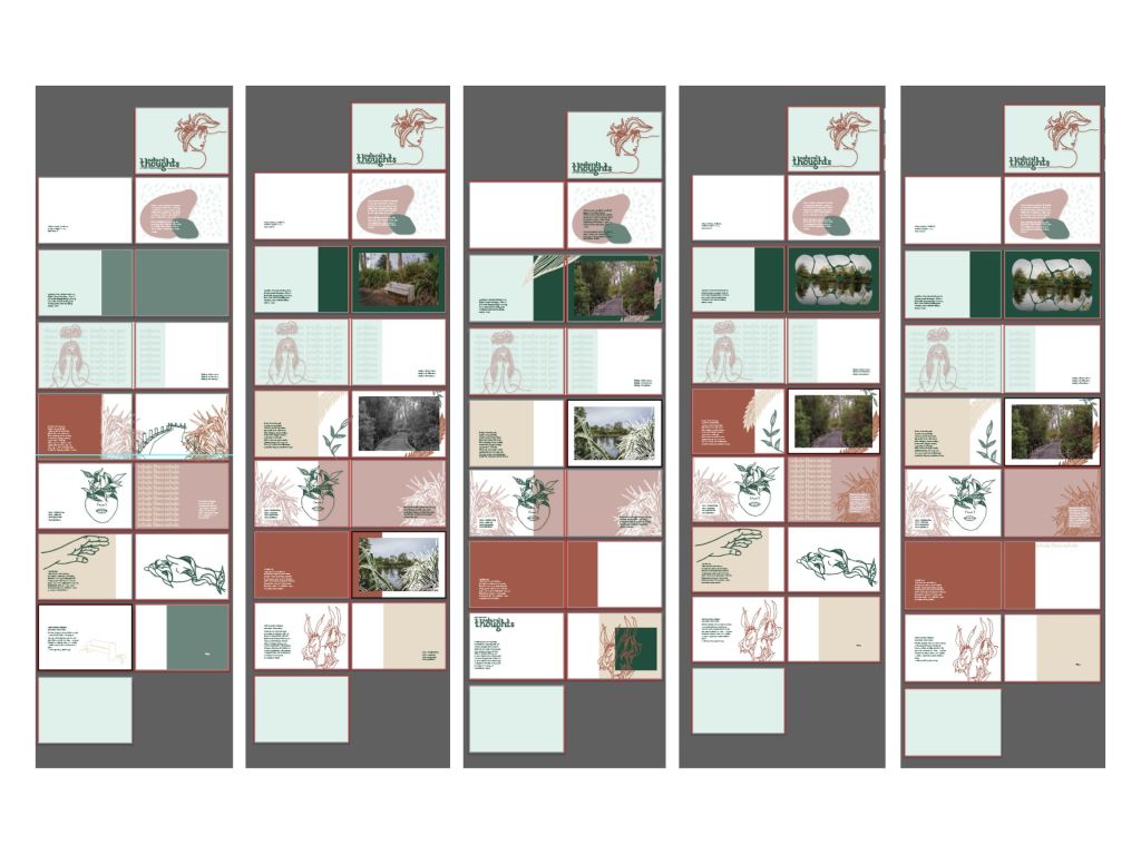
Here were some more explorations I had tried out. Here I had tried to incorporate my photos and illustrations together but they seemed to not really work together in this layout. So I tested out the look of black and white images but it made them stand out more and it didn’t feel right together. Also, I think that because the photographs themselves were full of leaves and plants it felt messy alongside my illustrations which is why I decided not to continue with the images.
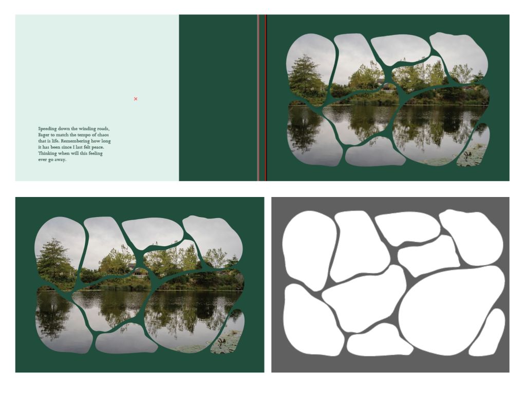
This was another I tried to explore in regards to my photographs. I just wanted to test out and see how my photographs would look if it was masked in the same shape of the rocks which I had trialed earlier but with colours. I explored this for I wanted to try and see if I could somehow showcase my photographs in a different form without just placing the photo itself. Overall, I think that this was interesting idea to explore and it looked cool but I don’t think I’m going to be pushing this further. Also, I wasn’t sure about the placement of the rocks and whether it looked good to still be contained in a rectangle shape.
Illustration placement and colour exploration:
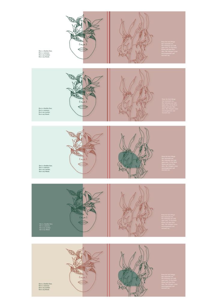
Here were some colour explorations and placement explorations. I was testing out what colour would look better on what element.
Moreover, in terms of the placing of the illustrations, I tried to choose the illustrations that would work well and would make sense on each specific part of the poem so that the two (drawings and poem) would work well together and it would have a good pace/ flow.
This was my most recent illustration which I had digitalised and had decided to place across the two pages which I thought turned out quite nice.
Also, I had tried to test out the blur imaged effect which I mention in the illustration process post.. Link:https://janinecarlos.photo.blog/2020/06/06/more-illustrations-direction-week-10/
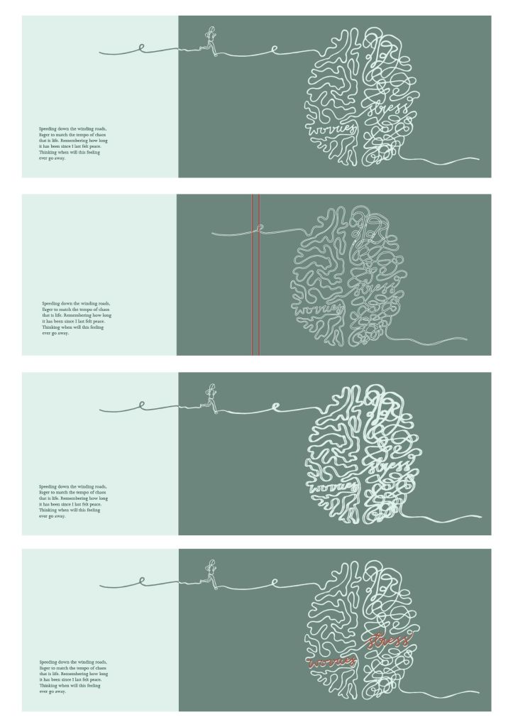
I also tried to explore fill and outline. whether the brain should be one filled colour or it should be outlined which is the one in the first screenshot.
Lastly, I tried seeing how it would look if I had put another colour on top of the words worries and stress to see if I can emphasise it but I think that it did not look as nice which is why I decided not to do this.
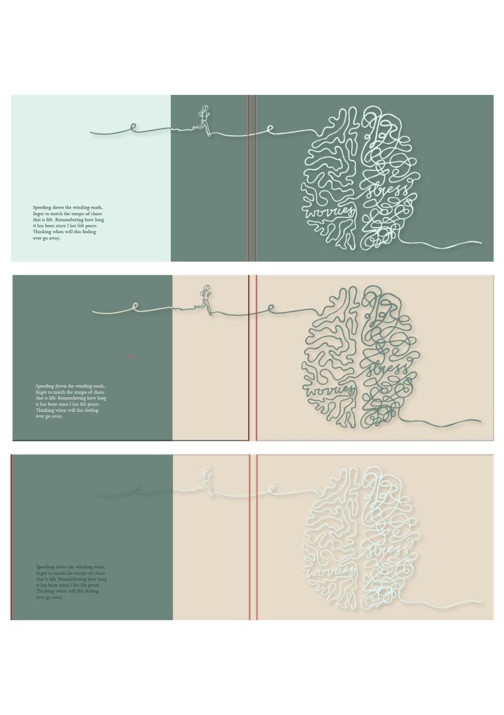
After having explored the illustration, I wanted to push the idea of colour and I played around with different colours. I think that the yellow and green looked a lot better together and it made the illustration pop more which is why I chose this one for the publication.
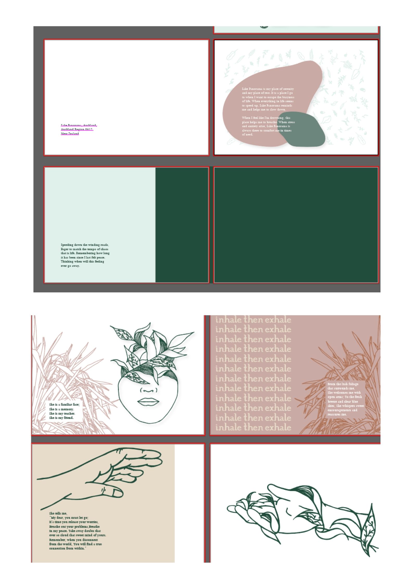
Lastly, here were a few more screenshots of the layout process. With these illustrations, I am still working on how I want this to look but am just continuing to try and make the illustrations and poem match together on the page.
Reflection: So far, I am quite happy with how my publication is turning out and I am glad to have taken some risks in terms of letting go of my photographs because I think that the illustrations felt stronger and worked better. Side note, I was actually a stuck on layout ideas but after having made the decision to let go of the images, I think that I was able to find a flow in the publication and where I wanted it to go.
